There's a lack of consistency on the wheel controls that make this look more like a UX showcase rather than a usable interface.
Case in point:
- A bunch of rotary knob that perform the same function: to select. But, they all look different and use different ways to represent the selection.
- Some have a lighted indicator, some have a notch, and some are completely ambiguous.
- The 2, 1, *, 0 switch has a hole in it to indicate the currently selected option.
- The plastic surrounding this is is mere millimeters of thickness and I would expect it to break off within a decade.
This is big. Ferrari, as a brand, is the top cult of internal combustion engine.
For them to release an EV is like Apple releasing an Windows computer or Android phone.
Soon, the last holdout of big oil will be the American government.
Their interiors look high-end, functional and not just a minimalist big computer screen.
https://www.caranddriver.com/photos/g46528574/2024-porsche-m...
Elements of it are precious and well designed. But it doesn't feel like a car interior.
As an Apple Car™ it makes sense, but as a Ferrari it's incredibly soulless and oversimplified. This Ive design aesthetic (Dieter Rams' aesthetic really) is fine on consumer electronics where you want the device to disappear and give way to the display, but on something as emotional as a vehicle (Ferrari especially), this design falls flat.
I do hope some of the design details work their way through the industry (e.g. using glass instead of gloss black plastic, convex glass to add depth to digital gauges), but I hope the rest of it stays as a one-off experiment demonstrating the hubris and one-dimensionality of a top designer.
But since it's all about the interface, I must say, the idea of a sports car with a touch screen is still rather terrifying.
Anyway, whether it's a Ferrari or other, I'm always disappointed by touchscreen in cars.
And as I said it before, it always seems and afterthought and just put there because someone forgot about it.
I'm guess I'm getting old but when I'm driving I usually look at the road and couldn't car less about a nice touchscreen.
Not clear yet on the exact charge speed or launch date. Or what the 0-100km/h time is, but expect a low number, of course. That number has to be eye-catching.
https://cdn-fastly.thetruthaboutcars.com/media/2022/07/20/94...
There’s a roughly 7 inch above the vents that flips up whenever the car is off, but using the screen is optional. The screen is up near the road, and it’s very safe to use. There’s a small joystick to move the cursor.
Screen up:
https://preview.redd.it/after-about-a-year-of-ownership-post...
CT also has a stateless “springy gear selector” which works the same way as a manual gear selector, but after selecting the gear it springs back, so it’s stateless. It also has tactile blocking for gears you can’t enter yet. It felt extremely satisfying.
CT got a 10/10 from me, like a small aircraft cockpit. Enough knobs and computers to be exciting, but not OTT. Made a hybrid micro hatchback feel exciting.
I would really like to have analog features back, buttons and all that, in an EV.
In tesla ( trend setter for this) big screen is functional, and it can show you multi media, when you charge you watch netflix.
this screen is not capable of multi media....
e.g.
> a 0–100 km/h (62 mph) acceleration time of 2.36 seconds, and a quarter mile (402 m) drag race time of 9.78 seconds. ... unofficially the fastest production car in the world
https://en.wikipedia.org/wiki/Yangwang_U9
> Model S Plaid Takes 2.07 Seconds to Accelerate from 0-100 mph
Rivian is the only excellent one.
[0]: https://www.astonmartin.com/en-us/our-world/brand-stories/as...
In many other cars that look would have been sleek.
I can see a car company who doesn't care about design stumbling into this outcome, but Ferrari doesn't seem like that kind of company. So the choice must have been intentional.
Well, that’s not (yet) possible, but this video does a good job in the meantime:
https://m.youtube.com/watch?v=6Wv1btxCjVE&pp=ygUQTG92ZWZyb20...
This feels like a modern Ferrari F40 dashboard and I like it a lot.
Strongly disagree. To each their own...
It looks like something from Fisher Price.
But I'm clearly not the target audience.
Touch screen buttons, especially the ones on the far edge of the center screen, are harder to accurately hit for most people. More physical buttons = better = more premium.
They're so ungodly heavy because of the batteries that they handle like barges. They need giant tyres and so much ESC and software control because these things weigh almost 2000kg or more. You can try and work around it but there's only so much that can be done to make 2000kg take a corner.
Looking at where sports cars will be in 10 years with ICEs being regulated out of existence makes me very sad because it seems like we're about to see the death of the lightweight sports car.
Instead it feels like sitting inside an iPad which is an aesthetic already cheaply deployed at massive scale to motels, pharmacies, and shitty coffee shops.
Weird, because that's exactly what it looks like.
Generally speaking, cars are not about simple designs/shapes. They, especially to enthusiasts, are viewed as something closer to art where care is taken to craft shapes and forms for both function and feel. This is amplified dramatically for Porsche, Ferrari, Lamborghini, etc..
Ive was clearly doing this design work for the Apple EV that never shipped. It followed Apple's historic design aesthetic (driven largely by him) of simplifying things as much as possible--using circles and squircles everywhere, removing as many unnecessary geometry as possible. That's fine for an Apple EV because that's their design aesthetic. That is, demonstrably, not Ferrari's design aesthetic. It's a jarring departure from decades of automotive design and, in my professional opinion, an exercise in hubris.
As we remember that design is largely subjective and that this is all my opinion, I will say that almost everything in the vehicle is overly simplified:
* Steering wheel: an attempt at modern retro, but they added two blobs (to keep the steering wheel simple) to house the dials and buttons instead of incorporating it in a sculpted, thoughtful way. Instead of putting the turn signals in those blobs (or elsewhere), they interrupted the simple steering wheel with a couple circles to act as the turn signals.
* Digital instrument cluster: it's an iPad that connects to the base of the steering wheel. Wasted space in the top corners. Convex glass is a really nice touch however. Gauges are strange to me (gas gauge for an EV, left dial is confusing at first glance, G-force gauge unnecessarily busy), but that can always be changed later so not worth waxing on about.
* The key: a small iPhone 4. It's not terrible, but it's rather uninspired and boring. Ferraris aren't supposed to be boring.
* Dashboard interface: another iPad, but with a Mac Pro handle on it. Might be very nice for moving it, but how often are you going to do that? Does it stick out far enough to act as a wrist-rest as mentioned in their video? The mechanical switches are a nice touch if the display/UI keeps up. The clock/compass/stopwatch in the top right is neat, but almost antithetical to the rest of the design--it's added complexity for the sake of complexity. I still like it though.
* Vents: these make sense to be simplified. I've never loved the number of flaps in most vehicles, but if you have kids you might have issues with toys/food getting lost inside if there's no mesh behind it.
* Seats are nice, but if you removed the Ferrari emblem would you know it's a Ferrari? Is there enough bolstering for spirited driving?
The shapes, iconography, etc. are all carried over from Apple devices. Cars, even in EV form, are not iPads and iPhones. Cars, particularly those like Ferraris, are supposed to be designed, sculpted, given character and flare in order to evoke emotion.
Rivian and Porsche, in my opinion, have designed beautiful EVs (inside and out). They have a design aesthetic that's unique to them and in the case of Porsche stays true to the brand. The Ferrari Luce looks like Ferrari hired Ive to take whatever work he did for Apple and copy paste it over to them. If this was announced as an Ive + Kia/Hyundai/Honda/Lexus/etc. collaboration would it look any more or less out of place? No, because it's been simplified to the point that it doesn't even look designed any more. It almost feels "default" in a way.
This is all just my opinion as someone that's been doing product engineering and industrial design for a long time and happens to love cars--take it with a grain of salt.
Under 1000kg for a reasonable price probably means building your own electrified exocar.
That was potentially 36 years ago. 36 years from 1990 would have been 1954.
What changed in technology from 1954->1990, vs change in technology from 1990-2026? Quite a lot.
A first look at the interior and interface of the Ferrari Luce. Every element meticulously designed and engineered to be functional, intuitive, and thrilling to drive.
Precision-engineered mechanical buttons, dials, toggles and switches are combined with multifunctional digital displays.
INTERIOR & INTERFACE
Thousands of deeply considered details unite to create a singular driving experience.
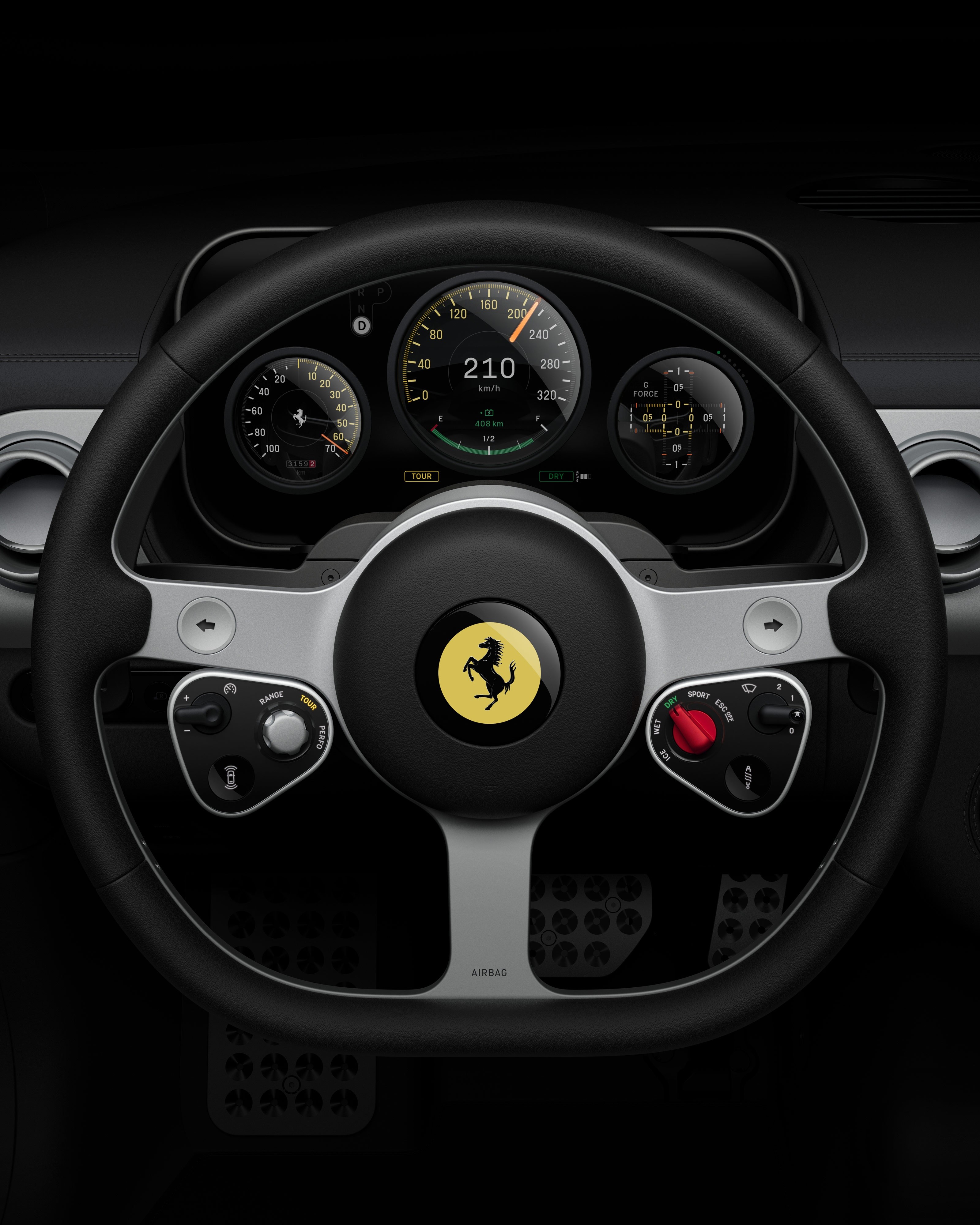
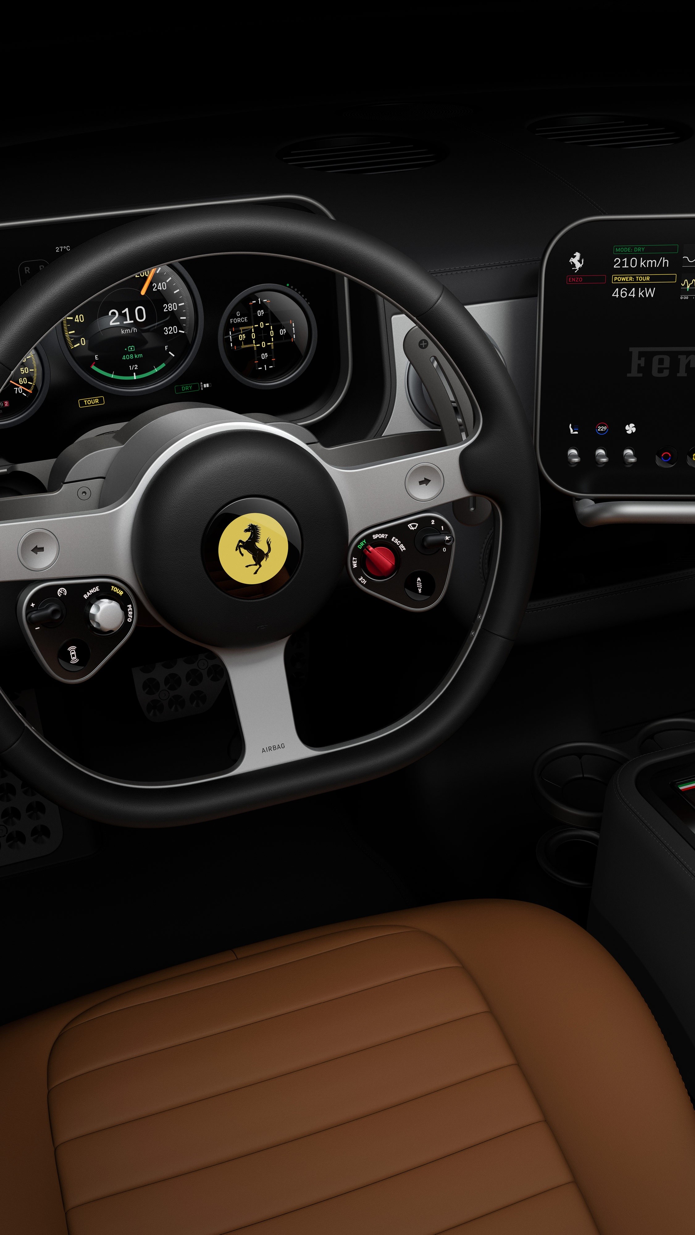
Steering Wheel
The three-spoke steering wheel is a pure and singular form, machined from a single piece of aluminium. Emblematic of driver control, the wheel is augmented with distinct and functional analogue control modules in the most ergonomic position for driving.
Binnacle
Essential driver-focused information is concentrated on the binnacle, a multi-layered display combining digital and mechanical instrumentation.
Power Dial
The left dial is directly connected to the e-Manettino mode, displaying available power output and regenerative braking.
Central Dial
The two most critical data points, speed and battery level, are shown on the central dial, which combines a mechanical needle with a digital dial.
Driver Dial
The right dial can display seven functional data points designed to improve driver performance, adjusted with a mechanical toggle on the right analogue control module.
Steering Assembly
The steering wheel, torque control paddles and binnacle combine to form the steering assembly.
Control Panel
The control panel is a self-contained articulating panel that augments the driving experience, combining mechanical controls with a digital touchscreen.
Climate, Settings & Media
Three physical buttons control climate, car settings and media.
Dedicated climate controls
Cabin temperature, fan speed, seat heating and ventilation are all physical controls that can be accessed quickly and intuitively while driving. The touch screen is used for deeper climate settings, media, and navigation.
Multigraph
Combining mechanical hands with a digital face, this multi-functional instrument displays a clock, compass, or 60-second stopwatch. During Launch Mode it automatically displays a 5-second stopwatch.
Centre Console
The centre console is a standalone module integrating the key, shifter, armrests, storage, and controls for the rear cabin.
Overhead Control Panel
The overhead control panel houses a physical pull that initiates Launch Mode. Additional controls include exterior lights, defrosters and the SOS emergency system.
Seats
Engineering
Engineering finesse every step of the way.
Ferrari has always been ready to innovate. The Ferrari Luce project with Jony Ive, Marc Newson and LoveFrom began with a mutual interest in learning, in understanding the future – and a deep understanding of and appreciation for Ferrari heritage. This work is motivated by excellence, and by creating something extraordinary.
The inside story
It would have been much better imho to for instance have lots of tiny screens embedded in the dashboard/console alongside their respective buttons. Each "app" gets their own toggle and physical dials. That would have been expensive and cool and could have been made not-tacky. (Like some cars are, expensive and cool but also without any class whatsoever, they look like a teenage gaming room.)