the peculiar case of japanese web design
a project that should not have taken 8 weeks
how is japanese web design different?
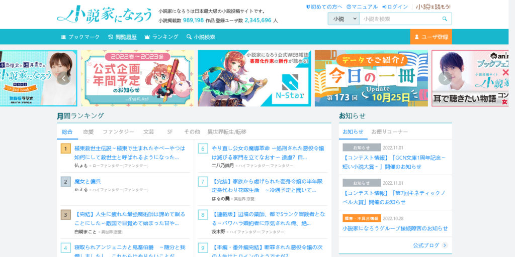
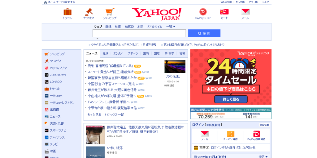
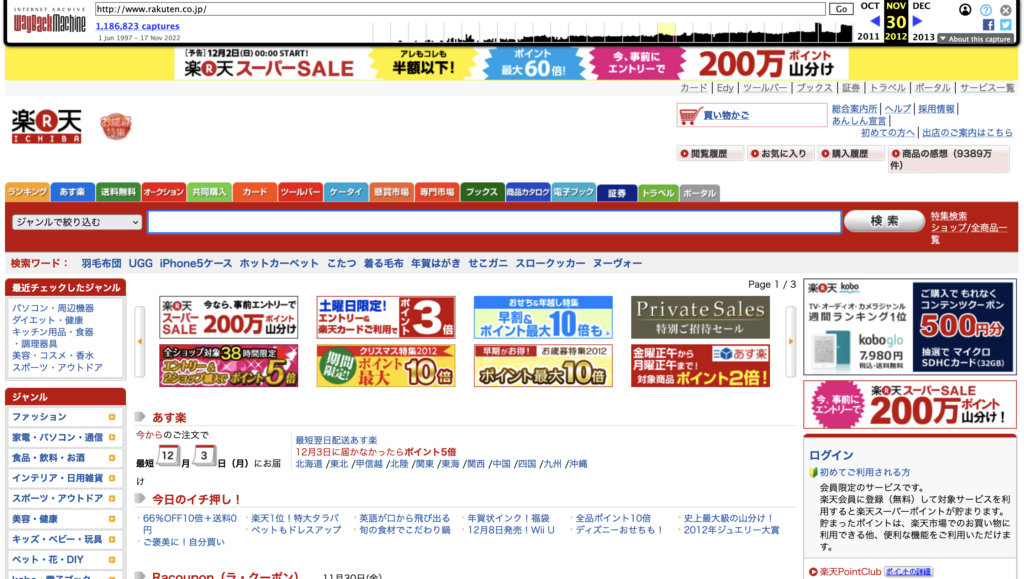
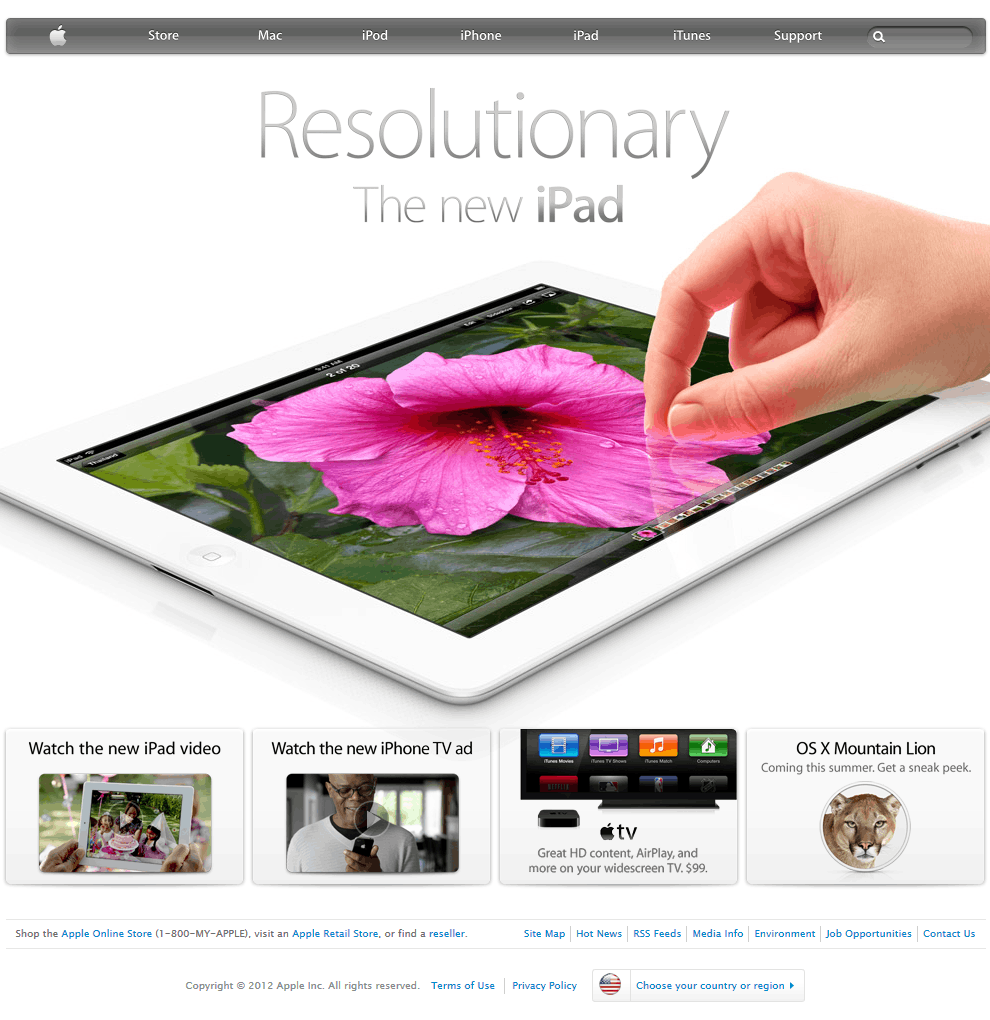
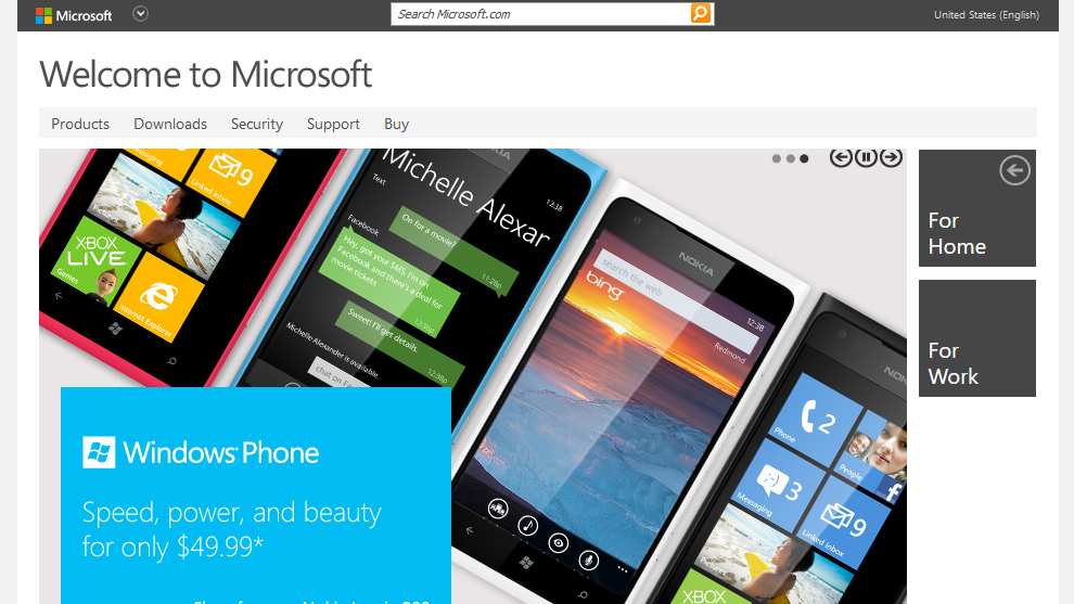
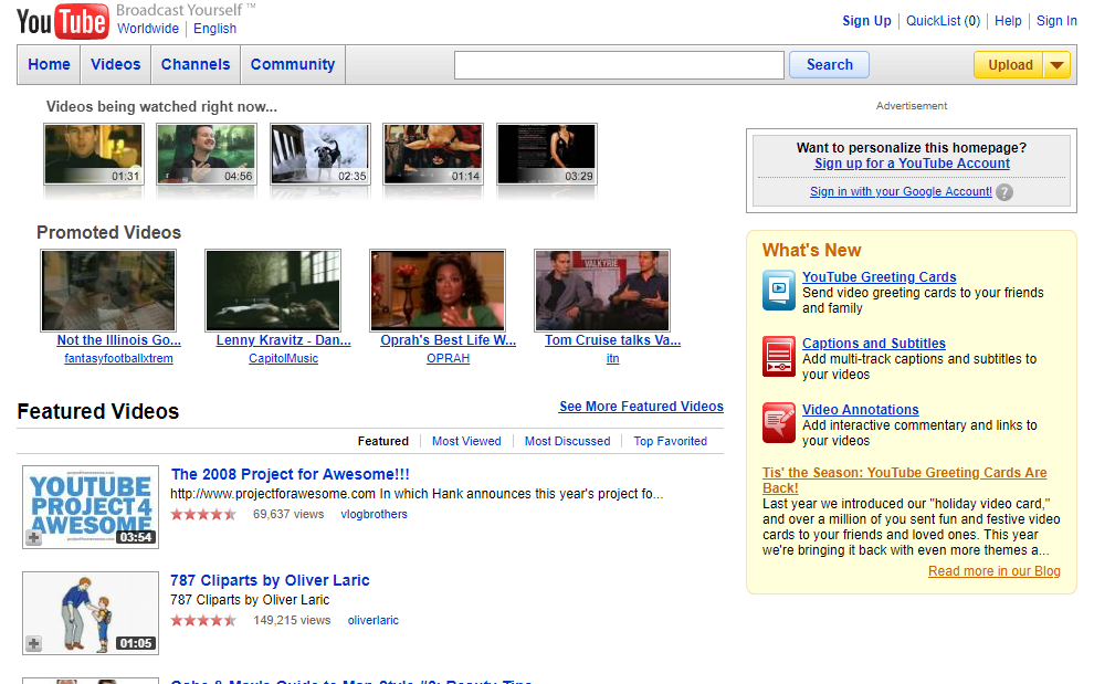
in this 2013 Randomwire blog post, the author (David) highlighted an intriguing discrepancy in Japanese design. While the nation is known abroad for minimalist lifestyles, their websites are oddly maximalist. The pages feature a variety of bright colours (breaking the 3 colour design principle), small images, and a lot of text. Just see for yourself with these screenshots taken in November 2022.


the blog post listed some possible reasons that have since been supported by cultural experts, fellow designers, and frustrated citizens.
i was curious if this theory still holds true and whether we could take a more quantitative approach… so i did.
what i found
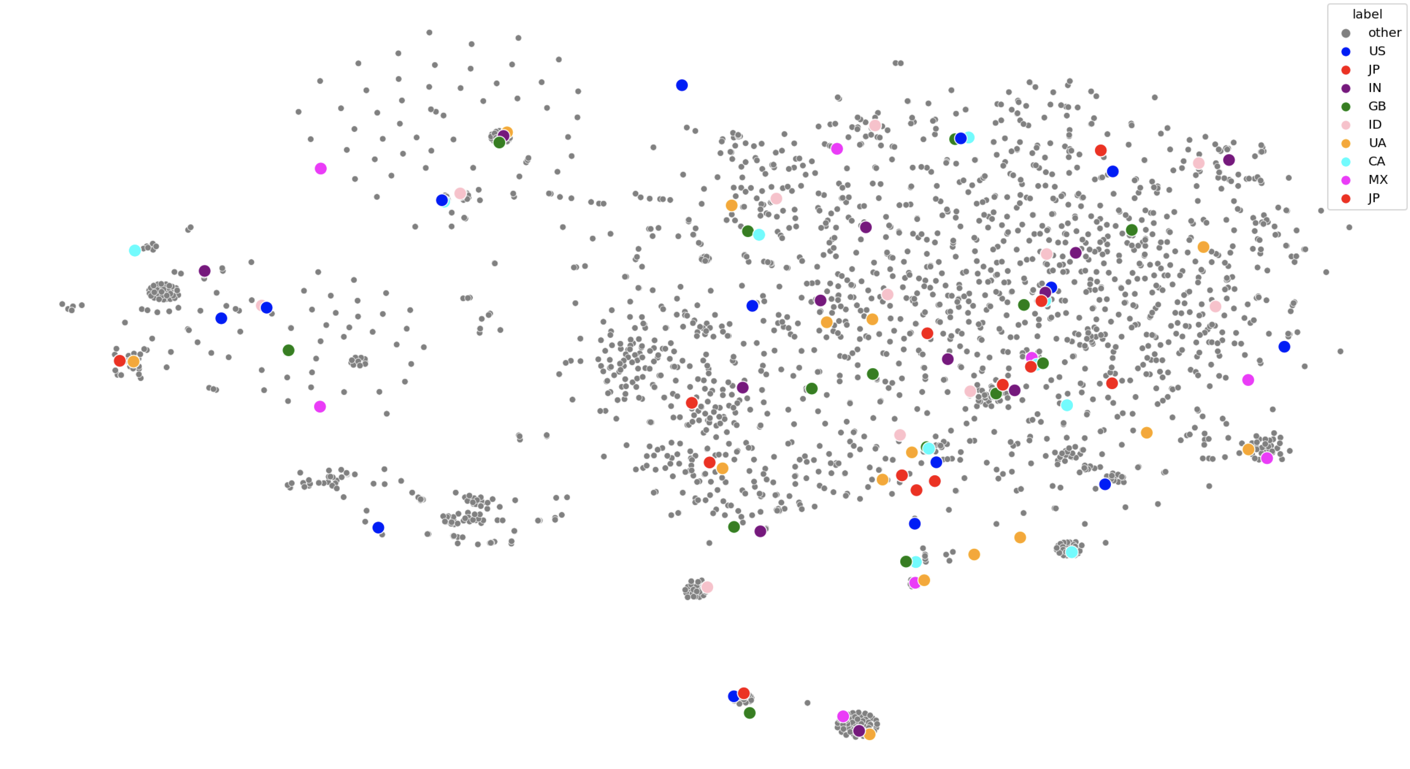
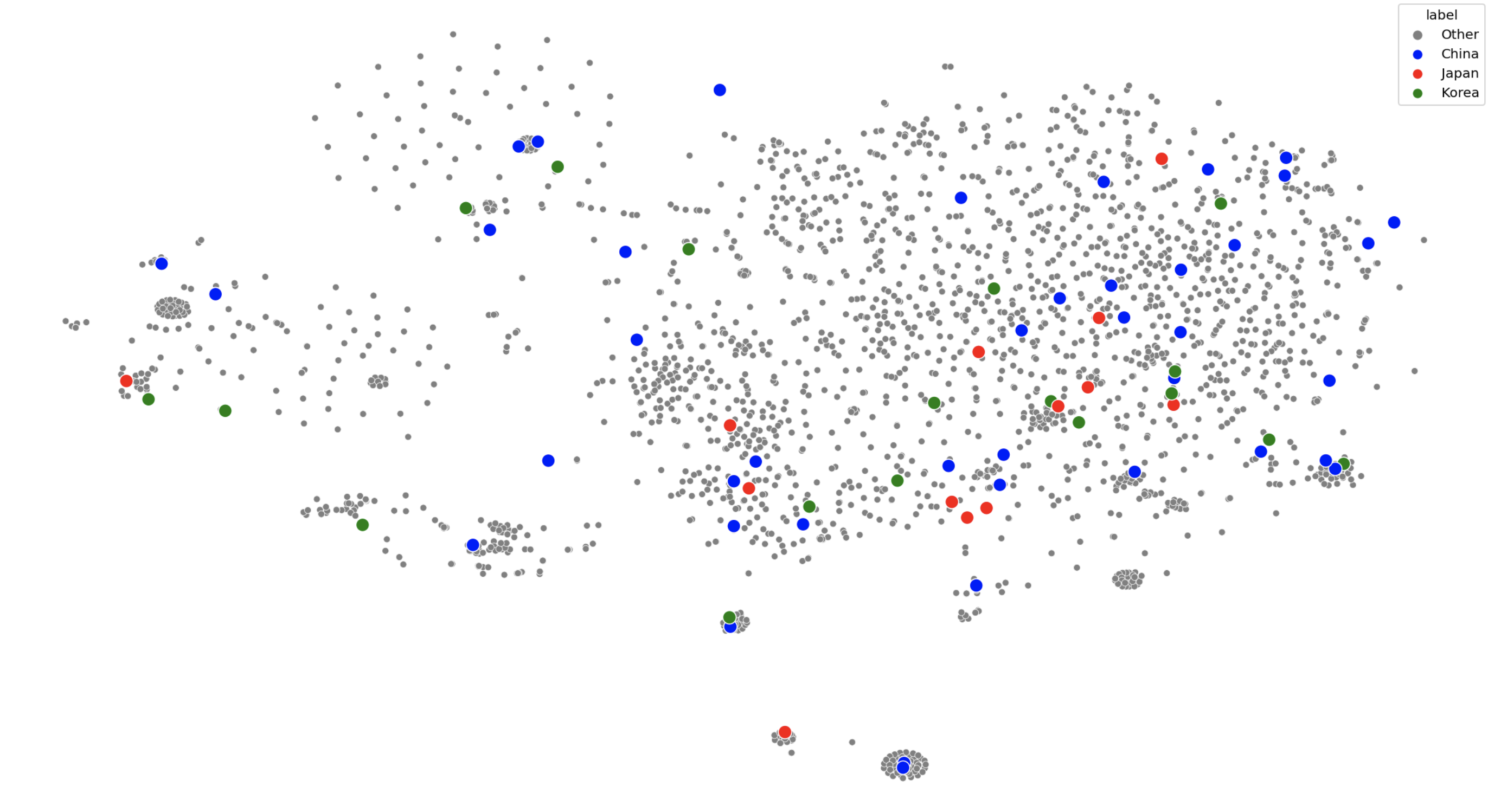
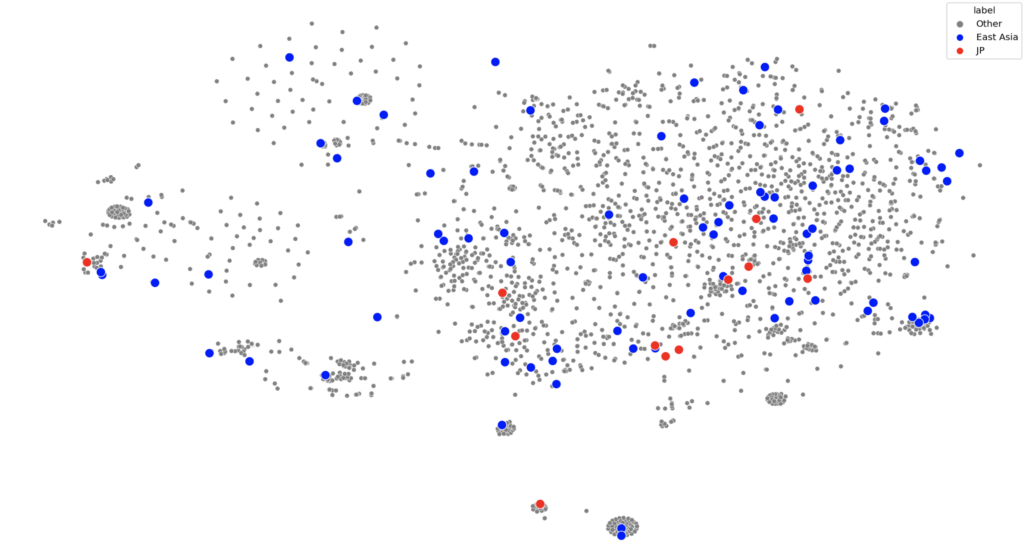
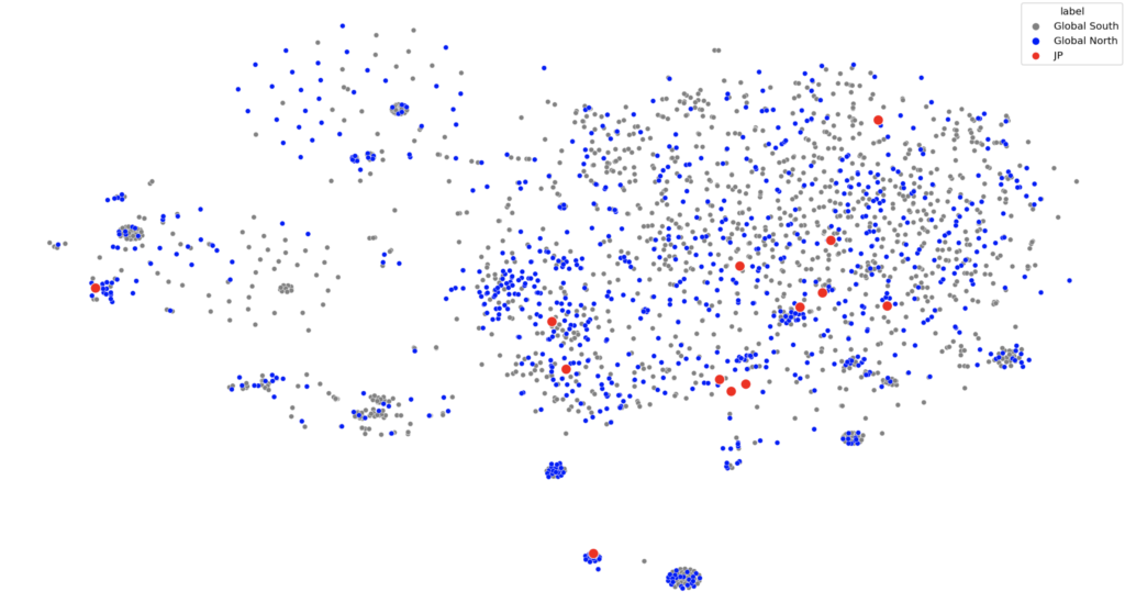
after running 2,671 images of the most popular websites in every country through an AI, i was able to group web design patterns around the globe based on their similarity
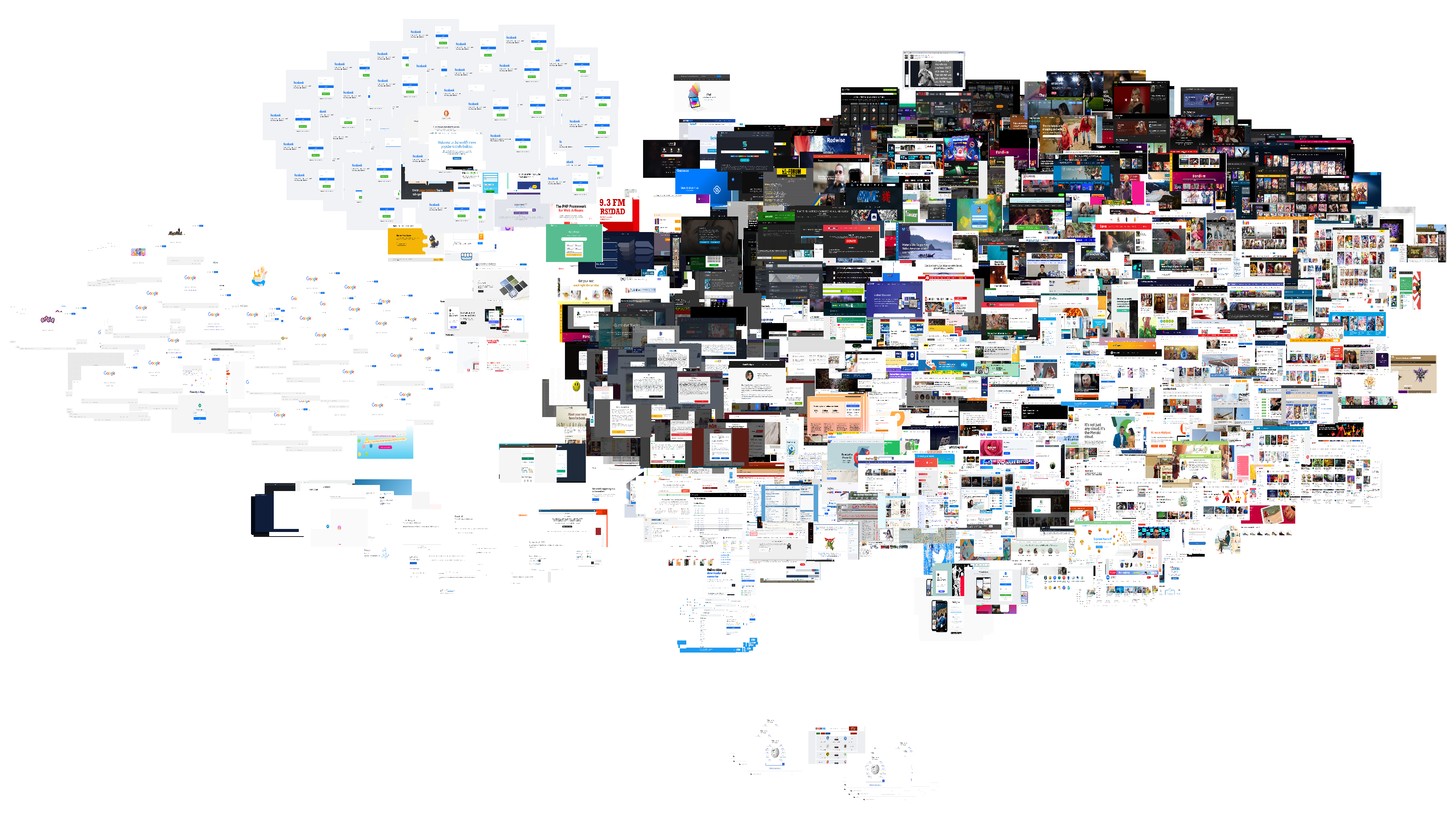
there are clear clusters composed of screenshots of the same handful of globally popular websites (Google, Twitter, Facebook, Wikipedia, etc.) as well as common visual web features (captcha pages and GDPR cookie policy pop ups).
however, a closer look at the clump in the top right of the image reveals a pattern
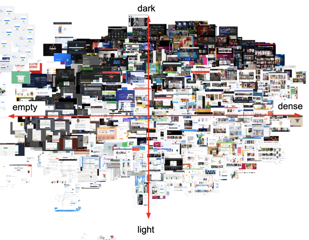
vertically, the images move from dark to light
horizontally (tbh it’s more of a diagonal but anyway), the images go from largely empty to text heavy to image heavy
interestingly, the popular japanese websites seem to avoid empty-dark designs
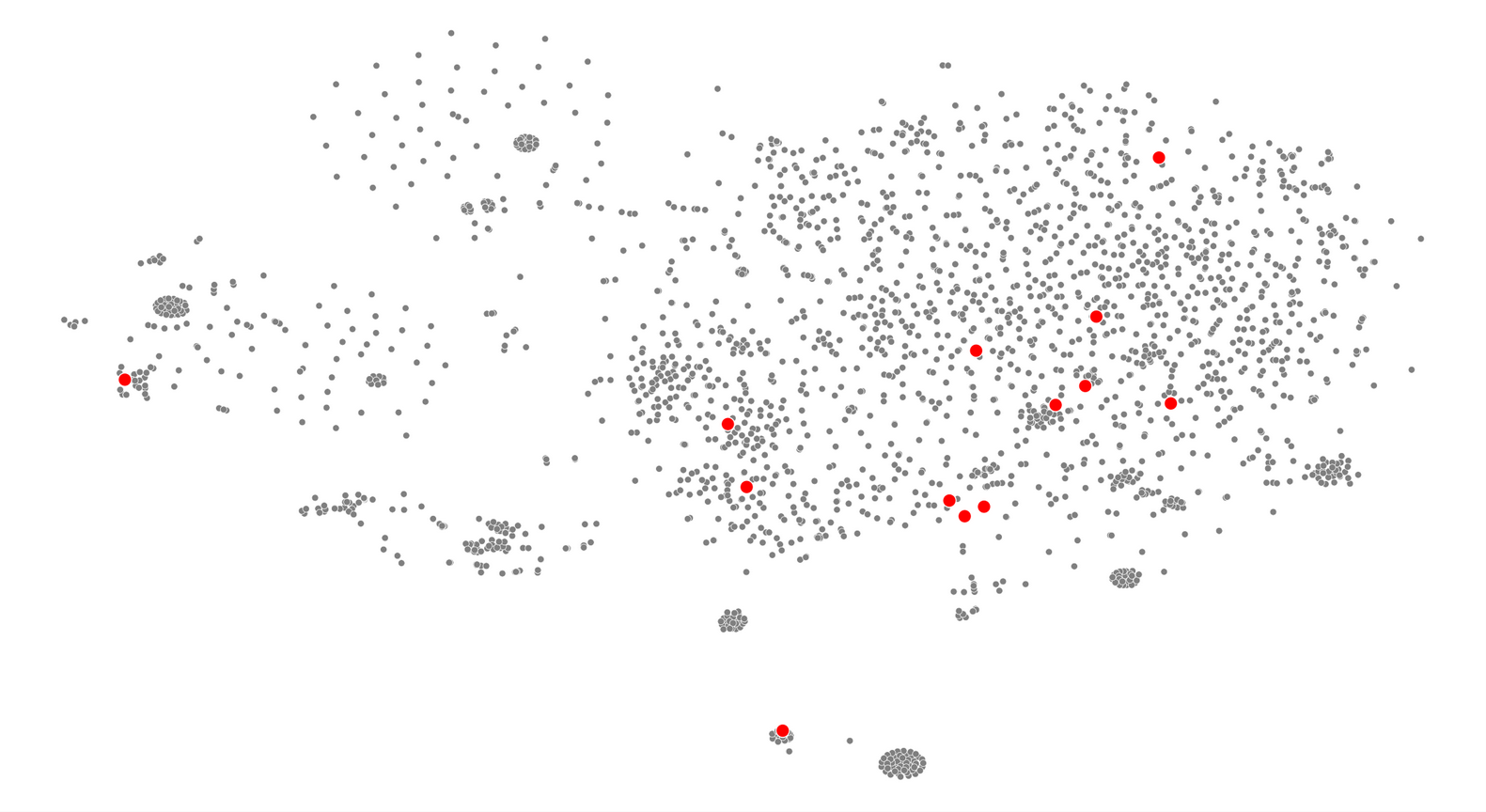
this differs in behaviour from other countries which contain the full variety of designs
this suggests that japan is relatively unique in its concentration of lighter coloured and/or denser web design.
this leads us to our next question: why?
why is japanese web design different?
the original theory lists a wide array of possible causes including urban landscape, language barriers, and risk avoidant consumer behaviour.
i paired those ideas against conversations i had on Twitter with internet users in Asia to identify 3 leading possible causes:
writing systems
Japanese writing systems share a large set of logographic characters with Korean and Chinese that are collectively titled CJK characters. There are a lot of these characters and not many designers are willing to create fonts for them compared to Latin fonts. So, Japanese web designers have less fonts to choose from and they can’t use capitalization to form visual hierarchies.
these fonts being larger also means that they might load slower.
however, other CJK regions (places that use CJK characters) don’t necessarily show the same patterns as Japan. It’s close but these other regions are more open to darker designs with a few “minimalist” offerings.
cultural differences
Japan is said to have a more risk averse culture that might demand more information for a lot of consumer goods. The way this information is displayed may be influenced by the urban structures of the region where bright coloured lights and compact spaces being normal.
however, when comparing Japan to its regional neighbours (which might have some cultural similarities) – no patterns arise.
if we try to group the countries by socio-economic and political characteristics (global north vs global south) there definitely aren’t patterns
technology
to understand this argument, we need to understand how software and hardware shaped the way websites look today. Here’s a great blog that covers the early days of the internet and another one that documents the evolution of popular websites and a YouTube video i made that contain the full-ish story.
But the tl;dr of the matter is:
- The internet was made as a way to share documents on desktop computers
- This document sharing quickly extended to interactive, multi-media experiences
- These developments happened quickly and with very little standardization leading to a lot of unique web design (that often crashed)
- Eventually, exploring the internet became frustratingly unstable and difficult to navigate due to too many websites.
- The rise of web standards and search engines led too a reduction in number of web design styles
- The rise of smartphones further reduces the amount of content available on a page due to limited screen size and data plans – resulting in minimalist web designs
So the idea is that Japan’s web design missed step 6 (or took longer to get there than the rest of the world) for three reasons.
japan is old
Japan is one of the oldest nations in the world (meaning the average citizen is older compared to many other nations). These people use the internet differently – they seem to be stuck with intuitions that fit older versions of the internet (source).
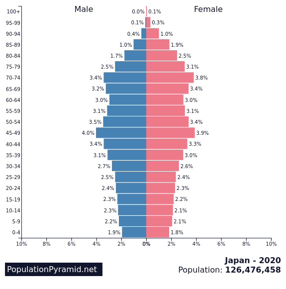
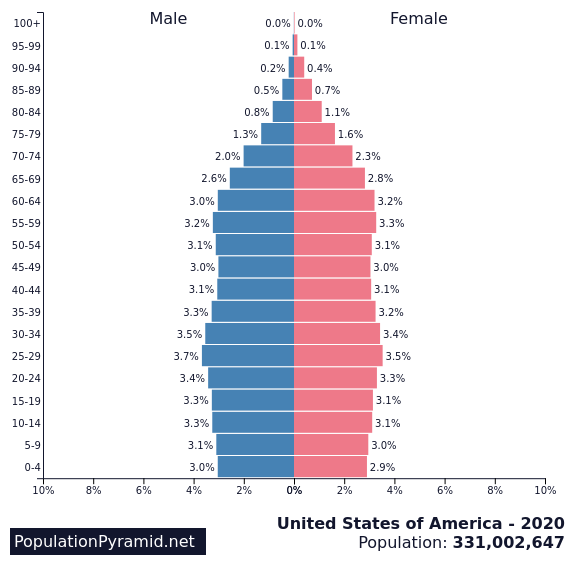
a comparison of the age distributions between japan and the US
japan is slow to adopt new technology
This is compounded by Japan’s general reluctance to update software. This idea is backed up by the fact that half the businesses in Japan were still using Internet Explorer at the time Microsoft announced that they were ending support for the program (source) and how the Father of Internet in Japan, Murai Jun, noted an active rejection of internet technology in the nation that caused it to “[lag] behind the United States” (source).
japan has it’s own unique cellphone culture
while the rest of the world’s smart phone adoption began with the iPhone, Japan was years ahead – but alone. This article points out:
[Japanese cellphones had] e-mail capabilities in 1999, camera phones in 2000, third-generation networks in 2001, full music downloads in 2002, electronic payments in 2004 and digital TV in 2005.
The result was that Japan’s smart phone culture evolved separately from the rest of the world. There was less emphasis on large pictures and text was more acceptable since it had been the norm since the early days.
Since Japan is so singular in this argument, it’s hard to pull comparable regions. Instead, let’s look at websites over time. If Japan had been impacted by the global smart phone revolutiooon, we would expect its web design to shift around 2010. It didn’t – to an almost comical degree.
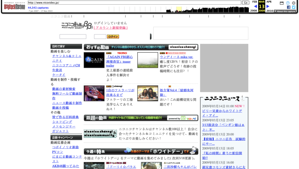
Japan

2007
2012
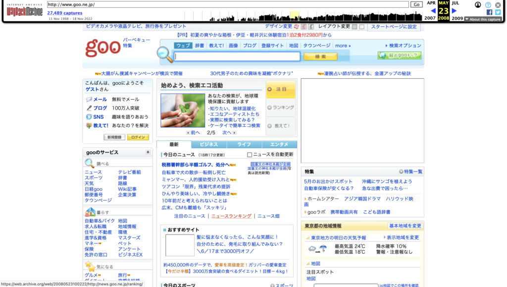
2008

2013
2009
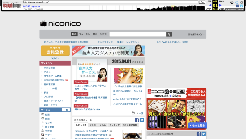
2015
via web.archive.org
America
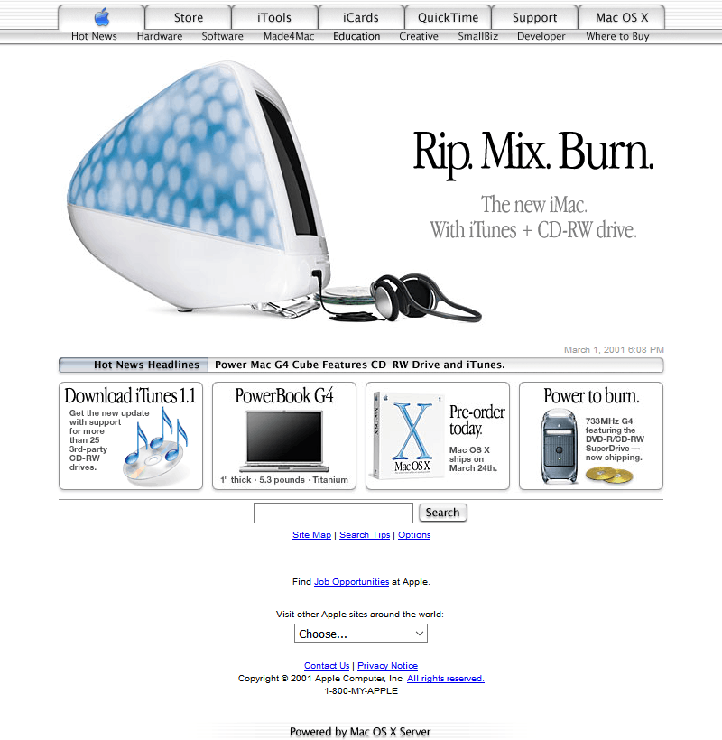
2001
2012

2005
2012
2008

2015
via webdesignmuseum.org
Thus, it’s clear that the introduction of the iPhone/smartphones didn’t impact Japan in the same way as the rest of the world (or at least, the English-speaking world).
In fact, the early 2000s design differences suggest that Japan has been on its own design trajectory for a while… but will it continue to be?
Unlikely, Japan is slowly but surely moving to meet technology in the rest of the world because younger generations want it (as detailed in this video by Mayuko) and also because they have no choice as companies end support for their older technologies.
methodology
This project can be broken down into three parts: gathering data, processing data, and analyzing data.
gathering data
I started by using SEM Rush’s Open.Trends service to find the top websites for each country across all industries. While this can be done manually, i automated the process using the Python libraries BeautifulSoup and Selenium-Python (you can also use the Requests library in this case, but I already had Selenium imported lol). Here’s some pseudo-code to give you an idea of how it was done:
# run a function to get the list of countries Open.Trends has listed on their site
countries = getCountries()

# initialize a dictionary to store the information
d = {
    'country':[],
    'website':[],
    'visits':[]
}

# iterate through that list
for country in countries:
  # follow semrush's URL formatting and plug in the country using a formatted string
  url = f'https://www.semrush.com/trending-websites/{country}/all'

  # navigate to the URL using Selenium Webdriver
  driver.get(url)

  # feed the page information into BeautifulSoup
  soup = BeautifulSoup(driver.page_source, 'html.parser')

  # extract the table data using BeautifulSoup
  results = getTableData(soup)

  # feed the results into the dictionary
  d['country'] = results['country']
  d['website'] = results['website']
  d['visits'] = results['visits']

# save this into some sort of file
df = pandas.DataFrame(d)
df.save_csv('popular_websites.csv', index=False)
NOTE: the quality of this data is subject to the accuracy of SEM rush’s methods. i didn’t really look too deeply into that because their listings were comparable to similar services.
You should now have a dictionary of the most popular websites in each country. A lot of those websites will be porn or malware or both. Let’s try to filter some of those out using the Cyren URL Lookup API. This is a service that uses “machine learning, heuristics, and human analysis” to categorize websites.
Here’s more pseudocode:
# iterate through all the websites we found
for i in range(len(df['website'])):
  # select the website
  url = df.loc[i,'website']
  # call the API on the website
  category = getCategory(url)
  # save the results
  df.loc[i,'category'] = category

# filter out all the undesireable categories
undesireable = [...]
df = df.loc[df['category'] in undesireable]

# save this dataframe to avoid needing to do this all over again
df.save_csv('popular_websites_filtered.csv', index=False)
NOTE: Cyren URL Lookup API has 1,000 free queries per month per user.
COMPLETELY SEPARATE NOTE: You can use services like temp-mail to create temporary email addresses.
Now it’s time to get some screenshots of the websites! If you want to take fullpage screenshots, you will need to use Selenium-Python’s Firefox webdriver. If not, any webdriver is fine. However, you probably don’t want to use full page screenshots as webpage sizes vary a lot and this can make your final results less interpretable.
def acceptCookies(...):
  # this function will probably consistent of a bunch of try-exception blocks
  # in search of a button that says accept/agree/allow cookies in every language
  # ngl i gave up like 1/3 of the way through

def notBot(...):
  # some websites will present a captcha before giving you access
  # there are ways to beat that captcha
  # i didn't even try but you should

# iterate through websites
for i in range(len(df['website'])):
  url = df.loc[i,'website]
  driver.get(url)

  # wait for the page to load
  # you shouldn't really use static sleep calls but i did
  sleep(5)
  notBot(driver)
  sleep(2)
  acceptCoookies(driver)
  sleep(2)

  # take screenshots
  driver.save_screenshot(f'homepage_{country.upper()}_{url}.png')

  # this call only exists for firefox webdrivers
  driver.save_full_page_screenshot(f'homepage_{country.upper()}_{url}.png')
NOTE: When doing this, you can use a VPN to navigate to the appropriate country / region to get increase the likelihood of seeing the local web page.
processing data
i mostly followed this tutorial by Grigory Serebryakov on LearnOpenCV. It utilizes an implementation of a ResNet model to extract the features of an image. You can pull the code from his blog post but we do need to load our images in differently. We can use this method by andrewjong (source). We need to save the image file paths for use in our final visualization.
class ImageFolderWithPaths(datasets.ImageFolder):
    """Custom dataset that includes image file paths. Extends
    torchvision.datasets.ImageFolder
    """

    # override the __getitem__ method. this is the method that dataloader calls
    def __getitem__(self, index):
        # this is what ImageFolder normally returns
        original_tuple = super(ImageFolderWithPaths, self).__getitem__(index)
        # the image file path
        path = self.imgs[index][0]
        # make a new tuple that includes original and the path
        tuple_with_path = (original_tuple + (path,))
        return tuple_with_path
now we can load our images using that method.
# identify the path containing all your images
# if you want them to be labeled by country, you will need to sort them into folders

root_path = '...'

# transform the data so they are identical shapes
transform = transforms.Compose([transforms.Resize((255, 255)),
                                 transforms.ToTensor()])
dataset = ImageFolderWithPaths(root, transform=transform)

# load the data
dataloader = torch.utils.data.DataLoader(dataset, batch_size=32, shuffle=True)
next we initialize and run our model. I needed to adapt Serebryakov’s code slightly to account for how our images were loaded.
# initialize model
model = ResNet101(pretrained=True)
model.eval()
model.to(device)

# initialize variables to store results
features = None
labels = []
image_paths = []

# run the model
for batch in tqdm(dataloader, desc='Running the model inference'):

  images = batch[0].to('cpu')
  labels += batch[1]
  image_paths += batch[2]

  output = model.forward(images)
  # convert from tensor to numpy array
  current_features = output.detach().numpy()

  if features is not None:
      features = np.concatenate((features, current_features))
  else:
      features = current_features

# return labels too their string interpretations
labels = [dataset.classes[e] for e in labels]

# save the data
np.save('images.npy', images)
np.save('features.npy', features)
with open('labels.pkl', 'wb') as f:
  pickle.dump(labels, f)
with open('image_paths.pkl', 'wb') as f:
  pickle.dump(image_paths, f)
we should now have 4 sets of data containing our image paths, labels, images, and their extracted features.
analyzing data
we start by running our data through sci-kit’s tsne implementation. This basically reduces our multidimensional feature arrays down to 2D co-ordinates that we can put on a graph. We can map smaller versions of our screenshots onto those coordinates to see how the machine has organized our websites.
# the s in t-SNE stands for stochastic (random)
# let's set a seed for reproducible results
seed = 10
random.seed(seed)
torch.manual_seed(seed)
np.random.seed(seed)

# run tsne
n_components = 2
tsne = TSNE(n_components)
tsne_result = tsne.fit_transform(features)

# scale and move the coordinates so they fit [0; 1] range
tx = scale_to_01_range(tsne_result[:,0])
ty = scale_to_01_range(tsne_result[:,1)

# plot the images
for image_path, image, x, y in zip(image_paths, images, tx, ty):
  # read the image
  image = cv2.imread(image_path)

  # resize the image
  image = cv2.resize(image, (150,100))

  # compute the dimensions of the image based on its tsne co-ordinates
  tlx, tly, brx, bry = compute_plot_coordinates(image, x, y)

  # put the image to its t-SNE coordinates using numpy sub-array indices
  tsne_plot[tl_y:br_y, tl_x:br_x, :] = image

cv2.imshow('t-SNE', tsne_plot)
cv2.waitKey()
now we can look for any visual patterns in the images. What i found was detailed in the sections above.

i wanted to understand this data through the lens of writing systems, culture (geographically and economically), and technology. So, I found datasets containing that information: writing systems, iso countries with regional codes, and the global north-south divide. They needed to be supplemented with some additional Google searching to make sure we had labels for each country in our dataset.
Here’s a basic walkthrough of how I used this new analysis data.
analysis_data = # import data

# initialize a list to capture a parallel set of labels
# so instead of the country, we can label our data through writing system, etc.
new_labels = []

# iterate through our pre-existing labels and use it to inform our new_labels
for label in labels:
  # select the new_label based on the old label (the country name)
  new_label = analysis_data['country' == label]
  new_labels.append(new_label)

# use the new_labels to colour a scatterplot with our tsne_results
tsne_df = pd.DataFrame({'tsne_1': tx, 'tsne_2': ty, 'label': new_labels})
sns.scatterplot(x='tsne_1', y='tsne_2', data=tsne_df, hue='label')
NOTE: The technology argument used a more qualitative methood and is not included here.
we can see the results of those comparisons in the sections above

an answer in progress project
Bibliography
7/11/96, O. N. (n.d.). W3 catalog history. Retrieved November 1, 2022, from https://scg.unibe.ch/archive/software/w3catalog/
20 years of SEO: A brief history of search engine optimization. (2021, February 27). Search Engine Journal. https://www.searchenginejournal.com/seo-guide/seo-history/
Abdelaal, A. (2019, October 11). Autoencoders for image reconstruction in python and keras. Stack Abuse. https://stackabuse.com/autoencoders-for-image-reconstruction-in-python-and-keras/
Brownlee, J. (2020, December 6). Autoencoder feature extraction for classification. Machine Learning Mastery. https://machinelearningmastery.com/autoencoder-for-classification/
Contributors to Wikimedia projects. (2022, September 25). CJK characters. Wikipedia. https://en.wikipedia.org/wiki/CJK\_characters
Google fonts: Noto sans. (n.d.). Google Fonts. Retrieved November 16, 2022, from https://fonts.google.com/noto/specimen/Noto+Sans/about
Google fonts: Noto sans traditional Chinese. (n.d.). Google Fonts. Retrieved November 16, 2022, from https://fonts.google.com/noto/specimen/Noto+Sans+TC/about
Holt, K. (2022, June 16). Report reveals half of Japan’s businesses had yet to ditch Internet Explorer. Engadget. https://www.engadget.com/microsoft-internet-explorer-japan-business-151751069.html
Little, C. (2021, September 28). The history of web design – Tiller Digital. Tiller. https://tillerdigital.com/blog/the-history-of-web-design/
McGowan, D. (2018). The truth about Japanese web design. Multilingual. https://multilingual.com/issues/aug-sep-2018/the-truth-about-japanese-web-design/
Murai, J. (2015, October 9). The birth and evolution of the internet in Japan. Nippon.Com. https://www.nippon.com/en/features/c01905/
nathancy. (2022, March 27). Checking images for similarity with OpenCV. Stack Overflow. https://stackoverflow.com/a/71634759
ricmac. (n.d.). Web development history. Web Development History. Retrieved October 7, 2022, from https://webdevelopmenthistory.com/
Search engine market share worldwide. (n.d.). StatCounter Global Stats. Retrieved November 2, 2022, from https://gs.statcounter.com/search-engine-market-share#yearly-2009-2022
Segal, D. (2011, February 12). Search optimization and its dirty little secrets. The New York Times. https://www.nytimes.com/2011/02/13/business/13search.html?\_r=1&pagewanted=all
Sonnad, N. (2015, December 18). The long, incredibly tortuous, and fascinating process of creating a Chinese font. Quartz. https://qz.com/522079/the-long-incredibly-tortuous-and-fascinating-process-of-creating-a-chinese-font
staff. (2013, October 3). 実例で納得!シニアが使えないサイトの例. マミオン有限会社-パソコン・数学研修、法人研修 | 大人向けのパソコンおよび数学研修を実施。対面、オンライン対応。コンテンツ提供なども. https://mamion.net/2013/10/実例で納得!シニアが使えないサイトの例/
Stephanie. (2017, July 30). Self-Selection bias. Statistics How To. https://www.statisticshowto.com/self-selection-bias/
Stern, T. (2015, June 24). The evolution of SEO trends over 25 years. Search Engine Land. https://searchengineland.com/evolution-seo-trends-25-years-223424
Tabuchi, H. (2009, July 20). Why Japan’s smartphones haven’t gone global. The New York Times. https://www.nytimes.com/2009/07/20/technology/20cell.html
Taskesen, E. (2022, September 27). A step-by-step guide for clustering images. Towards Data Science. https://towardsdatascience.com/a-step-by-step-guide-for-clustering-images-4b45f9906128
Total number of Websites. (n.d.). Internet Live Stats. Retrieved November 2, 2022, from https://www.internetlivestats.com/total-number-of-websites/
t-SNE for Feature Visualization. (2020, April 12). LearnOpenCV – Learn OpenCV, PyTorch, Keras, Tensorflow with Examples and Tutorials. https://learnopencv.com/t-sne-for-feature-visualization/
Woodford, C. (n.d.). How broadband Internet works and how ADSL is different from dial-up: Explain that Stuff! Retrieved November 2, 2022, from https://web.archive.org/web/20110913021130/http://www.explainthatstuff.com//howbroadbandworks.htmlZDNET Editors. (2005, September 26). Top search engines in September 2005: Google – 56.9%, Yahoo – 21.2%, MSN – 8.9%. ZDNET. https://www.zdnet.com/article/top-search-engines-in-september-2005-google-56-9-yahoo-21-2-msn-8-9/