I wrote a blog post about how I customized Firefox exactly to what I wanted https://varun.ch/posts/firefox/ including a minimal UI, monospaced font, sidebar, etc etc. userChrome.css is a great feature and it’s amazing that it’s just exposed to the user.
Just make the goddamn browser fast, lightweight, and stable. Forget everything else.
Except spell check. Please god fix that too.
Chef’s kiss.
Is there a technical reason for this that Polish is defaulted to more often than not? Or is this just a me thing.
The "..." convention is used when menu options open a dialog box rather than just immediately doing the action.
In fact, I've read several such rants about Firefox removing functionality from other parts of their UI.
It's sure hard to make everyone happy.
> Apple experiments in GUI design for the Lisa project initially used multiple menu bars anchored to the bottom of windows, but this was quickly dropped in favor of the current arrangement, as it proved slower to use (in accordance with Fitts's law). The idea of separate menus in each window or document was later implemented in Windows and is the default approach in most Linux desktop environments.
I recall hearing a quote that said Jobs called the menu the ultimate discoverability tool in the designer's arsenal, but I couldn't find the quote.
I am thankful for the menu junk drawer in Firefox. Better to give me everything I can discover in a menu rather than make a zillion fugly buttons and cluttering up the chrome. Although, anything that isn't frequently used by users should at least go under a few submenus to echo OP's criticisms. If Copy Clean Link is the "right" thing to do for users, then make "Copy Raw Link" a sub-menu item.
[1] https://en.wikipedia.org/wiki/Fitts%27s_law [2] https://en.wikipedia.org/wiki/Menu_bar
I think that I never used “Set Image as Desktop Background…” in all my life. That's a very narrow use case to get its own menu entry.
1. In about:config, turn pref toolkit.legacyUserProfileCustomizations.stylesheets on.
2. Create chrome/userChrome.css in your profile directory (which you can find from about:support).
3. Open the Browser Toolbox with Ctrl+Alt+Shift+I or ≡ → More tools → Browser Toolbox or Tools → Browser Tools → Browser Toolbox or some such thing. This is dev tools for the browser.
4. In the Inspector tab, search #contentAreaContextMenu to navigate to the <menupopup id="contentAreaContextMenu" …> element.
5. Look through its children. Decide which ones you don’t want, then kill them in CSS.
From my userChrome.css (I think this must be something like a decade old because I started typing curly quotes somewhere around then):
/* I don't want *two* items for Inspect, just the one main one please. */
#context-inspect-a11y,
/* I'm happy to use Ctrl+Shift+S; I don't need a context menu item for it. */
#context-take-screenshot,
#context-sep-screenshots,
/* I don't use Firefox's password manager. */
#fill-login,
#fill-login-generated-password,
#manage-saved-logins,
#passwordmgr-items-separator {
display: none;
}
The article takes the approach of disabling features (e.g. devtools.accessibility.enabled). I take the approach of leaving the features enabled (I want the accessibility stuff!) and just removing the specific context menu item that I found annoying.(… and I see at the end of the article that this approach is what the next post is to be about. Heh. Posted before reading to the end. Probably would still have posted roughly the same thing.)
A lot of software (Github, Okta, etc. etc.) will just delete portions of their UI, usually because you don't have permission to access it, or even just some of it. So, if you google "how do I do X?" the AI — assuming it gets it right at all — will tell you to click on UI that doesn't exist. Even if you then scroll to the organic docs, those will also have you click UI that does not exist.
A greyed-out item gives you the affordance of knowing that that feature / path exists, even if it's not available right here, right now. Truly good UI would also give me an affordance of knowing why (e.g., a tooltip saying "to access blah, you need permission blah"), but that's just asking for the moon, I know.
But when you're staring at docs referencing a non-existence menu item: is it because I lack a permission? What permission? Or perhaps the docs are just out of date? — you don't know!
> It's sure hard to make everyone happy.
I definitely think this is a hard task and it's pretty apparent with Firefox. I mean no matter what they do people are going to be very vocal and upset about it.But to talk more generally, I think finding the balance of what options to expose to normal users and then how to expose things to power users is quite challenging. I think a big mistake people make is to just ignore power users and act like that just because they're a small percentage of users that they aren't important[0].
I think what makes computers so successful is the fact that computers aren't really a product designed "for everyone," instead, they're built as environments that can be turned into a thing that anyone needs. Which is why your power users become important and in a way, why this balance is hard to strike because in some sense every user is a power user. Nobody has the same programs installed on their computers, nobody has the same apps installed on their phones, each and every device is unique. You give them the power to make it their own, and that's the only way you can truly build something that works for everyone.
This is why I think computers are magic! But I think we've lost this idea. We've been regressing to the mean. The problem is when you create something for everybody you end up making something for nobody.
[0] I think Jack Conte (Patreon/Pomplamoose) explains it well here. It's the subset that is passionate that are often your greatest ally. No matter what you sell, most of the money comes from a small subset of buyers. The same is true with whatever metric we look at. As a musician a small subset of listeners are the ones that introduce you to the most people, buy the most merch, and all that that makes you successful. It's not the average "user" but the "power user". https://www.youtube.com/watch?v=5zUndMfMInc
At 13:00 he quotes Kevin Kelly (founder of Wired) and I think it captures the thesis of this talk
In the age of the internet, you don't need millions of fans to be successful. If you can just find 1000 people who are willing to buy $100 of stuff from you per year, that's $100k/yr.To each their own; glad it's an option :)
He also rails against menu items that are greyed out and unusable, where to me that’s a very useful indicator that the action isn’t available here but that I’m looking in the right place.
When I want to click a menu item and find it greyed out, that tells me something. But when I want to click a menu item and it’s not there at all, I’m confused. Did a developer move it somewhere else? Did the name of the action change? Am I losing my touch?
Also greyed out options have a point, they only seem "fucking useless" if you don't know it.
It's about the disrespect of not asking. Could Firefox have asked if users wanted to enable AI features? Of course they could have, did they? Of course not, just think about how would asking would effect the shareholders!!
I don't disagree with the premise that it's hard to make everyone happy, but the problem isn't about pleasing everyone, it's about treating users with respect, and not jumping on the AI everywhere bandwagon, without asking first. Especially because Firefox has billed itself as privacy protecting, and AI is definitely not privacy focused. One might even say, privacy violating... From the privacy focused browser...
It had one fixed menu entry called "advanced menu" this replaces the menu with one that has everything (except from "advanced menu" which is replaced with "simple menu").
One of the menu entries is "configure simple menu". This opens the same looking menu as "advanced menu" only clicking any functionality toggles a check mark in front of it.
If a sub menu had less than 3 options it is merged into the parent menu.
One plays with it for a bit and before long it becomes a Japanese celebration of emptiness.
It even had a bunch of sort of redundant options. The sms submenu had something like 8 options of which I only really used "new message" and "all messages" but you could go for "unread messages". It's not like the rest of the menu is gone, its all under "advanced menu".
If the right click menu worked like that some would bother to further configure the simple menu and one could share their config.
To make it clear it is not a "more" button "advanced" could fold out the hidden entries like a harmonica.
No, putting an explanation on the help article that this feature is only available to admins doesn't work. No one reads anything.
Um … how else do you access this feature?
(I use the context menu's item for that all the time … since that's the only way at it that I know of.)
Unfortunately that one is not removable through about:config.
Blog first, ask questions later? It's like c'mon man, have at least a little bit of curiosity...
The greyed out options have no point because 99.99% of the links I click are already clean. Like so many of the other privacy enhancing options, just provide an option to "clean links automatically."
Also, Mozilla Corporation's sole "shareholder" is the not-for-profit Mozilla Foundation.
I have noticed that Mac Sequoia I'm running now has some memory as to which process last focused on each display and now is able to show a different menu per display, albeit grayed for displays where the user is not currently focused. It's a little janky, but kindof a graceful devolution of the original single menu vision.
On a fresh installation of Firefox on MacOS, right-clicking an image while some text on the page is highlighted (to show as many buttons as possible) looks like so:
![]() |
|---|
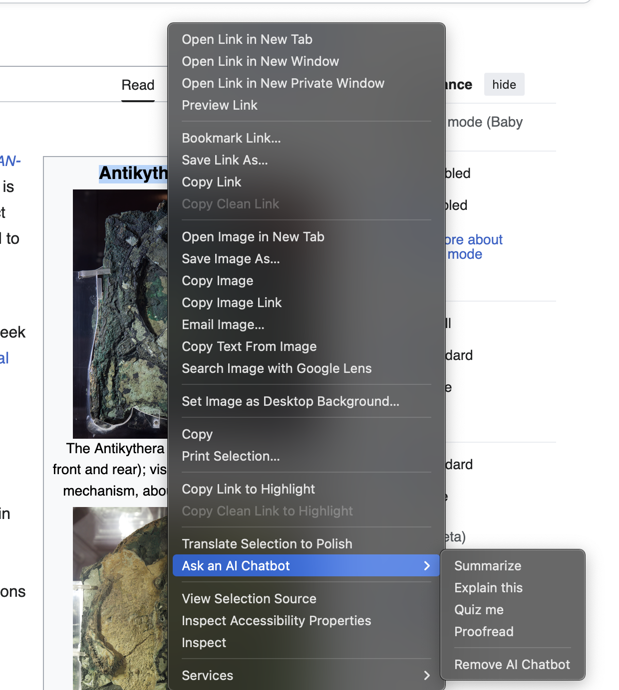
| Freshly installed Firefox, right-clicking |
To be blunt: holy fucking shit, what the fuck is all of this shit? 26 rows of which 2 are greyed-out (aka: fucking useless), 7 dividers, 2 submenus; because a single row for “Ask an AI Chatbot” wasn’t enough, they just had to make another submenu. Amazing.
The “Inspect Accessibility Properties” button was added because I opened the DevTools (Inspector) once. It’s not obvious how to actually disable it ever again. Why am I shown “Copy Clean Link” if there is no clean link (or the link is already clean)? The same goes for “Copy Clean Link to Highlight”. Why can’t I make it so it always defaults to the “clean link” no matter what (and get rid of “Copy Link” completely, instead)? “Ask an AI Chatbot”? No, fuck you.
The rest? Completely useless. Thanks for showing me every feature you’ve ever shipped, with no authoritative selection of what users actually care about – and making it completely non-obvious how to disable the useless shit here.
Enough venting, let’s clean this all up. The following settings in about:config can be used to disable a ton of these useless right-click menu buttons. Note, some of them actually disable other functionality, so choose wisely. We can set the following to false:
browser.translations.select.enable – Removes the “Translate Selection” button from the right-click menu.screenshots.browser.component.enabled – Disables the built-in Firefox screenshot functionality, which also removes the “Take Screenshot” button.dom.text_fragments.enabled – Disables Text Fragments support, which also removes the “Copy Link to Highlight” button (and disables the auto-focus on URLs that include #:~:text=...).privacy.query_stripping.strip_on_share.enabled – Removes the “Copy Clean Link” / “Copy Link Without Site Tracking” buttons.devtools.accessibility.enabled – Disables the DevTools Accessibility Inspector and removes the “Inspect Accessibility Properties” button.browser.ml.chat.menu – Removes the “Ask an AI Chatbot” button.browser.ml.linkPreview.enabled – Disables Link Previews (and the AI-generated key points inside them), removing “Preview Link” button.dom.text-recognition.enabled – Disables OCR on images, removing the “Copy Text From Image” button.browser.search.visualSearch.featureGate – Disables Visual Search (Google Lens integration) and removes “Search Image with Google Lens” button.extensions.formautofill.addresses.enabled – Disables address autofill and the associated menu/button that sometimes appears in forms.extensions.formautofill.creditCards.enabled – Disables credit card/payment method autofill and removes the associated menu/button that sometimes appears in forms.widget.macos.native-context-menus – Turns off native macOS context menus so Firefox uses its own menus. This removes the “Services” button.print.enabled – Completely disables Firefox’ printing UI and capabilities, which also removes the “Print” and “Print Selection…” buttons.How do we look now?
![]() |
|---|
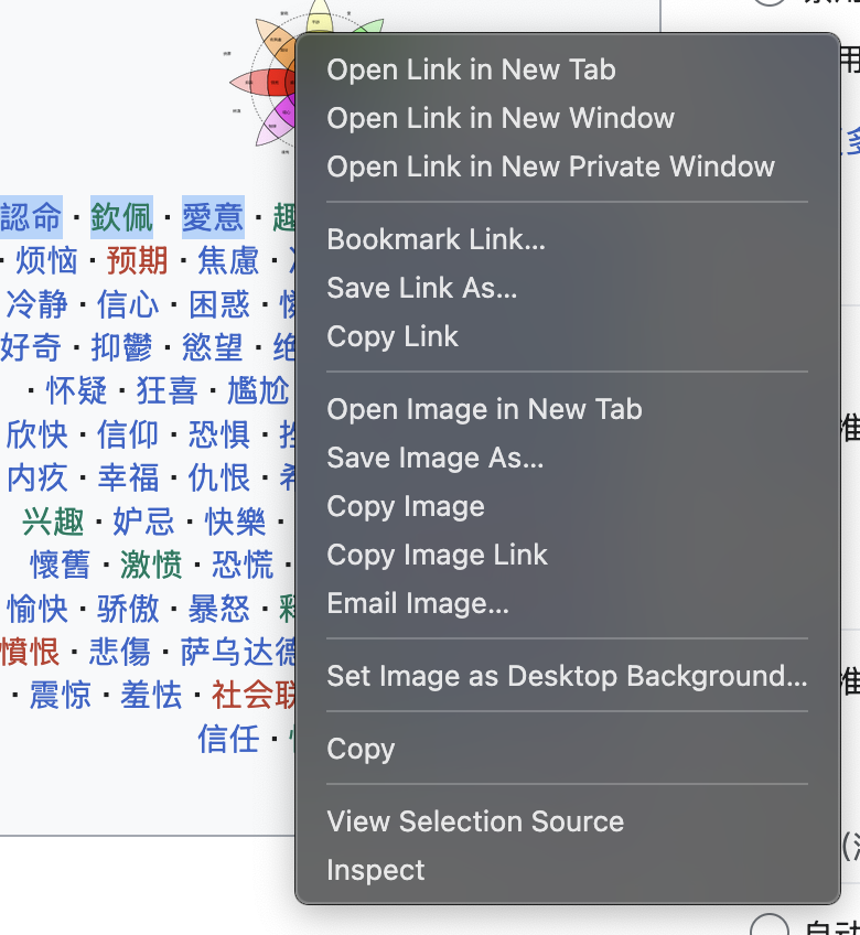
| Firefox right-clicking, after disabling everything above |
Great, much better, we’re down from 26 buttons to just 15. Here’s what it looks like when you right-click on a page and when you right-click a link:
![]() |
![]() |
|---|---|
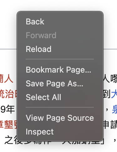
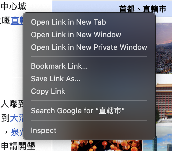
| Right-clicking on a page | Right-clicking on a link |
We still have the following useless buttons though:
Why do all of the above have ...? No clue (edit: according to this, “it means that more information is required to complete the task (e.g. requesting the filename for saving a file)”. But the real bad news is that we can’t get rid of these things by simply toggling some option in about:config.
We also have these when we right-click in a form:
![]() |
|---|
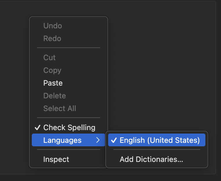
| Right-clicking in a form |
Despite the browser only being used in one language, there is no way to get rid of the “Languages” menu there. It’s possible to get rid of “Check Spelling” by completely disabling spellcheck, but that’s a useful feature for me, so I don’t.
Those remaining useless buttons can only be removed by creating a custom userChrome.css. I’ll cover how to do that in my next post.
For what it’s worth, it is nice that these buttons can be enabled/disabled, and userChrome.css is cool. But at the same time, imagine being a completely new Firefox user, who has zero use for any of this? How are they supposed to figure out how to do all of this? It took me a significant amount of time to find those settings to disable (and some of them are hacks, like disabling print.enabled). Maybe Firefox should implement something similar to their “Customize Toolbar”, which makes it easy to plug & play each of the right-click buttons. “PRs welcome” as they say, I suppose.
So there's a lot of noise and resetting things can be unclear. Especially given that when you reinstall things not all uninstalls clear out settings. It could definitely help if the about:config page tells you about the user.js file and directs you to more information. Why doesn't editing things in about:config generate the user.js file? Maybe tell people about prefer.js and where it exists?
The other thing I'd suggest, documentation. Like what is "browser.translations.chaos.errors"? There's a million things like that that are hard to learn about and explore. In an ideal system there would be a wiki with every option documented and when hovering over the option you'd get a short explanation and a click is a link to the documentation. But that's also a big undertaking (if you're building a new browser, would be nice to do this from the get go!)
I don't think there's a perfect solution and certainly these things are not easy to implement, but if you're asking how it could be easier for the user, then yeah, I think these things would be major improvements and help prevent the blindly following of random blog posts and copy pasting of things like betterfox (I'm sure it is, but how do I know?)
From the Apple Human Interface Guidelines, published in 1986: "The application dims an item when the user can't choose it. If the user moves the pointer over a dimmed item, that item isn't highlighted."
There may well have been prior art, but that's as far back as my knowledge goes.
Just two of the things Microsoft copied successfully. :)
Mine also isn't anywhere nearly as confusing as his by default, so this smells like a power-user-has-power-user-problems-and-solutions rant...
With today’s wide screens, a vertical menu bar at the side would perhaps make more sense than the usual one at the top, though, similar to vertical tabs.
I don’t see a future VR world other than for casual use, because keyboard and mouse/trackpad will remain the highest-bandwidth way to interact with a computer.
px is the CSS unit, device pixels aren't.
Also a few of the menu items are new since the latest ESR (the AI stuff in particular), so you won't see them if you are running v140.
Part of the discoverability of menus is learning what actions are modal (titles have the ellipsis) and learning what hotkeys and key chords do what in the app. There's nothing faster than hotkeys. Ideally, users train themselves to use hotkeys to get work done and forego the menu except to discover additional features.
You can run the following and try it for yourself. Don't forget to highlight some text before right-clicking an image (e.g. https://en.wikipedia.org/wiki/The_World_Factbook)
TMPPROF="$(mktemp -d /tmp/ff-tmp.XXXXXX)"
/Applications/Firefox.app/Contents/MacOS/firefox -no-remote -profile "$TMPPROF"That's what NeXTSTEP did for application menus, along with right-click context menus (which MacOS X did keep).
Yes, please. Bring back the NeXTSTEP menus for desktops! But on laptops, it's still pretty common for almost all windows to be full screen most of the time, so having the menu bar at the top of the screen is still the best choice for that environment.
That gap between what's best on a laptop and what's best on a desktop with large or multiple displays has been growing since desktop displays broke free of the 1080p but they were stuck in. But I don't think it's anywhere close to wide enough that Apple or Microsoft would be willing to implement different UI paradigms. It's hard enough getting them to understand that tablets and laptops need different UIs.
Putting the chat or sidebar in the core of the browser sounds very much like something done by a developer who wasn't around for Mozilla prior to Firefox, and isn't aware of the original goal of being the antithesis of the browser that included everything and the kitchen sink.
(usually attributed to Bruce Tognazzini)