As an exec sitting there frustrated by the slow pace of software development, at least you can always yell at the UI guy and demand changes that your gut tells you "look cool", and you can be an active, though uninformed particpant in sessions with design mockups.
Car UIs are a great case in point. People have been yelling for years at the poor usability of touchscreens in cars as opposed to discrete buttons/controls. Yet the enshittification of car UIs continues unchecked. My ioniq 5 has multiple touch panels and buttons, yet something as simple as directing air flow to the dash vents requires me to prod at a tiny touch area and look at a separate tiny display area well away from the touch control to see what I managed to select. It is 10 times worse than an old school rotary dial that I could operate instantly by touch alone. My workaround now is to prod the control, wait for 5 seconds to see if I feel air start flowing, and if not, prod the control and wait again.
Peak usability of most computer UIs was back in the 90s when simple (to use) but deep and powerful hierarchical menus were uniformly placed at the top of the page, and right clicking on objects in the UI opened context-sensitive popup hierarchical menus.
For cars it was in the 2000s before touch screens.
In the example, we have a sidebar for the formatting in the newer example vs havign that in the toolbar in Lion. Was it that back then, people were more likely to configure fonts & formatting settings, and we've gradually as a society de-emphasized our formatting in word processing? Or did UI changes such as this, hiding formatting options push us towards a world where we care less about formatting? I'd like to think it's a bit of both; as the user-based broadened, you had less percentage-based people that cared so heavily about formatting, so UI changes were made to optimize for that, further pushing people in that direction.
On a different note, I want to call out just how badly the sidebar is laid out compared to the toolbar. In the Lion toolbar, there were unlabeled sections but it was pretty clear what the purpose of each group was. Then you have the sidebar, where labels are added in some places, excessive space given where uneccesary, tabs that are sectioned off from the settings they'll show/hide, collapsible sections that can also be shown/hidden, some dropdowns using up/down caret while others just use the down caret, most dropdown carets being right-aligned but not the gear one, and in the liquid glass versions, the overlay of toolbar buttons over the sidebar creating confusion.
I need contrast in order to differentiate content. I need contrast on buttons to know where to click and what is clickable. I don’t need to depend on muscle memory. On Catalina it was automatic. Chrome in moderation is not bad.
Now the visibility of the liquid glass stuff, that is definitely a problem. Can't recognize a UI element if it's constantly rendered differently and with very little contrast with the background elements.
Well, I guess someone is going to vibecode a decent Linux GUI or fix the driver pains there or something and we'll be free of this. Because Microsoft/Apple and to a lesser extent Google have jumped the shark with their UI these days.
Pretty sad state of affairs. Software isn’t build for usability but purely for whatever designers find fashionable at the time.
This is pushing AI down my throat (+ privacy, but IMO Apple is at least okay-ish in this regard) is my main reason why my next laptop will not run macOS. Maybe Asahi Linux will finally support Thunderbolt, but maybe I'll just switch to a Framework. I'm just happy that I stayed on 15.7.5 until now. As soon as this gets no updates anymore, I'm gone.
I really REALLY love the Lion icons. Colorful but subdued with only mild saturation, distinctive shapes, strong line borders with very slight halo, and mild gradients to make them pop.
I can guarantee you they have done no such research. This redesign is a clear top-down imposition to make the visual language uniform and match some lead designer’s specs, not to actually make anything more useful or usable.
In subsequent examples the controls have made less space for content and obscured it. And takes up space with less-often used things like line spacing and and drop caps. Feels like I'm being told that up is down.
And the smudgy liquid glass effect just makes everything look grubby. Not classy.
Arguing aesthetics is pretty pointless (it’s a decided question to me: my taste is great; most others have very poor taste).
What bothers me about Tahoe are all the sloppy bits, like things you can no longer click or scroll to. We’re on 26.3.1 now and it looks/works like 1.0.
They blur together. I can't see which is document and which is chrome. This is the article's point, but... how can Apple be saying what they have, when I feel that since Big Sur at least it's not only perceptively but arguably objectively not true?
NNGroup has written about this trend: https://www.nngroup.com/articles/content-chrome-ratio/
And then just above is a bunch more ovals and circles. The sidebar button is an oval, the back/forward buttons are in an oval, the Wipr extension icon is in an oval, the URL bar is an oblong over, etc. And (at least in light mode) this is all white ovals on a white background. It all looks so amateurish.
I'm so glad that Hack Alan Dye is gone and I pray to God that Stephen Lamay can get us back to reason. I doubt they'll do an overnight Cmd+Z update in macOS 28 or whatever, but perhaps he can direct Liquid Glass in a direction that isn't just rounding things for the sake of it.
The sidebar for formatting they added is strictly worse than the inspector UI in old Pages ’09. The sidebar is constrained not to overlap with content, but the user can choose to overlap the inspector. It’s strictly better flexibility for users. If you are doing a lot of fine adjustments to a single text box, then of course it’s fewer mouse movement if the inspector is located right next to the text box, despite that it has obscured other irrelevant text boxes. I dearly miss Pages ’09.
I'm still on macOS Sonoma 14 and iOS 18
What really matters is not how the screenshots look, but how easy it is to use the software in action, with low error rate and without having to spend more than a fraction of a second finding the controls you need.
But we're making the UI gEt OuT oF tHe WaY .
Liquid Glass also makes more sense on tablets. I think Apple is copying Microsoft because Apple is also moving toward full UI-level unification between their desktop mouse-and-keyboard UI and their mobile/tablet touchscreen UI. They've already done it for some apps (e.g. Notes.)
From a commercial point of view branding and how it looks is more important. People buy what looks simple - they are not going to spend time trying something out to asses what is simple.
What puzzles me is that information like this is out there. How did Apple get it so wrong?
I am hopeful for the new UX VP. He has his work cut out for him.
The formatting bar was an (IMO unnecessary) option added in iWork 08.
With iWork 2016, they took the existing inspector panel setup and docked it into each window.
Anyway, we know people read symbols by shape/lines/pattern just fine without color because that's how reading works.
> What really matters is not how the screenshots look, but how easy it is to use the software in action, with low error rate and without having to spend more than a fraction of a second finding the controls you need.
Indeed. Which is why this article is mostly blowing wind.
One of so many reasons why I love mpv so much. Fine control via keyboard, allows turning off all the UI elements. Always a pleasure to use. I hate having to use any other media player.
I do wonder if we'll see the pendulum swing the other direction. We used to have UX designers that actually studied users and how best to mold the interface to them. I think now is the best time ever to get into UX design and make your mark by showing the world that software doesn't _have_ to be flat, lifeless, and radiused to hell and back in order to be great.
Liquid Glass does have some good points, but it feels like someone turned in C- level work.
Remember also the "Get a Mac" ads that parodied Windows Vista permission dialogs, but now macOS is a permission dialog hell.
Tim Cook was an IBMer. I'm sure that Cook was a fine hire as an operations manager, but I doubt that Steve Jobs intended for someone like Cook to be in charge of everything at Apple, including UI design. (Jobs never put Jony Ive in charge of software, by the way, whereas Cook did.) Indeed, I doubt that Jobs groomed anyone to be his successor. By the time Jobs learned he had a fatal illness, it was too late, and he had to turn over the company to someone the board of directors would accept, which was Cook. Jobs was CEO but didn't own the company; infamously, the Apple board of directors chose John Sculley over Jobs in an earlier power struggle.
Let liquid glass be your red pill - come join us in the real.
I love Liquid Glass - the blur and refractive effects are so pretty and technically impressive - but it should be used tastefully instead of this nonsense. I feel like Tahoe in general is straying way, way too far from the battle-tested Cocoa foundation and into this total top-down crap. Liquid Glass feels like some sort of shareholder-enforced enshittification.
macOS is supposed to be defined from the bottom up; it always has been. There has always been importance in having a solid base; a robust foundation for developers to build on. HIG, Cocoa, CoreGraphics, all of that is in service of this. The user experience and vertical integration is a result of this and couldn't exist without it.
There's so much wrong with Tahoe that goes against everything Mac has ever been. We don't want to dumb down the interface; that has never been the goal. The goal has always been to make the interface intuitive enough that anyone can learn it. macOS and iOS are fundamentally different platforms with fundamentally different design constraints and considerations.
Icons being able to escape the squircle was supposed to be a reflection of the fact that apps on Mac are less contained than apps on iOS. They have more expressive power and more advanced capabilities. You're working closer to the metal and in a less controlled environment. Because of that, you can do more and you're not constrained to the flows of the system.
iOS always hasn't been this. The constraints of touch are different than the constraints of the desktop. Steve Jobs spoke about this a lot back in his day, about why iOS is so much more locked-down than Mac.
But Mac has always been a platform for freedom and control. And Tahoe strips the soul of that.
[1] https://www.macrumors.com/2026/03/08/apple-planning-macbook-...
Apple copying Microsoft is a mistake. It used to be the other way around.
I actually really did like Windows Phones though. I can imagine a world with a third competitor in that space today... But MS didn't seem to have any understanding or ability to develop an ecosystem that works. Even when they were literally paying people to write apps for their app store, it was just terrible.
It had a glassy aesthetic but the similarity doesn't go much further than that description. They didn't make all the buttons into glass blobs floating on top of the content with distracting warping effects; the window chrome was still generally separated from the content.
Yeah but why? Is it just a design trend? Is it just fashion? Or is there some underlying reason why it went this way?
When Cook took over, he was unequivocally the only choice. He steered the company in his own direction, with a focus on operational health to the detriment of other things. He kind of lost the plot somewhere in there and has been spinning his wheels for a while. That's not what I'm contesting. It's your idea that Jobs didn't want Cook. Jobs loved Cook.
They just need to get back into the mindset that design is how it works. Not forcing some aesthetic into everything with the superficial idea of "focusing on content" as a backwards justification for making everything transparent cause someone thought it was prettier.
What's a good calendar app on Linux?
What's a good e-mail client?
What's a good photo and image editor?
I'd rather Linux developed an identity of its own. I feel like keyboard driven tiled windows are the closest it has to that.
I think Liquid Glass looks good.
My impress has always been the opposite: MacOS is "opinionated", and the user can either accept the Apple way of doing UI or can take a hike.
MacOS has offered token customization, such as allowing the user to change the color of menu bar highlights, but any substantive change required 3rd party intervention, which would inevitably cease to function at the next upgrade.
These days the OS is even more locked down, making it all but impossible to modify OS files.
The cross platform scene is much different these days. Electron apps suck, but at least they suck equally across all platforms. And there are many Electron apps.
But a lot of people rely on Adobe, Microsoft or Windows-only, Mac-only apps. I don’t see that changing anytime soon, unfortunately.
I don’t like it either, but I wonder if that’s to support the touch-enabled Macs that the rumor mill is reporting about right now.
In any case, Tahoe has many other issues beyond padding.
Any time Jobs had to step aside from the CEO position temporarily, Cook took over immediately. Metaphorically speaking, Cook kept the trains running on time. Cook did not set or change the direction of the company at the time, and Jobs was still available for consultation.
Sick is not the same as dying. Jobs initially didn't think he was dying, and tried to treat his illness with some hippie-dippie "alternative" medicine, when aggressive treatment might have saved his life.
> He was Jobs' designated successor for a decade when he learned he was sick.
Citation needed.
> Jobs loved Cook.
In what way? According to biographer Walter Isaacson, Jobs lamented that Cook was "not a product person".
Linux is for people who want to get rid of "they". If "they" start screwing things up, you switch to a different "they". Alternatively, you become "they" by forking the project.
AI is making handling the edge cases that kept people locked in almost trivial. Any workflow, custom spreadsheet, specific OS-only app can be worked around, easily. Staying stuck on Apple or Microsoft is a choice - they're no longer returning value concurrent with the money they charge.
You're free to continue giving them money, but the reasons to do so make less and less sense each day that goes by.
This doesn't make sense for the vast majority of people.
Linux desktop doesn't have the vast majority of the niceties that living in the Apple ecosystem gives you. If I was going to rebuild any one of them for Linux, it would easily become a major project that would suck up all my free time.
Do most people want to get through that research? Absolutely no, I don't expect many people to follow me into that rabbit hole. They can get the default or Windows or a Mac, no problem with that.
Inkscape is not an option, nor is anything involving importing PDF/SVG, those have to expand a huge ton of stuff that's represented much more compactly in an .AI file. It's about as large a difference as that between an executable file and its source code.
There’s nothing that comes even close to Photoshop. Same for a lot of similar professional tools.
> AI is making handling the edge cases that kept people locked in almost trivial
Not for anything remotely complex. Let’s see how that looks in 5 years, but I’m skeptical.
What's the AI workaround for Illustrator/After Effects/etc.? You're not suggesting generating vector art or video assets via LLM replaces these, surely?
Inkscape, Affinity, other open source alternatives exist, but have a remarkably different UI and don't capitalize on your muscle memory.
The feature overlap is bordering on complete, but there are some Adobe Illustrator only perks, for sure. Most of it you can make up for with any of the frontier image AI models.
There are plugins - if you're well versed in how they work, converting between AI and vectorpea should also be a piece of cake with AI.
I've converted over a dozen weird edge cases of spreadsheets and access apps and ancient scripts used by departments into standalone little apps or browser apps, ranging from budget and finance related bookkeeping to tracking sales to licensing management. The only advantage Excel has over this is ease of maintenance - it's a lot easier for someone to guide themselves through updating things on a spreadsheet, or to break an idea down into multiple pages, etc, if spreadsheets are what they're familiar with.
If you're an engineering or finance firm dependent on an obscure, unique Excel feature, I could at least see the argument that your use case is too hard to migrate off of Windows.
https://techdocs.broadcom.com/us/en/vmware-cis/desktop-hyper...
It seems like they removed it from VMware 17.6, but maybe another VMM still has this functionality?
In a WWDC 2011 session, Dan Schimpf explained some of the goals of the refreshed design for Aqua in Mac OS X Lion were “meant to focus the user attention on the active window content”. This sentiment was echoed by John Siracusa in his review of Lion for Ars Technica:
Apple says that its goal with the Lion user interface was to highlight content by de-emphasizing the surrounding user interface elements.
When Apple redesigned Mac OS X again in 2014 with Yosemite, it promised…
[…] a fresh modern look where controls are clearer, smarter and easier to understand, and streamlined toolbars put the focus on your content without compromising functionality.
Then, when it revealed the Big Sur redesign in 2020, it explained:
The entire experience feels more focused, fresh, and familiar, reducing visual complexity and bringing users’ content front and centre.
And you will never guess what it promised in 2025 with the announcement of MacOS Tahoe and Liquid Glass, as introduced by Alan Dye:
Our goal is a beautiful new design that brings joy and delight to every user experience. One that’s more personal, and puts greater focus on your content — all while still feeling instantly familiar.
It is not just Apple, either. Here is Microsoft’s Jensen Harris at Build 2011 describing a key goal for the company’s then-new Metro design language:
Metro-style apps have room to breathe. They’re not about the chrome, they’re about the content. […] For years, Windows was always about adding stuff. We added bars, and panes, and doodads, and widgets, and gadgets, and bars — and stuff everywhere. And that’s how we defined our U.I., based on what new widgets we added. Now, we’ve receded into the background, and the app is sitting out there on the stage.
And later, as Microsoft rolled out app updates with its Fluent Design language, it described them in familiar terms:
With the updated OneDrive, your content takes center stage. The improved visual design reduces clutter and distractions, allowing you to focus on what’s important – your content.
This is a laudable goal if the opposite is, I assume, increasing the amount of clutter in user interfaces and making them more distracting. Nobody wants that. Then again, while the objective may be quite reasonable, there are surely different ways of achieving it — but Apple has embraced a single strategy: make the interface blend into the document. (I will be focusing on MacOS here as it is the platform I am most familiar with.)
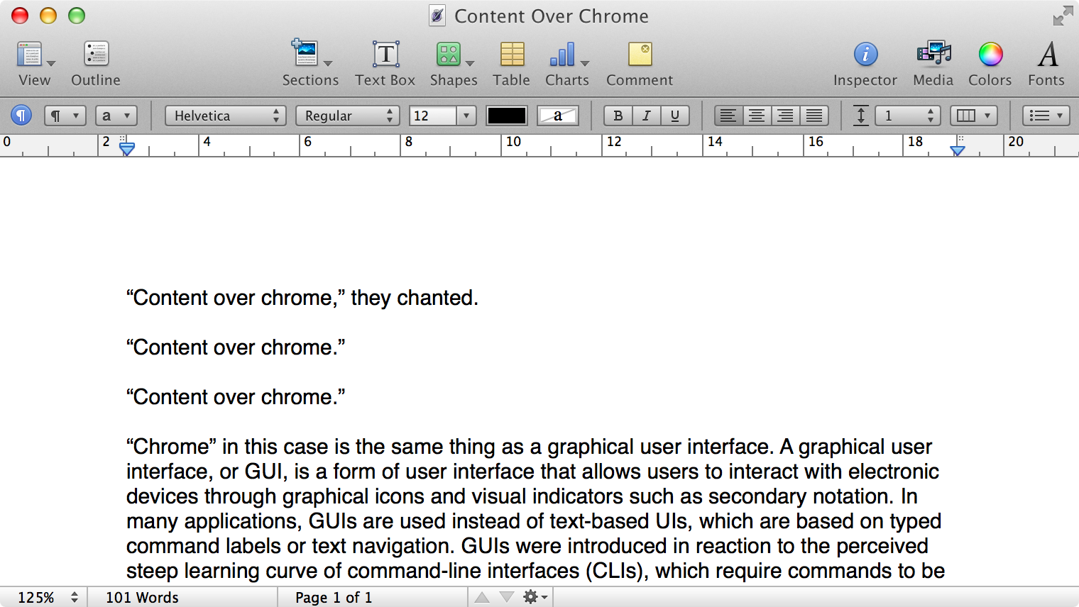
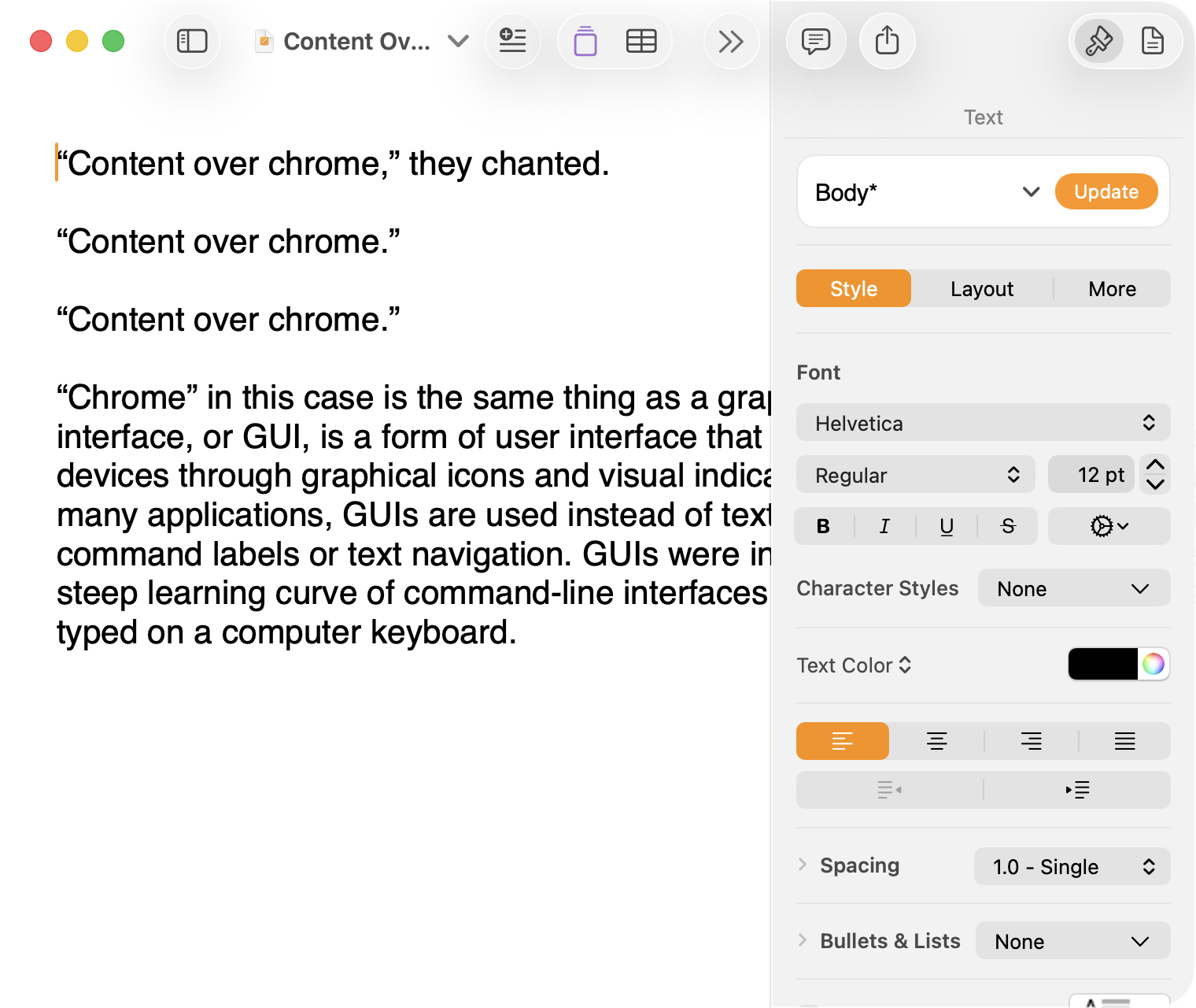
Here is what a Pages document looks like running under Mac OS X Lion:
Click to expand (except on mobile).
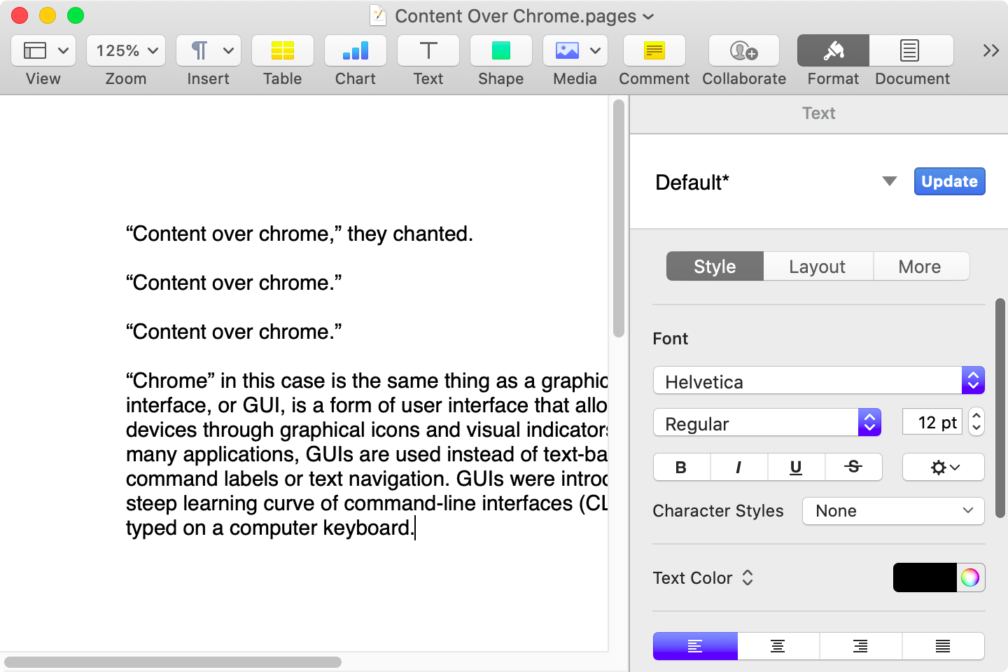
Here is that same document in a newer version of Pages running on MacOS Catalina, with the Yosemite-era design language that replaced the one that came before:
Click to expand (except on mobile).
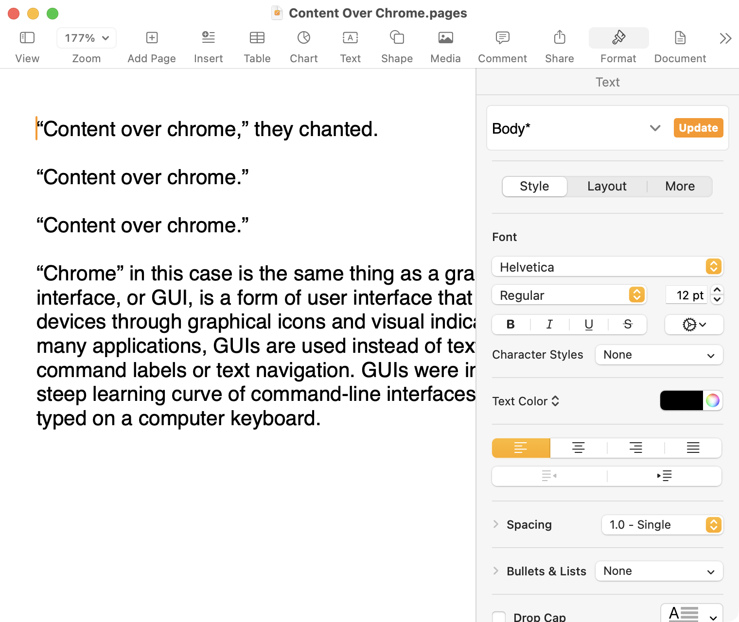
Here it is in the last version of Pages on MacOS Tahoe, using the design language introduced with Big Sur:
Click to expand (except on mobile).
And, finally, the newest version of Pages on MacOS Tahoe using the current Liquid Glass visual design language:
Click to expand (except on mobile).
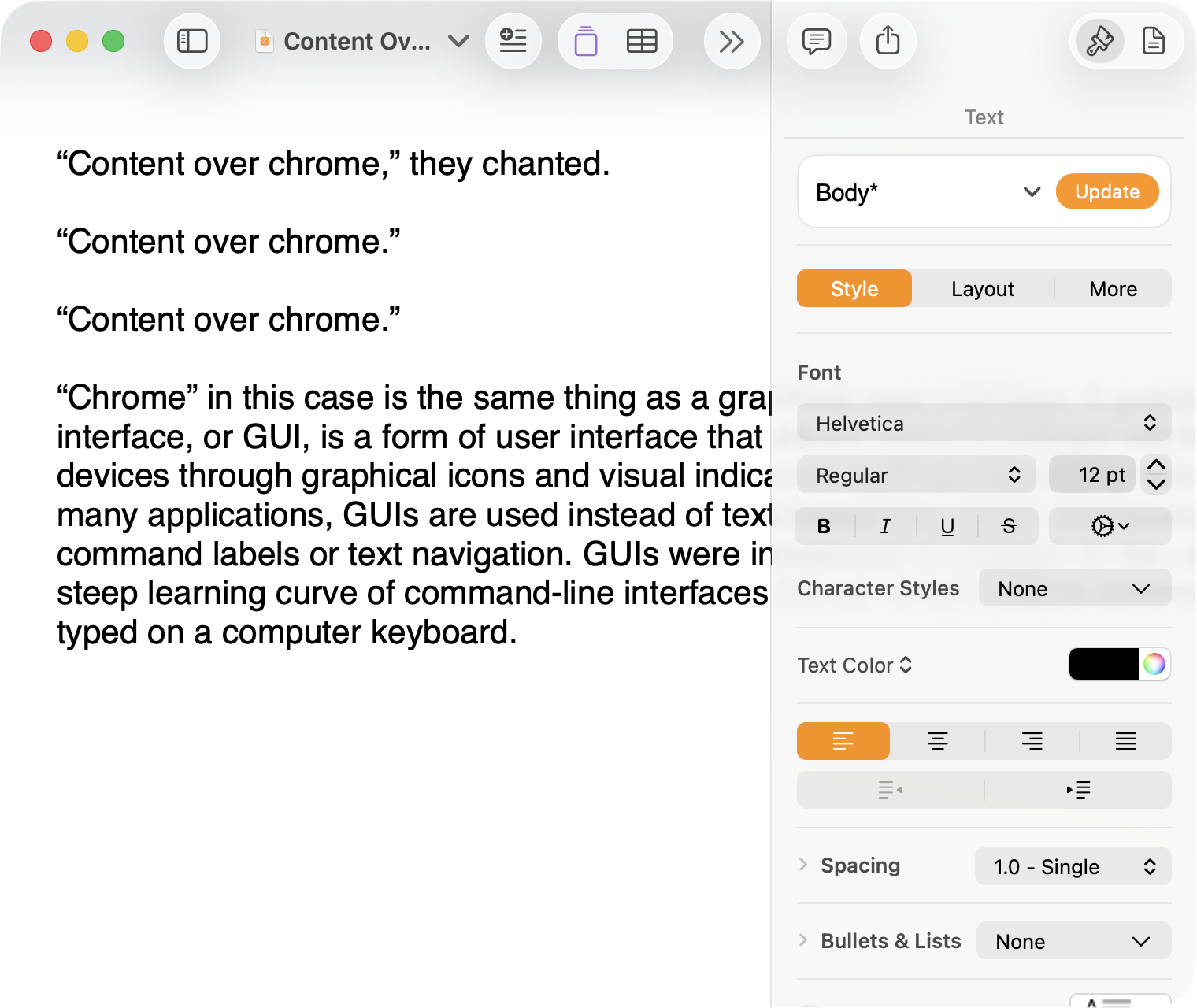
There are welcome improvements in newer versions of this comparison, like the introduction of the “Format” panel on the right-hand side, which makes better use of widescreen landscape-oriented displays, and allows for larger controls. While I admire the density of the Lion-era screenshot, the mini-sized controls in that formatting menu are harder to click.1
Overall, however, what Apple has done to Pages over this period of time is representative of a broader trend of minimizing the delineation of user interface elements from each other and the document itself. This is the only tool in the toolbox, and I am skeptical it achieves what Apple intends.
Compare again the two more recent screenshots against the ones that came before, and focus on the toolbar at the top of each. In the older two, there is a well-defined separation between the toolbar — the window itself — and the document. In the Big Sur visual language, however, the toolbar is the same bright white as the document. By Tahoe and the Liquid Glass language, there is barely a distinction; the buttons simply float over the document. And, bizarrely, that degrades further with the “Reduce Transparency” accessibility preference enabled:
Click to expand (except on mobile).
(Also, no, your eyes do not deceive you: the icons in the drop cap menu, barely visible in the lower-right, are indeed pixellated.)
For me, this means a constant distraction from my document because the whole window has a similar visual language. As the toolbar and its buttons become one with the document, they lose their ability to fade into the background. In the two older examples, the contrast of the well-defined toolbar allows me to treat them as an entirely separate thing I do not need to pay attention to.
This is further justified by the lower contrast within those two older toolbars. In Lion, the grey background and moderately saturated colours are a quiet reminder of tools that are available without them being intrusive. The mix of shapes is a sufficient differentiator, something Apple threw away in the following screenshot. By making all the buttons literal and with the same bright background, the toolbar becomes a little more distracting — but at least it does not blend into the document. Without the context of the previous screenshot, the colours of each icon seem almost random, and I find the yellow-on-white “Table” button difficult to distinguish at a glance from the black-on-yellow-on-white “Comment” button.
The Big Sur-era design language is, frankly, an atrocious regression. The heterogeneous shapes may have returned, but in the form of monochromatic medium-grey icons set against a uniform white background. The icons are not bad, per se — though putting “Add Page” and “Insert” next to each other in this default toolbar layout, both represented by a plus sign, is a little confusing. But I will bet you would not guess that some of these are buttons, while others are pop-up buttons with a submenu.
Finally, there is Liquid Glass which, in its default form, has more contrast than the previous example; with “Reduce Transparency” enabled, which is how I use MacOS, it has even less. The buttons themselves have a greater amount of internal contrast with bigger, darker grey icons on a white background. This is preferential within the context of the toolbar compared to the thin, small, and low-contrast buttons in the past example, but it also means this toolbar has similar contrast to the document itself.
I would not go so far as to argue that Pages ’09 has a perfect user interface and that everything since has been a regression. The average colours used for the icon fill in both older toolbars generally fails accessibility contrast checks which, remarkably, the Big Sur design will pass. The icons in Pages ’09 rely on dark outlines and unique shapes to have sufficient contrast with the toolbar background. However, Apple has since discarded most variables it could change to design these interfaces. Every button contains an icon of a single uniform colour, within barely defined holding containers of the same shape, and without text labels by default.
This monochromatic look means any splash of colour is distracting. The yellow accent used in Pages is garish — though, thankfully, something that can mostly be mitigated by changing the Theme Colour in System Settings, under Appearance. (Unfortunately, the yellow background remains on the “Update” button in the most recent version of Pages regardless of the system accent colour.) But perhaps you also noticed the purple icon in the Liquid Glass screenshot above. Here is the full toolbar:
Click to expand (except on mobile).
Those purple icons signify features that are part of Apple Creator Studio, a paid subscription to Pages and other applications that allows you to — in the order they are presented above — generate an image, artificially boost the resolution of an image, and access a stock image library. If you would like to insert one of your own images into your Pages document, that feature has been moved to the paperclip icon. Yes, it is a menu and not a button, despite lacking the disclosure triangle of the zoom menu right beside it, and it also reminds you about the “Content Hub” and “Generate Image” features. In Pages under Lion, colour was used in the icons to help guide the user as they complete a task — click the green thing to add a shape; click the darker yellow thing to add a table. Colour is not being used in the newer version to signify these are A.I. features, as the “Writing Tools” icon remains dark grey. In this version, the coloured icons are there to guide the user to premium add-ons regardless of whether they are currently paying for them.
I decided to focus on Pages for this comparison because it has lived so many different lives in MacOS. However, it is perhaps an imperfect representation for the rest of the system. Across Mac OS X Lion, for example, the toolbars of first-party applications like Finder and Preview almost exclusively use monochromatic icons. This has been true since Mac OS X Leopard, which also introduced barely differentiated folder icons. Some toolbars in Tiger, introduced two years prior, featured icons inside uniform capsule shapes. These were questionable ideas at the time, but they still retained defining characteristics. The capsules, for example, may have had a uniform shape, but contained within were full-colour icons. Most importantly, they were all clearly controls that were differentiated from the document.
Perhaps Apple has some user studies that suggest otherwise, but I cannot see how dialling back the lines between interface and document is supposed to be beneficial for the user. It does not, in my use, result in less distraction while I am working in these apps. In fact, it often does the opposite. I do not think the prescription is rolling back to a decade-old design language. However, I think Apple should consider exploring the wealth of variables it can change to differentiate tools within toolbars, and to more clearly delineate window chrome from document.