System architecture diagrams are essential tools for documenting complex systems. However, common mistakes in these diagrams can lead to confusion, misinterpretation, and frustration for viewers. Here’s a rundown of seven (more!) common mistakes to avoid.
This is a follow-up to the original 7 Common Mistakes in Architecture Diagrams.
Mistake #1: Not including resource names
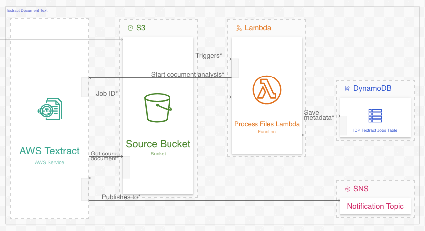
Poorly labeled resources (the entities between the lines) is a common problem in system diagramming. Consider the labels under the icons in this AWS diagram:
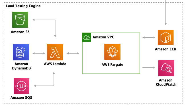
The resources in this diagram are labeled by type instead of by name. Source: amazon.com.
Each resource in the diagram has an icon labeled with its type but not its name. While the resource type is certainly valuable, one is not a substitute for the other:
Types describe what kind of thing a resource is. Types can include concrete items such as database tables or VM instances, or abstract items such as services. Types can be written out or represented as an icon.
Names disambiguate resources from other resources of the same type. Descriptive names can also reveal the resource’s role or purpose.
When space allows, viewers are best off knowing both the name and type of a resource. This can be as simple as adding a type suffix to a resource name (e.g. Orders Table, Results Bucket). Diagram icons/shapes typically indicate the type (as they do in the diagram above), so labeling a resource by name is especially preferable when an icon is present.
#2 Unconnected resources
Here is a simple one: resources in a diagram should always be somehow connected to the other resources. Including resources that are disconnected from all others is a mistake.
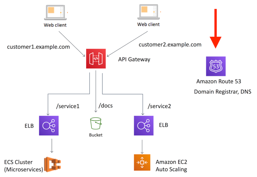
Amazon Route 53, on the right, is disconnected from every other resource. Source: amazon.com.
In the diagram above from this article, Amazon Route 53 (on the right) is unconnected to the other resources. Its role in the system is completely unclear. Diagrams like this exist to show relations between resources, so omitting those relations defeats the purpose of the diagram to begin with.
This issue arises when diagram authors know a resource is part of a system but can’t find a clean way to express it. It is often the result of trying to include too much information in a single diagram (usually a “master” diagram, see next item).
#3 Making a “master” diagram
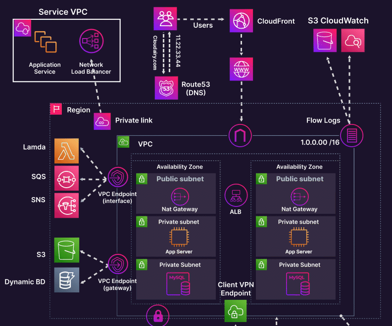
“Master” diagrams attempt to show an entire system at once. They stem from a misguided desire to “see it all” in a single diagram. They are almost always a mistake.
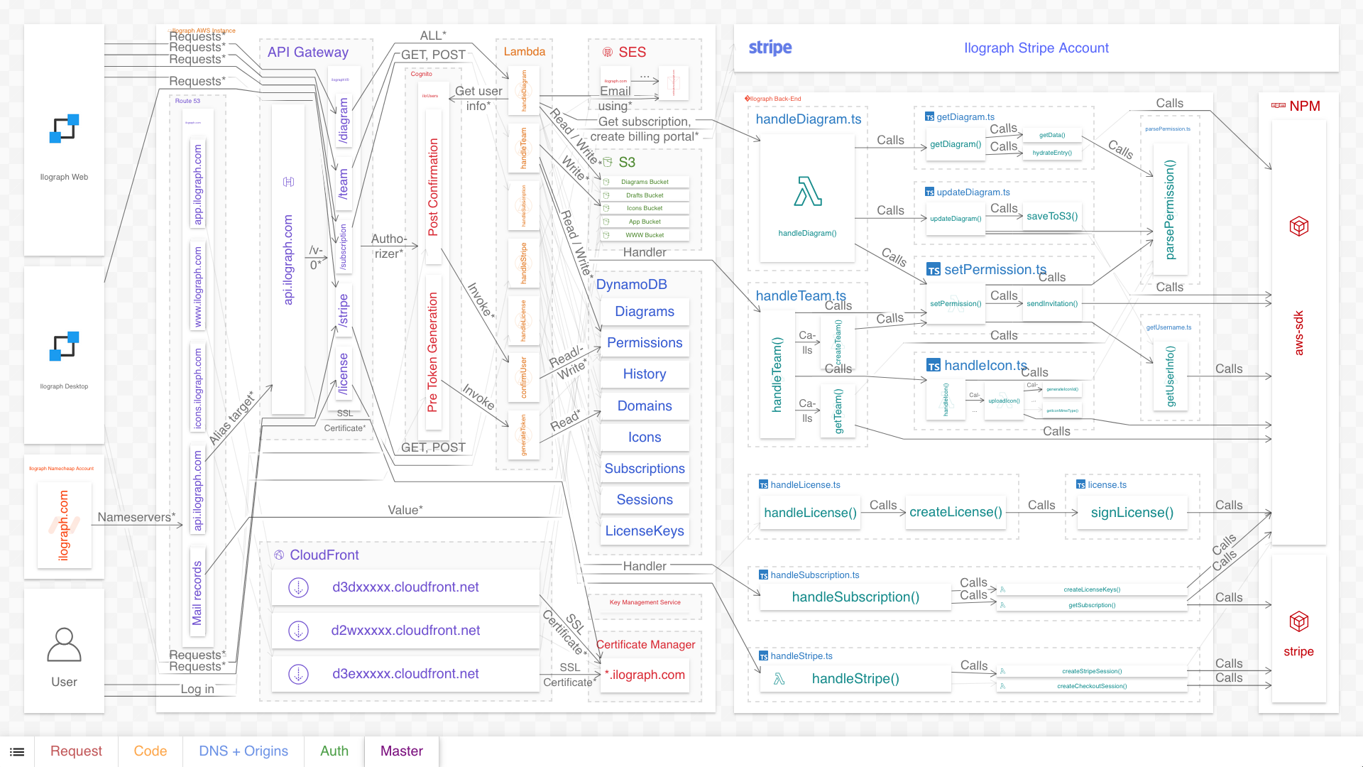
Ilograph's serverless back-end architecture (click to enlarge).
The above diagram is a “master” diagram of Ilograph’s back-end system architecture. It combines run-time dependencies, DNS configuration, CDN configuration, source code, and deployment-time dependencies, all in a single diagram. As it hopefully illustrates, including this much information in a single diagram will overwhelm the viewer.
The solution is to break up such a diagram into multiple perspectives (points of view):
The "master" diagram can be split up into multiple perspectives.
Most systems are complex enough to warrant breaking up their diagrams like this. Each perspective tells a cohesive story without interfering with the others.
If using model-based diagramming, perspectives can explicitly share resources among them to maintain their connections. For more details, see Breaking Up the Master Diagram.
#4 Conveyor belt syndrome
So far, the example diagrams in this article have all been relational diagrams, which show relations between resources. There is another class of system diagrams called behavioral diagrams, which aim to show specific interactions between resources rather than relations.
Because behavioral diagrams show specific interactions, they tend to be more detailed than relational diagrams. Diagram authors sometimes simplify these diagrams for space or time reasons; what I call conveyor belt syndrome occurs when they over-simplify them by omitting the realities of round-trips and orchestrations in the actual system. The result is a diagram that seriously misleads the viewer on the nature of the system.
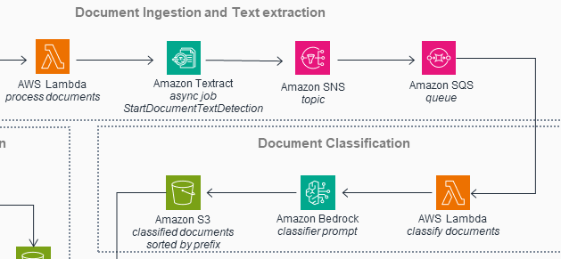
This diagram depicts the system as a conveyor belt. Source: amazon.com.
The diagram above (from this solution) depicts the system as an assembly line: data flows neatly from one resource to the next. It’s as if each resource takes input from its predecessor, augments that input, and then passes it along to the following resource.
Now, it’s true that sometimes this is what is happening in the system. But as a rule, this isn’t accurate; there is a lot more back-and-forth among these resources (and others not shown). Experienced developers may intuitively understand that there is more to the diagram than it shows, but the inexperienced will be severely misled.
The solution is to use a different kind of diagram entirely: sequence diagrams. Sequence diagrams (first specified in UML) are tailor-made to show detailed back-and-forth interactions between resources, like in the revised diagram below:
Depicting a portion of the same system as a sequence diagram.
Reformatting the diagram like this yields both greater detail and greater fidelity to the system it depicts. See this article for more information.
#5 Meaningless animations
This is an issue that is almost certainly witnessed much more often than it is committed. Diagrams with meaningless, distracting, and at times obnoxious animations have proliferated on social networks such as LinkedIn over the years. Here is a typical example:
The animations add no actual information to the diagram. Source: cloudairy.com.
Diagrams like these exist exclusively for marketing purposes, almost needless to say. They’re great at attracting attention, but offer little to no value as technical resources. In addition to being a distraction, the animated arrows in the diagram above are completely redundant. They indicate nothing more than the direction that the arrow already goes in. Almost needless to say (again), unless you are creating a diagram primarily for marketing, avoid unnecessary animations like these.
#6 Fan traps
Fan traps in system diagramming occur when relation information between resources is lost in intermediate resources. For example, in an event-based system diagram, the specific communications between edge resources are lost if they are collapsed in a shared message broker:

In system architecture diagramming, a fan-trap occurs when relations collapse onto a single resource.
Fan traps can be fixed by adding more specific resources (in this example, topics) inside the intermediate resources and re-routing the relations through these new resources. This restores the communication paths between the edge nodes:
The individual relations are now visible.
There are other ways to resolve fan traps when adding intermediate resources isn’t possible; see this article for examples.
#7 Assuming AI can create quality diagrams from source code
Artificial Intelligence can be useful when diagramming. When “whiteboarding”, that is, interactively specifying a system, AI can assist a human as they make iterative improvements and try out ideas. If an AI could automatically diagram a system directly from source code, that would be even better. Unfortunately, while AIs certainly can attempt this, the diagrams they generate are often vague, contain hallucinations, and exhibit many of the issues discussed above.
These problems stem from the challenges AIs face when creating diagrams of real-world systems from source code. These including an almost complete lack of training data, difficulties analyzing dense source code, and a general inability to strategically choose what to include and omit. As AIs improve this could change in the future; but for now, detailed system diagramming is still primarily a human endeavour.
Questions or comments? Please reach out to me on LinkedIn or by email at billy@ilograph.com.