Hello! This is a long, hopefully fun one! If you’re reading this in your email, you may need to click “expand” to read all the way to the end of this post. Thank you!
When I lived in Nashville, my girlfriends and I would take ourselves on “field trips” across the state. We once went on a tour to spot bald eagles in West Tennessee, and upon arrival, a woman with fluffy hair in the state park bathroom told us she had seen 113 bald eagles the day before. We ended up seeing (counts on one hand)…2.
In the summer of 2017, we went on another field trip to the National Park’s Manhattan Project Site in Oak Ridge, TN. In 1942, Oak Ridge, TN, was chosen as the site for a plutonium and uranium enrichment plant as part of the Manhattan Project, a top-secret WWII effort to develop the first atomic bomb. Once a small and rural farming community settled in the valley of East Tennessee, the swift task to create a nuclear bomb grew the secret settlement titled “Site X” from 3,000 people in 1942 to 75,000 by 1945. Alongside the population growth, enormously complex buildings were built.
A Note: The Manhattan Project created the nuclear bomb that caused extreme devastation in Japan and ended the war. There’s a lot of U.S. history that’s awful and indefensible. Today, though, I’d like to talk about the industrial design and color theory from that era.
The Tour
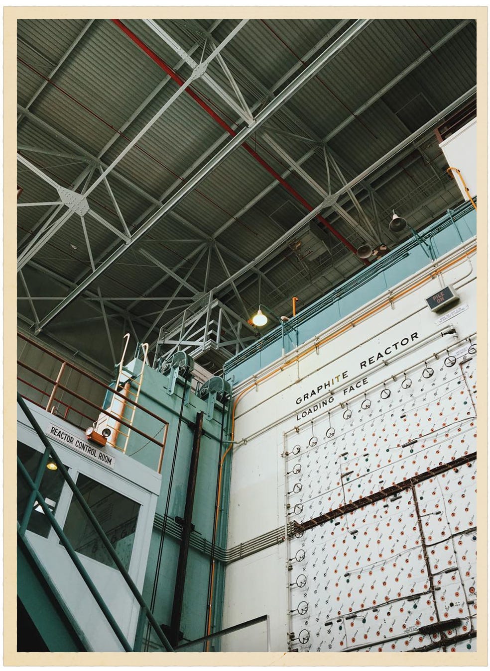
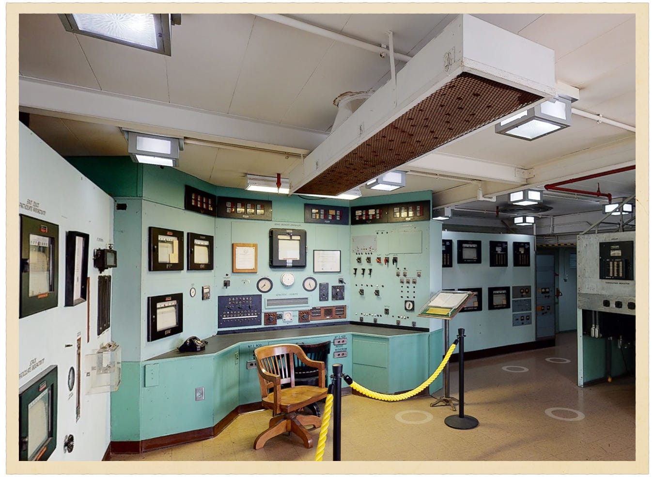
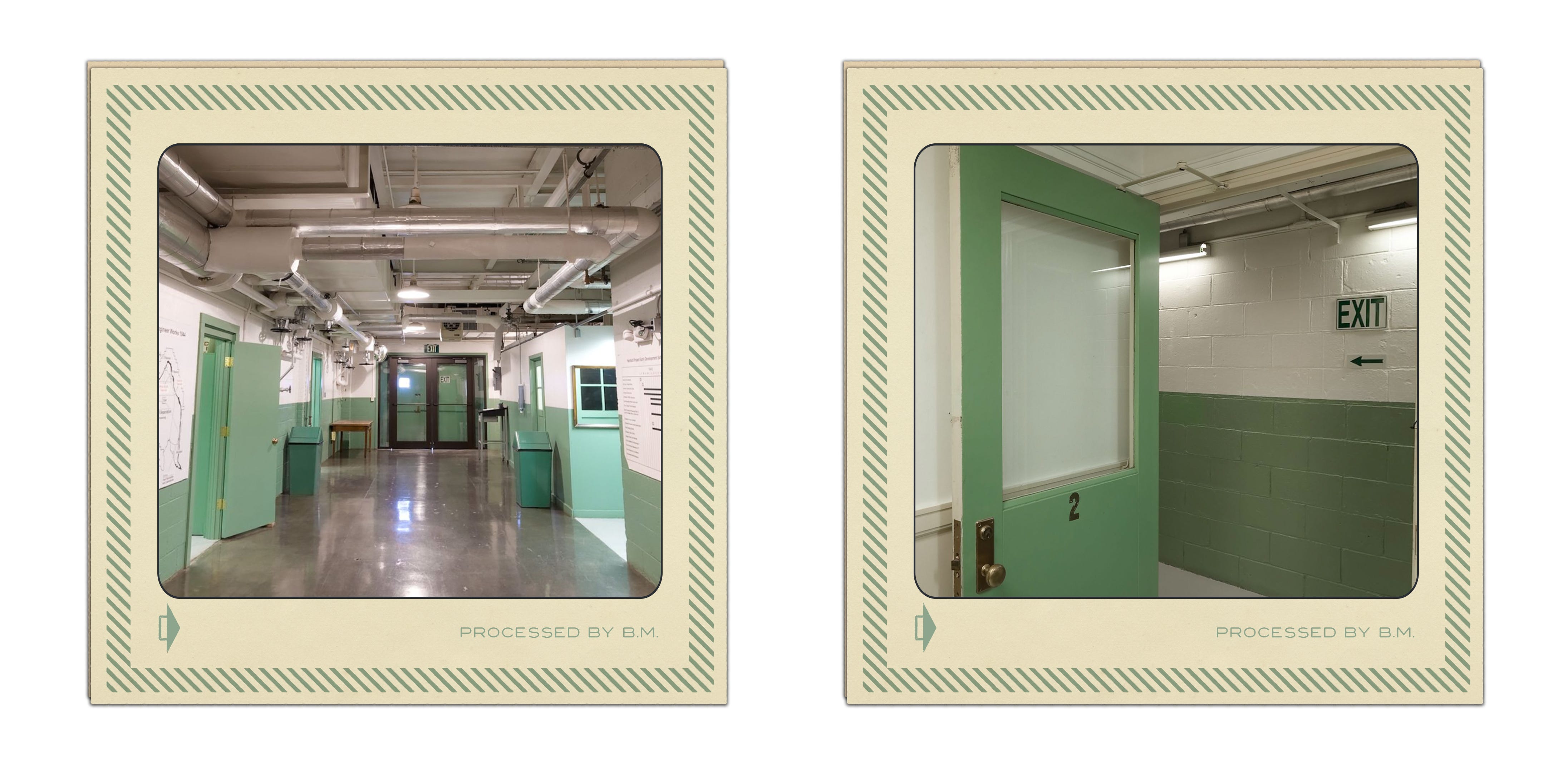
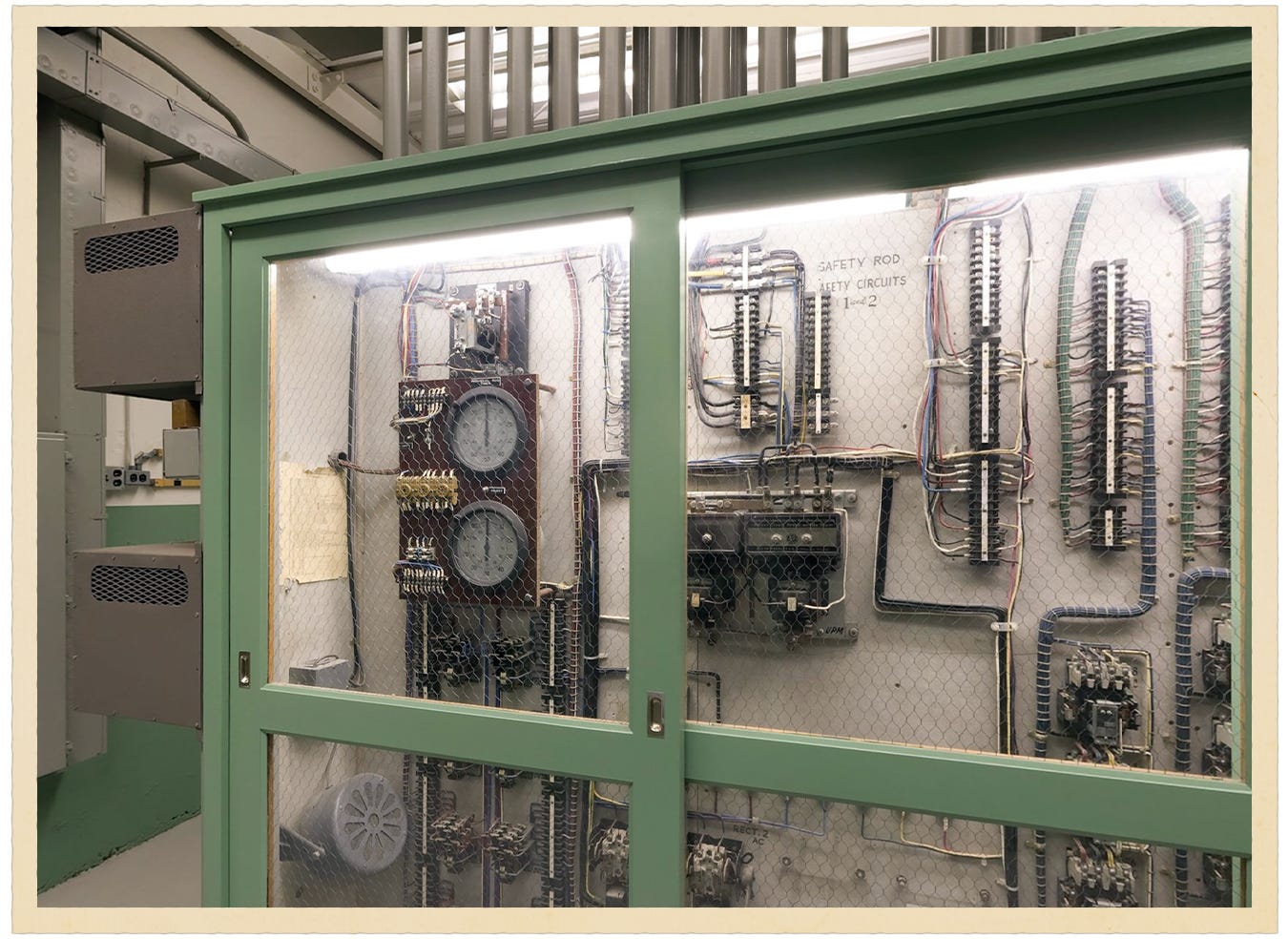
Our first stop on the tour was the X-10 Graphite Reactor room and its control panel room. The X-10 Graphite Reactor, a 24-foot-square block of graphite, was the world’s second full-scale nuclear reactor. The plutonium produced from uranium there was shipped to Los Alamos, New Mexico, for research into the atomic bomb Fat Man.
[
What caught my eye as a designer, as with most industrial plants and control rooms of that time, besides the knobs, levers, and buttons, was the use of a very specific seafoam green, seen here on the reactor’s walls and in the control panel room.
[
Thus began my day-long search, traipsing through the internet for historical information about this specific shade of seafoam green.
Thankfully, this path led me to the work of color theorist Faber Birren.
In the fall of 1919, Faber Birren entered the Art Institute at the University of Chicago, only to drop out in the spring of 1921 to commit himself to self-education in color, as such a program didn’t exist. He spent his days interviewing psychologists and physicists and conducted his own color studies, which were considered unconventional at the time. He painted his bedroom walls red vermillion to test if it would make him go mad.
In 1933, he moved to New York City and became a self-appointed color consultant, approaching major corporations to sell the idea that appropriate use of color could boost sales. He convinced a Chicago wholesale meat company that the company’s white walls made the meat unappealing. He studied the steaks on various colored backgrounds and determined that a blue/green background would make the beef appear redder. Sales went up, and soon a number of industries hired Faber to bring color theory into their work, including the leading chemical and wartime contract company, as well as the Manhattan Project building designer, DuPont.
[
![]()
Industrial Color Coding
With the increase in wartime production in the US during WWII, Birren and DuPont created a master color safety code for the industrial plant industry, with the aim of reducing accidents and increasing efficiency within plants. These color codes were approved by the National Safety Council in 1944 and are now internationally recognized, having been mandatory practice since 1948. The color coding went as such:
Fire Red: All fire protection, emergency stop buttons, and flammable liquids should be red
Solar Yellow: Signifies caution and physical hazards such as falling
Alert Orange: Hazardous parts of machinery
Safety Green: Indicates safety features such as first-aid equipment, emergency exits, and eyewash stations.
Caution Blue: Non-safety information, notices, or out-of-order signage
Light Green: Used on walls to reduce visual fatigue
My industrial “seafoam” light green mystery has finally been solved thanks to this article from UChicago Magazine.
[

The Hanford Site, B Reactor Control Room and Office
Keeping in theme with “control rooms”, I researched the second Manhattan Project plant, the Hanford Site, home to the B Reactor, the first full-scale plutonium production reactor in the world. To my surprise, this site looked like an ode to Birren’s light green and color codes, which makes sense, since his client, DuPont, was also responsible for the design and construction of Hanford.
In Birren’s 1963 book Color for Interiors: Historical and Modern, he writes about research undertaken to measure eye fatigue in the industrial workplace and the effects of interior color on human efficiency and well-being. Using the color chart above, he states that the proper use of color hues can reduce accidents, raise standards of machine maintenance, and improve labor morale.
“The importance of color in factories is first to control brightness in the general field of view for an efficient seeing condition. Interiors can then be conditioned for emotional pleasure and interest, using warm, cool, or luminois hues as working conditions suggest. Color should be functional and not merely decorative.” - Faber Birren
[

Hanford Site Interiors
Now, looking at the interiors of the Manhattan Project control rooms and plants, the broad use of Light and Medium Green makes sense. One mistake and mass devastation could have occurred within these towns. Birren writes, “Note that most of the standards are soft in tone. This is deliberate and intended to establish a non-distracting environment. Green is a restful and natural-looking color for average factory interiors. Light Green with Medium Green is suggested.”
[

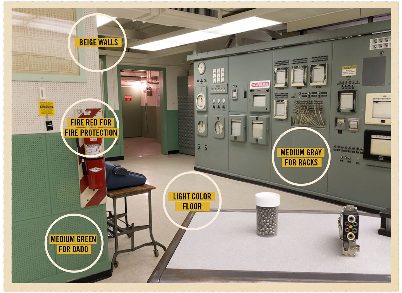
Testing the Color Theory
Let’s put these theories to work with this photo of the B-Reactor room found at the Hanford Site of the Manhattan Project. In Birren’s book, he directed the following color applications for small industrial areas:
✔️ Medium Green for a dado (lower part of wall, waist height)
✔️ Medium Gray is proposed for machinery, equipment, and racks
✔️ Fire Red is reserved exclusively for fire protection devices
✔️ Beige walls may be applied to interiors deprived of natural light
✔️ Light color floor
[
As we can see, his color theory was followed to a T.
Other US Industrial Plants that Used these Color Methods
This color theory research just opened a whole can of design worms for me, and I’m excited to dive into them more. For example, Germany developed its own seafoam green, specifically designed for bridges, called Cologne Bridge Green. That’s a post for another day.
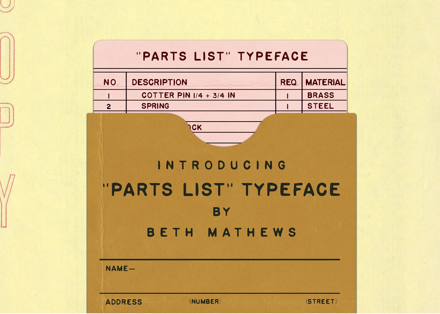
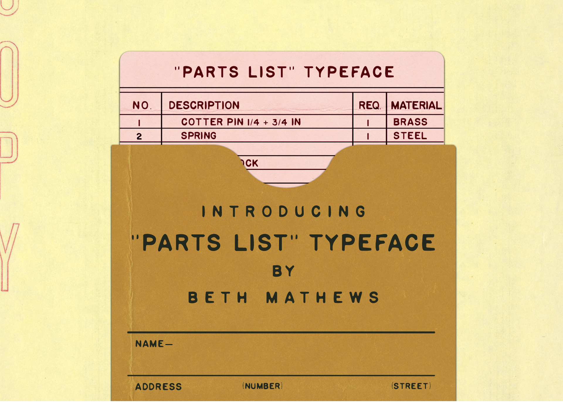
And finally, if you enjoy this sort of design, I designed a font called “Parts List” that is meant to evoke the feeling of sitting in an oil change waiting room, with the smell of burnt coffee. I created this font out of old auto parts lists, and it’s a perfectly wobbly typeface that will give you that ‘Is it a typewriter or handwriting?’ feeling. It’s now available on my website.
[
PS: I have an old friend whose dad still works at the Uranium plant in Oak Ridge. I told him that I was surprised that almost all of the facilities had been torn down, and he just looked at me straight in the face and said, “Who said it’s actually gone?” Noted. ✌️
Additional Eye Candy
Thanks for being here!
Love,
Beth