Custom Fonts For

A LETTERMATIC CASE STUDY: MONASPACE
By Lettermatic

GitHub Next, an experimental research incubator within GitHub, first reached out to Lettermatic about fonts in August 2021. As we spoke with Idan Gazit, Head of GitHub Next, it became clear that he, like all of us at Lettermatic, had a strong appreciation for beautiful and functional typography. This shared interest led us to talking about typography designed for code editors, which we all had some questions about.
Why hasn’t typography for code editors changed much since the advent of modern development tools? Why aren’t there more options available to developers who want to customize their experience of writing code? There is no shortage of opinions about document formatting, syntax highlighting systems, or color themes for editors — but why are developers expected to pick a single typeface to work with every day? These questions would lead GitHub and Lettermatic on a journey to make Monaspace: a superfamily of five interchangeable typefaces designed specifically for code, and one of Lettermatic’s most ambitious projects.
Information
№ of Families:5№ of Styles:42 static styles per family, 210 total styles + variable stylesClassification:Humanist Sans, Grotesque Sans, Slab Serif, Script & MechanicalReleased:November 2023Head of GitHub Next:Idan GazitLatin Type Designers:Riley Cran, Danelle Cheney, Heather CranLead Symbols & Punctuation:Heather CranLead Language Support:Heather CranLanguage Support Expansions:Danelle Cheney, Jane SolomonCyrillic Type Design:Heather Cran, Danelle Cheney, Jane Solomon, Lauren Dickens, Riley CranCyrillic Consultancy:Ilya RudermanGreek Consultancy:Elina KoutsogiannopoulouVietnamese Consultancy:Donny TrươngCase Study Editorial:Jane SolomonCase Study Design:Lauren Dickens, Tina Dirmyer, Anna Thomas, Laura SinisterraCase Study Illustrations:Rick MurphyWebsite:monaspace.githubnext.com
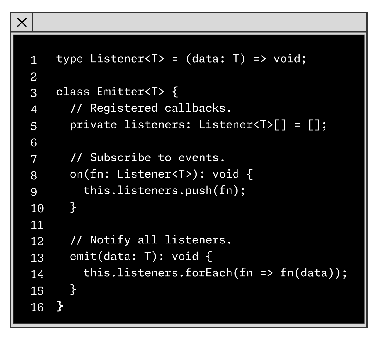
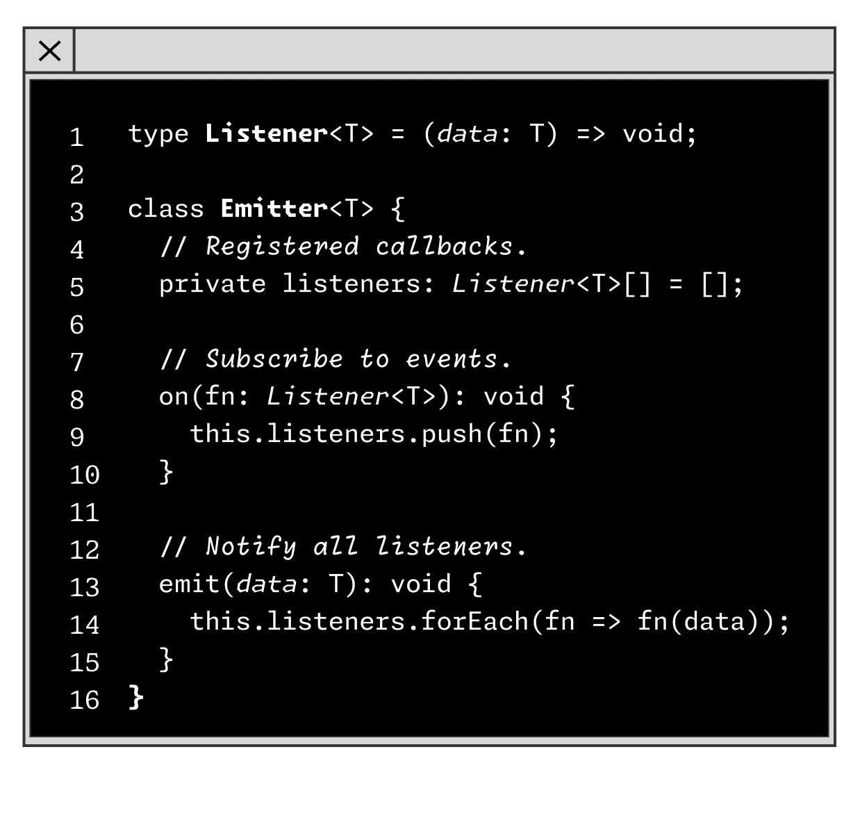
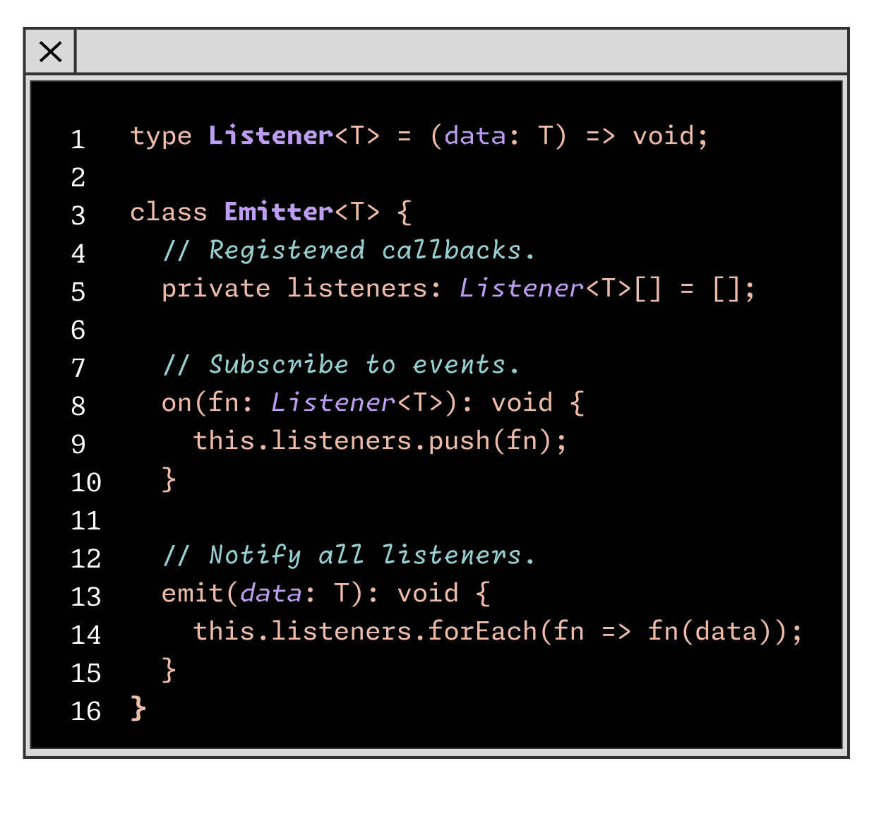
In modern code editors, we have inherited the monospace system. One particularly interesting thing about typesetting for code is that it has effectively evolved in its own branch of typographic hierarchy, separate from everything else. For example, in a dictionary we can see a differentiation between the headwords and the definitions purely by typesetting, using different typefaces, different weights, and so on. Mixing genre and style is an established way to help us tell things apart. But in the field of typesetting for code, the expectation is that there might be four or more different colors of text on a single line. No other kind of typesetting uses color coding as the expected primary method of telling things apart.
The name of this project, Monaspace, is a portmanteau of the words ‘Mona’ and ‘monospace’. Mona is the first name of GitHub's Mascot, the Octocat — silhouetted in the GitHub logo. The typefaces that make up Monaspace are, if it wasn’t already obvious, built on a monospace system, keeping with the legacy of typefaces made for coding. This project was an exercise in leveraging our expertise as typeface designers to take the weaknesses inherent in all monospace typefaces and flip them to our advantage.
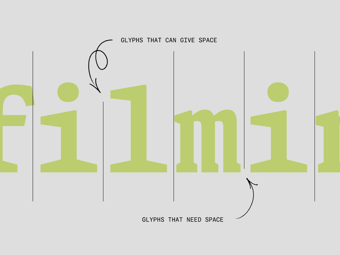
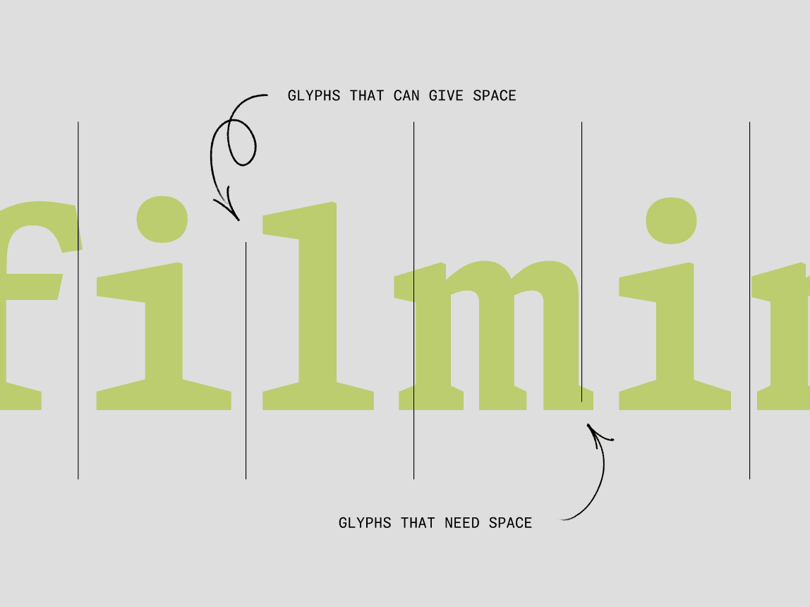
So what is Texture Healing? Imagine that there's a group of monospace glyphs which would like to take space if it were available. These are glyphs like the lowercase m and w, as discussed above. They want to be wider, they just can't because of the monospace constraint of the fixed advance width.
We also have this other category of glyphs like the lowercase i and the l, which would normally be very narrow, but are forced to reach out for the edges of the monospace width, trying to convince us that they are the right width for this typeface. We like to think of these glyphs as being willing to give up some space because they have too much.
Texture Healing Off
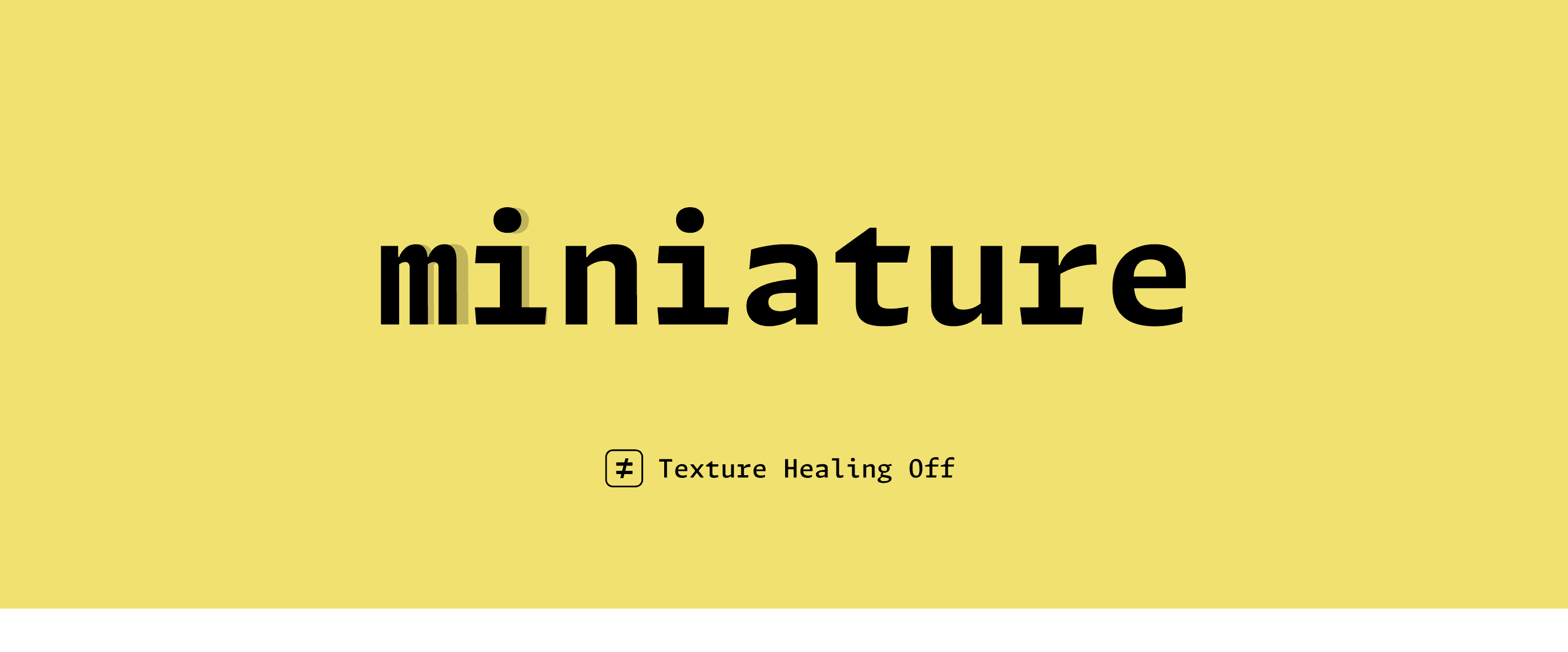

When you look at a certain word set in a monospace typeface, you can sometimes see situations in which one of these glyphs that would love more space appears right next to one of these glyphs that would like to give up some space because it has too much. What if a font were aware of that pairing and was able to redraw the letter i so that it took up less space in order to give up some space for the letter m?
One vital requirement of Texture Healing was to keep the monospace grid intact, even as letters became wider or narrower for legibility. So when the lowercase i gets narrower, it gets narrower to one side, and when the m gets wider, it gets wider in that same direction. This allows the body or bounding box around those two letters to stay exactly the same as it was. In this scenario, the appearance of both the i and the m have changed so that the pair looks visually more like it would in a proportional typeface, while still aligning to the original monospace grid.
From the very beginning of this project, going back as far as the original pitch, we knew wanted to incorporate accessibility features as a standard within the Monaspace type system. What are the ways in which a developer might customize the appearance of their code to accommodate their individual needs?
If a developer who has low vision chooses to use Monaspace in their code editor, they can adjust various settings to benefit their reading experience. With control over weight and width, it may very well be that they can reduce the overall point size of their type, see more on screen, scroll less, and interpret meaning more quickly.
One Style
Additionally, it could be helpful for people who have color blindness, for instance, if we can create hierarchy that does not rely on color at all. With the Monaspace type system it’s entirely possible to build that hierarchy through the seamless mix and match of typefaces and weights.
In many ways this is a return to form for typographic hierarchy, both within typesetting history and the history of editing code on a screen itself. All of these features work in service of helping developers find a typographic voice in their code editor that suits them best, regardless of if they have low vision, colorblindness, or typical sight. Too often accessibility features are an afterthought in the design process, which can lead to slapdash results. That’s not how we think about accessibility at Lettermatic. For us, accessibility is the foundation of any successful typeface, and that is certainly the case for the Monaspace type system.
Uniform Code
At the heart of Monaspace is the idea that developers should be able to customize their coding typefaces in a way that works for them as individuals. In addition to the ability for users to customize weight and width to best suit their needs, Monaspace contains a wealth of personalization options in every family and style that can be mixed and matched as desired. Texture Healing, for example, is recommended for maximum legibility, but can be toggled on and off.
There are also nine categories of character variants, letting users personalize how certain letters, symbols, and even the zero appears in their code editor: each style of Monaspace includes a dotted zero, a slashed zero, a reverse slash zero, a cut-out slash zero, or a traditional zero. Users can even personalize the alignment of an asterisk and how many points it has (five or six). Each of these categories of personalization options can be endlessly mixed and matched to create the ideal experience for any user.
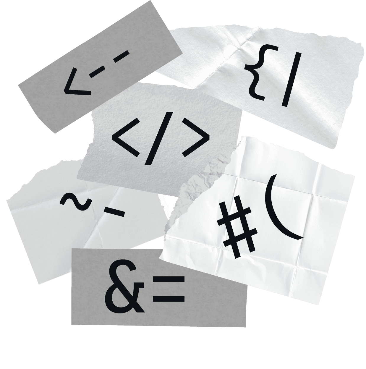
Every programing language has pairs of symbols that often appear together called ligatures, so we added almost 100 custom ligatures to visually improve these pairs automatically. For example typing --> swaps in a fully drawn arrow, strings of ### become connected, and === is replaced with a triple stroke equal sign, to name just a few. These ligatures are all controlled with OpenType, so users can mix-and-match to best suit their preferences and needs. There are ten separate categories of ligatures alone that can be individually enabled, giving developers control to personalize those settings to best suit the language and project they’re working with at that time.

Ligatures Off
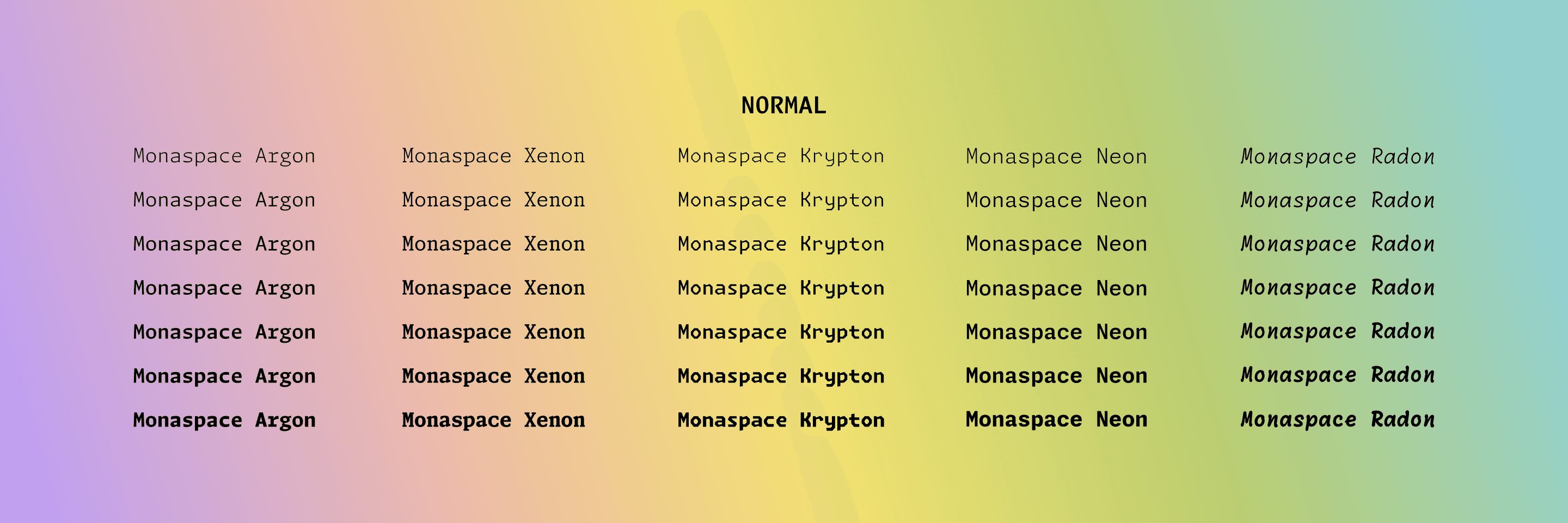
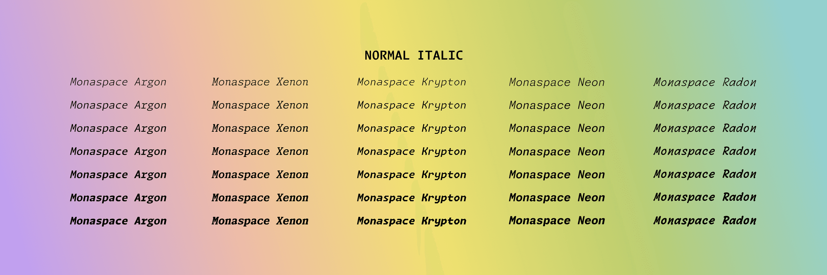
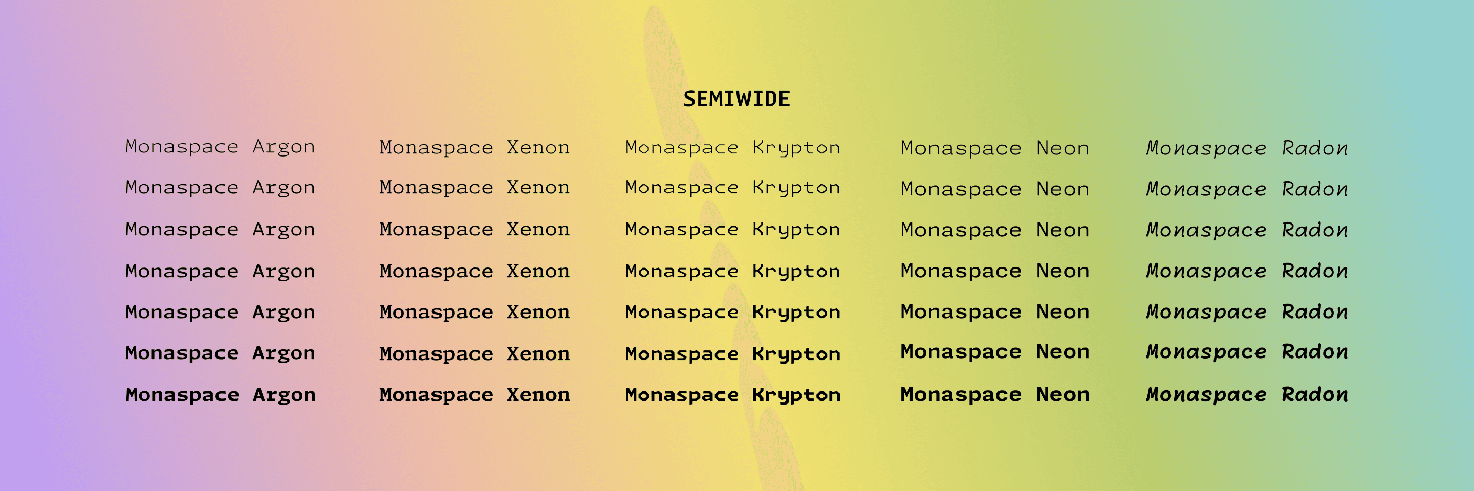
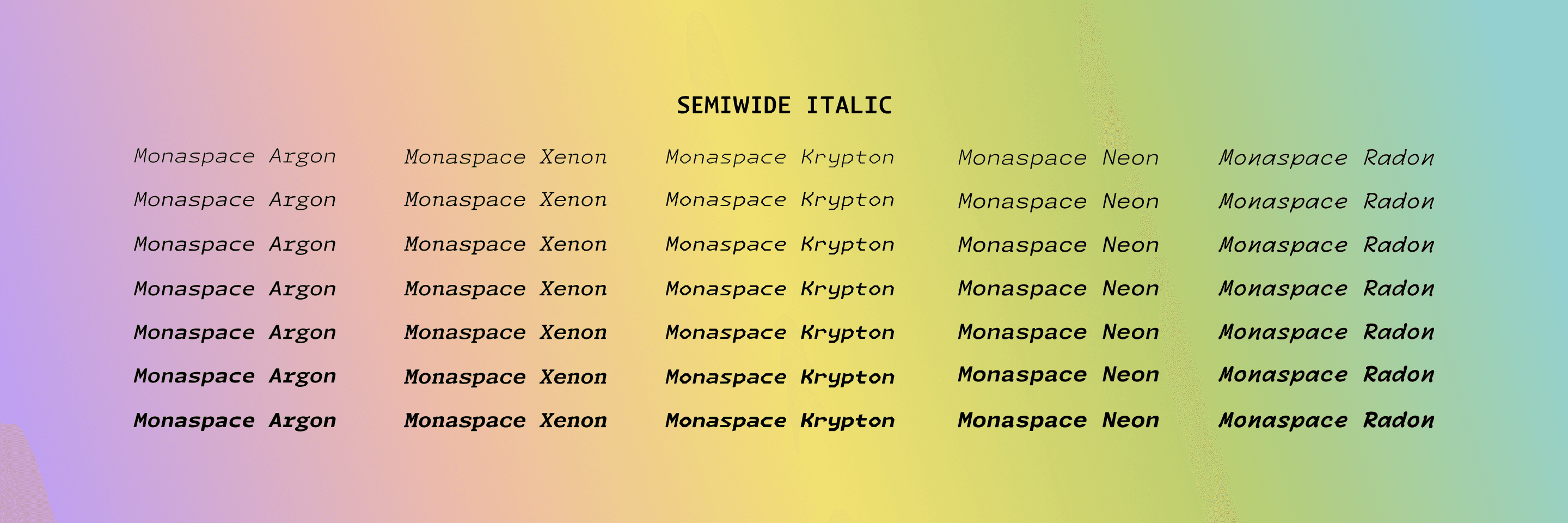
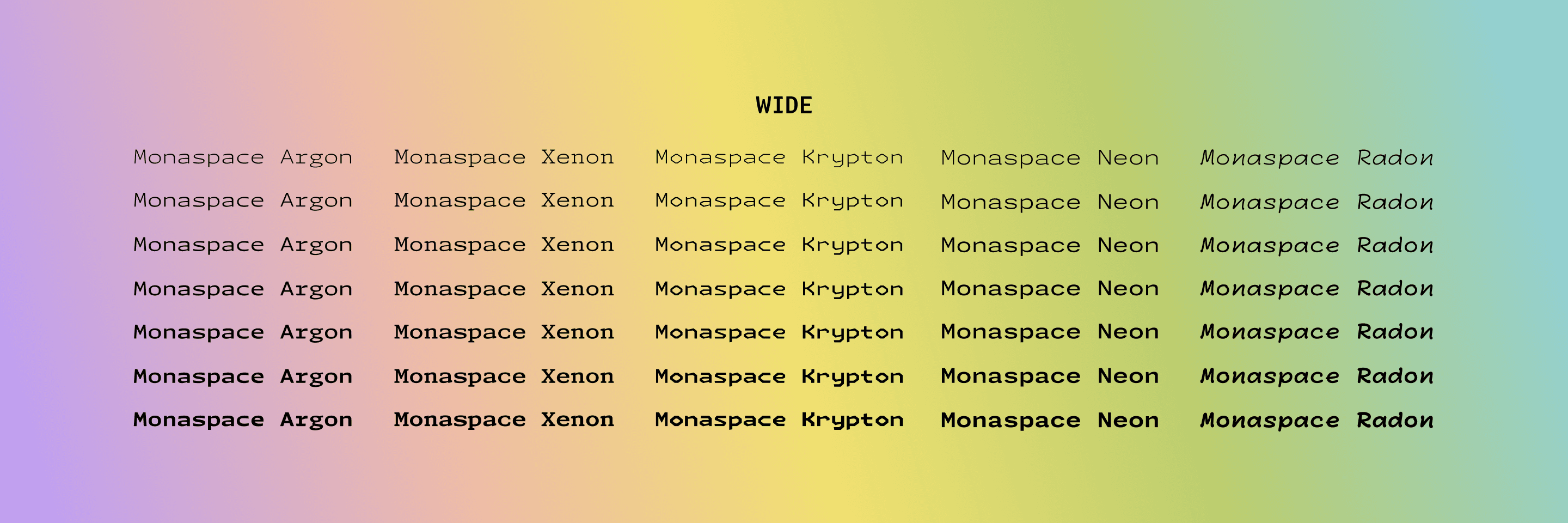
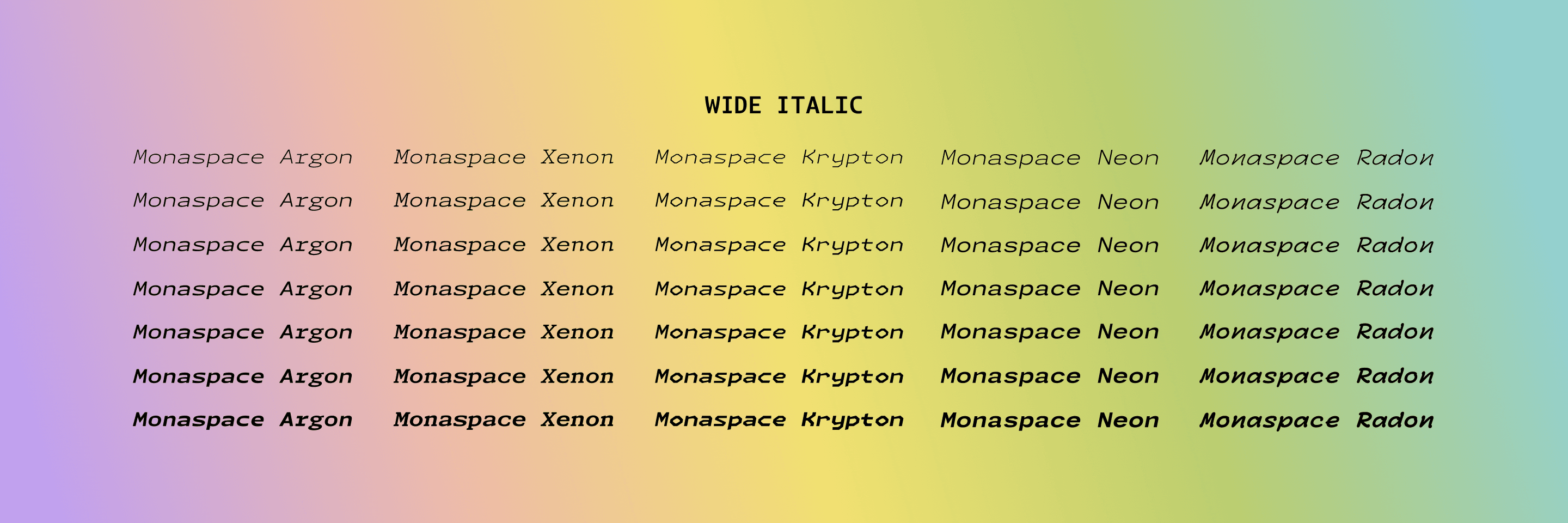
FIG. 24 — All five families in the Monaspace system contain options for width (ranging from Normal to SemiWide to Wide), weight (ranging from ExtraLight to ExtraBold, with many weights between), and slant (or, italics). Monaspace is available in both Static and Variable font formats. The Static fonts have predetermined styles along these axes, while the Variable fonts give users access to the full range of widths, weight, and slant to deeply personalize the appearance of the Monaspace styles.
In total, Monaspace contains nearly three-quarters of a million glyphs. The entire Monaspace type system is open source, in line with GitHub’s foundational belief in the open source mission. This means all of the typefaces in Monaspace are available to download for free to anyone with an internet connection. It also means that developers can add any additional glyphs they might want included in the Monaspace typefaces, should they wish to make contributions, for all Monaspace users, or just for their own private use. Additionally the open source nature of this project means that even the code that makes Texture Healing possible is publicly available.
In designing Monaspace, we have learned a great deal about how the monospace genre works, what it does well, what it doesn’t do particularly well, and how to ‘heal’ its flaws while no one is watching.
We’ve found ways to provide extra clarity between typographic voices, when mixed concurrently in one document. We’ve found a neutral set of styles for the ‘center’ of the spectrum, and departed further towards various kinds of experimental voice from that calm and predictable anchor. We have designs which could reasonably be your primary font in an editor, and designs which shout ‘I am not typical!’ in a convenient way. We have found ways to add voices to code which are more human, and voices which are more distinctly mechanical. We have given developers something expected, and unexpected, with the hopes that both will be useful to them in the future.
The Monaspace type families are open source, and available for anyone to use thanks to GitHub. Download them here, and we hope you’ll enjoy using them as much as we enjoyed building them.
Interested in
a custom font?
Let’s Chat, Drop us a line, Give us a call