Tailscale should feel nearly invisible when it's connecting you and all your devices together. But on some MacBooks, for a while there, it could be a little too invisible. We have two fixes for it: one small and slightly quirky, and another really useful one, available now on macOS.
The small, quirky fix might become a thing of the past for the vast majority of Mac users. I wanted to document it here: to help other developers, to mark this moment in time, and quietly crow about our windowed macOS interface now being generally available.
But for a while there, we had this issue with Tailscale's icon slipping into darkness.
“You end up where you end up”
At its debut on macOS, Tailscale was a command-line tool and a menu bar utility. Some MacBooks, starting with 2021 MacBook Pro models, have a notch in the top-middle of their display. And depending on how many other apps with menu bar icons are running, the Tailscale app’s icon can be hidden inside that notch.
Apple, a company that traditionally favors simple functionality over dense settings, does not offer users, or developers, a path out of the darkness. If there are more menu bar icons then there is space to the right side of the notch, the menu bar items simply disappear into the notch-y ether. If you don’t see it, you can’t click it. There is no notification to the user, no overflow section, no options to rearrange the menu bar items.
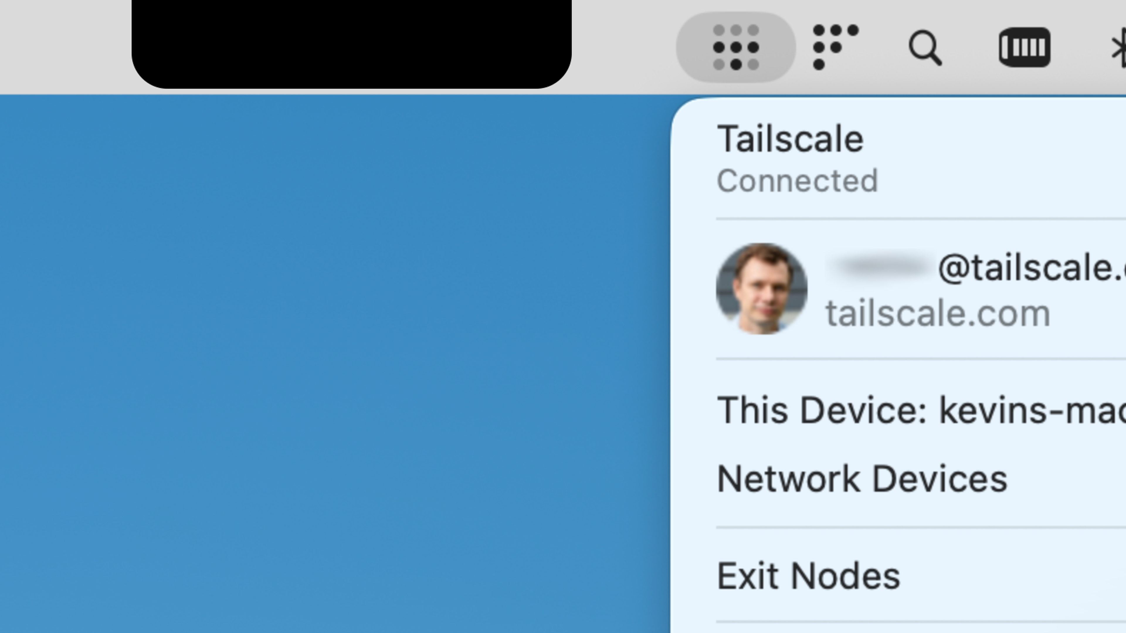
Author's rendition of the Tailscale menu bar applet, dangerously close to the inky depths.
As of this writing, Apple has some indirect work-arounds, like pushing more of its own system icons into a revamped Control Center, and offering a somewhat inelgant “Scale to fit below camera” option. Third-party menu-bar-managing apps like ICE and Bartender can help, but they add complications and overhead.
“We don’t have any control over where things get rendered in the menu bar,” said one Tailscale engineer, who asked to go nameless so as to share their honest opinion. “You just say, ‘I want to be a menu bar app.’ They shove it up there, and that’s it, you end up where you end up.”
Given this there-or-not-there behavior, Tailscale developers received a number of bug reports from users when, after the notched MacBooks' debut, their Tailscale icons fell into the middle-screen distance. "They were like, 'Actually, I can't find my Tailscale. It's gone. It didn't start," the engineer said. "We're like, 'No, it's there, it's just hiding behind the notch.' But we kind of got sick of that."
Mac menu bar icons may not know they are trapped inside the no-pixel phantom zone, but they can report that something is blocking them. Using data from occlusionState, the Tailscale app can see that its icon is in mid-bar limbo.
And while it cannot move, it can speak. Specifically, a pop-up message can say:
![Mac pop-up dialog, reading: Sneaky! The Tailscale icon is hiding behind the notch [new line] The Tailscale icon is hidden due to limited space in the menu bar. To see the Tailscale menu, please rearrange or remove some of the other icons.](https://cdn.sanity.io/images/w77i7m8x/production/5bddebdfce4d155ad72ebc3bba3e316d2036fb50-660x764.png?w=1920&q=75&fit=clip&auto=format)
This affable warning is not perfect, by any means. The notch warning can be inadvertently triggered by other display quirks, like opening and closing the MacBook lid, moving between monitors, or some combination of the two. But it helped triage the "Where are my Tailscale settings?" issue for a while.
The notch, and how we got around it
Apple could certainly make some changes to prevent this being an issue at all. The system could prevent menu bar icons from rendering in the notch area at all. An overflow mechanism could stack the icons that would otherwise drop into a negative notch zone. Or developers could be given more information and tools about icons' notch-itive states.
In the meantime, here’s a look at the Swift code that let our app know it should chirp a bit when hidden. It should be unnecessary with the new windowed app—unless you enable the “Hide Dock icon” option in the windowed client options, in which case it might still call out its hidden nature.
An actual fix: A whole new macOS interface
As we noted at its September beta release, a windowed version of Tailscale’s macOS app doesn’t replace the menu bar app, but runs alongside it. It can be pulled up from the Dock or a Spotlight search, and makes a lot of Tailscale data and features more accessible.
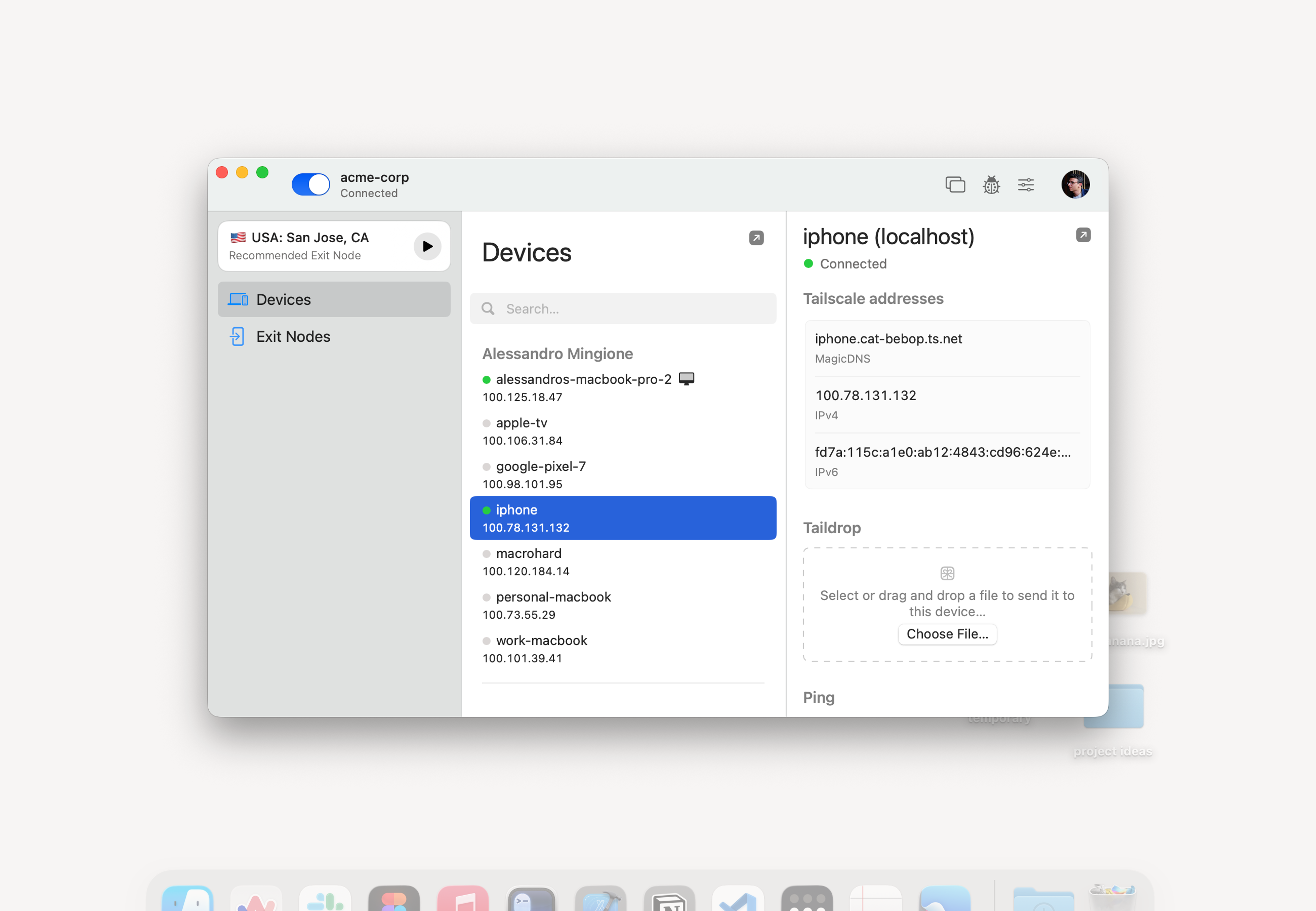
The windowed interface, enabled by default starting with version 1.96.2 of our macOS client, offers:
- A searchable list of tailnet devices and their connection status
- Easily ping, copy IP addresses, and send files through Taildrop to devices
- Easy access to exit nodes, searchable and with one recommended based on latency, performance, and location
- A red dot on the Dock icon to note critical errors
- A “mini player” that shrinks Tailscale down to the bare minimum
- A product tour of all these things upon installing/updating
Let us know what you think of the new interface so we can make it better. We’re working on a comparable UI for Windows devices. And we’re always looking for ways to bring a little bit of functional whimsy to our software.