https://chinese.stackexchange.com/questions/16669/lowest-pix...
Example: https://imgur.com/a/text-80-characters-per-line-240-pixels-w...
That's 3 horizontal pixels per character on average, including inter-character spacing.
The extra 1 pixel of height for the text in green, in particular, allowed for some cool "italic" styling, especially for letters like E, D, J, U, V
Yowsa. For those playing at home, that monitor is over 20 years old:
https://everymac.com/monitors/apple/studio_cinema/specs/appl...
I think 3x5 works well enough:
I'm quite fond of Spleen:
https://github.com/fcambus/spleen
It has a 5x8 font which has all of ASCII, but most glyphs are actually 4x8 and include horizontal spacing. I modified it to reduce the rest for a project I'm doing so all glyphs are 4x8. The result can be rendered on a 5x9 grid with a guaranteed line of horizontal and vertical spacing between all glyphs. It's very nice.
However, 5x5 isn't enough to draw "e" properly if you also want lowercase letters to have less height than uppercase, so you need at least 6 vertical pixels. And then that isn't enough to draw any character with a descender properly, so you need at least 7 vertical pixels (technically you should have 8 in order to allow "g" and "y" to have a distinct horizontal descender while still sitting on the baseline, but this is probably an acceptable compromise). And remember that in practice this means you will still need at least 8x6 pixels to draw each character, to allow for a visible gap between letters below and beside them.
In the end, I found "Gremlin-3x6" font[0] made by the guy named zephram. It's 1 pixel taller, but still a very compact when laid out horizontally. But, most importantly, all standard latin characters are pretty distinct from each other and it remains readable without zooming in too much.
Unfortunately, since then, zephram deleted his fontstruct account and all of his fonts. I have a copy of this font in my mod repo[1] along with a CC0 license and you can see the actual rendering of the font in the project screenshots[2].
[0] - https://fontstruct.com/fontstructions/show/1488093
[1] - https://codeberg.org/janAkali/isaac-extended-icons-mod/src/b...
[2] - https://codeberg.org/janAkali/isaac-extended-icons-mod/media...
https://www.pagetable.com/?p=901
> Creating a 4×8 character set that is both readable and looks good is not easy. There has to be a one-pixel gap between characters, so characters can effectively only be 3 pixels wide. For characters like “M” and “N”, this is a challenge.
EDIT: realized a better demo for this discussion would be the photos I took of all the tiny bitmap fonts I had converted to the C array style at the time. Thread has more but here are my favorites: https://bsky.app/profile/janiczek.cz/post/3mh25atboz224
[2x5-HP-Z24n-G2] https://i.imgur.com/yLyrpfg.jpeg
[1x5-HP-Z24n-G2] https://i.imgur.com/Z7kH005.jpeg
[2x5-Innolux-N156HCA-GA3] https://i.imgur.com/F4Ypxwj.jpeg
[1x5-Innolux-N156HCA-GA3] https://i.imgur.com/etkot5o.jpeg
[1] https://jp.ext.hp.com/monitors/business/z_z24n_g2/
[2] https://www.panelook.com/N156HCA-GA3__15.6__overview_33518.h...
Note: there are repeat glyphs here like c and o, though the example actually uses a different c somehow. But perhaps repeats are ok given context.
In theory (focusing on non colourblind english speakers) there could be say 8 distinct colours and 8 shapes giving 64 chars.
The hardware solution was to buy an "80 column card" that gave 80 columns of proper text, if your monitor could handle it.
2026-04-18 — 2026-04-20 (Programming) 
All characters fit within a 5 pixel square, and are safe to draw on a 6x6 grid. The design is based off of lcamtuf's 5x6 font-inline.h, which is itself inspired by the ZX Spectrum's 8x8 font.
5x5 is the smallest size that doesn't compromise legibility:
Five by five is actually big enough to draw most lowercase letters one pixel smaller, making them visually distinct from uppercase.
Narrower 4x5 and 3x5 dimensions are possible, but would require sacrificing the M, dotted zero, and reduce U/V/Y distinctiveness.
There's no artistic reason to make all characters five wide just because a few must be... but a using a constant width makes programming a lot easier: The length of a string on screen is always 6 times the number of characters.
It also makes compact layouts much safer: There's no need to worry that a number will overflow because "8978" is longer than "1111".
The whole font takes up just 350 bytes of memory, which makes it ideally suited to 8-bit microcontrollers like the AVR128DA28 (16 kB of RAM) These are cheap, low power and robust... but they fall short on graphics:
Even a low-resolution 384x288 display has 110 thousand pixels: way too big to fit in the AVRs memory.
... except most projects don't need anywhere near that many pixels. A 160x128 or 128x64 OLED is more practical and cheaper — but these need hand-drawn, pixel-efficient fonts to make good use of them.
For reference, here's a vector font rendered at a similar scale:

Actually 6 tall, but the letters are narrower, so I'll allow it.
Antialiasing, several megabytes of code, a megabyte of font data, and it's still terrible compared 350 hand-crafted bytes.
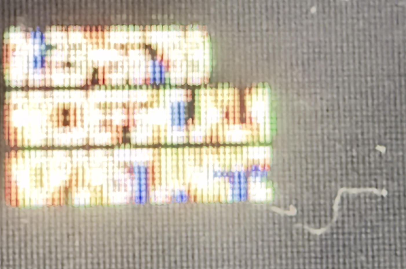
Pixels aren't perfect squares, so the font won't actually look like the rendering at the top of this post: This is it on an actual screen:

I actually really like the pseudo-dropshadow effect created by the subpixels. This won't happen on monochrome displays, but the font will still look smoother than you might expect.
The gaps between pixels really help sell the "e" and "g", but this same effect should allow...
While 5x5 is the smallest no-compromise resolution, a 3x5 isn't too bad:

There are 32,768 glyphs at this size. (27,904 are distinct)
The "M", "W" and "Q" suffer, but it's still got a distinct O and zero. Something like this might actually be a good option if you need to cram (50%) more columns into a display.
That's still readable, so what about 3x4?

There are 4,096 glyphs at this size. (3,392 are distinct)
At this size, there's no way to have a distinct upper and lowercase, so I've picked whatever style works the best in the limited space. The numbers have also taken a hit, but still work ok.
How about 3x3?

There are 512 glyphs at this size. (400 are distinct)
The main loss was the numbers, but the letters don't include any duplicates and are somewhat recognizable.
This font is hugely improved by being displayed on real hardware:

That means it's still too big. How about 2x3?

There are 64 glyphs at this size. (44 are distinct)
Ok, this is getting ridiculous. Most letters are unrecognizable, and there are quite a few duplicates. In case you couldn't tell, the bottom line reads "Hello World".
Flipping the aspect ratio to a 3x2 makes it a lot better:

There are 64 glyphs at this size. (44 are distinct)
![]()
Simulated pixel grid
More letters have horizontal detail (M, W, N, Q, G, P, etc) then have vertical detail (E, F). The bottom line reads "you can probably read this", although you might have to squint or zoom out.
... and for the sake of completeness, a 2x2:

There are 16 glyphs at this size. (10 are distinct)
On paper, there are 16 possible 2x2 images, but one of them is blank and 5 of them are shifted copies of another one. That leaves 10, just enough to do all the digits... but because they have no resemblance to the originals, it's more of a secret code than a font.
It can be enough if you "cheat" and make use of the horizontal space. This is how I did it in my font:
##
# #
## #
###I think that's the least of the properties I'd be willing to sacrifice to have a font that tiny.
Competitors could apparently show 80 characters per line, but only by switching to a horribly unreadable 2x7 font. "I found the tiny 80 column characters tiring to read but the mode is useful if you want to see what the finished output will be like." - https://www.crashonline.org.uk/31/words.htm . I can't find a screenshot.
xx
x
x
x
xxAt first, it seemed like an Easter egg, but it's probably just a natural happenstance of two people centuries apart deciding to represent the first ten letters of the alphabet in a 2x2 grid with a general idea to use fewer dots at the start than at the end.
https://www.omniglot.com/conscripts/dotsies.htm (original site https://www.dotsies.org, which has a casual introduction text that slowly transitions into dots; however, it was unavailable at the time of writing.)
And if the pixel font images were to be rendered at actually 5 pixels on my Retina screen, because the resolution of Retina screen is so tiny, the pixel fonts would still be unreadable without a microscope.
So while it's a cool project, as long as we can put Retina-dense screens in things, we are past the point where there is any useful need for a 5 pixel font
(but yeah, it's not quite right, and is especially jarring in the nice, clean, blown up pixels in the top example)
https://archive.org/details/zx_Tasword_2_Tutor_1983_Tasman_S...
Plenty of systems did it like CP/M on the Spectrum +3 and it looks pretty decent.
I would have loved to have seen a sample of the 4x5, not just the 5x5.
but wowza!! $900 for that lil guy, dang!
https://www.amazon.com/Best-Sellers-Kids'-Microscopes/zgbs/t...
Magnification is around 5x, but this is more than enough to see subpixels.
Electronic devices
Fine prints in images
I haven't done the pixel-by-pixel deviation checking, but they may be comparable and independently derived!
It reminds me people who research "colorizing grayscale photos", which do not exist anymore either (if you want a color photo of someone you met in your life, there probably exists a color photo of that person).
x
xxx
x
x
But I think you're right.Replace "imgur.com" in the links with "rimgo.bcow.xyz" and consider voting against the parties of surveillance next time you can :)
However I don't think even native developers with full Unicode language support tend to use Japanese/Chinese characters in variable names or keywords. There is the occasional hybrid registry key such as "令和_令_Reiwa_R" (which will allow the temporary replacement of the name of the Emperor in Windows dates when the current one dies).
The glyph coverage is enough for most programming languages; missing glyphs just fall back to a pixelized look.
Lode 1.5x works really well at 110 ppi displays, which seems to be the uncanny valley for antialiasing.
- https://github.com/akavel/clawtype#clawtype
- mandatory "Bad Apple" vid (not mine): https://youtu.be/v6HidvezKBI
(for the "splash screen" linked above I used font u8g2_font_3x5im_te: https://docs.rs/u8g2-fonts/latest/u8g2_fonts/fonts/struct.u8... and a multilingual u8g2_font_tiny5_t_all: https://docs.rs/u8g2-fonts/latest/u8g2_fonts/fonts/struct.u8...)
I can't at all.
Actually, the 4x6 doesn't look half bad if viewed at wrist-level.
128x64 monochrome screens are very common in both LCD and OLED format.
There are also several 32x32 led panels, which one could imagine needing some text.
Also, this kind of thing is just interesting, regardless of the usefulness.
VIP Term, and others, had 3x7 fonts on 4x8 grids to connect to 80-column mainframes.
Find me a 0.66" OLED display for ~$1 that has hundreds of pixels on each side then.
> It reminds me people who research "colorizing grayscale photos", which do not exist anymore either (if you want a color photo of someone you met in your life, there probably exists a color photo of that person).
What train of thought led you to think people are primarily researching colorising new B&W photos? As opposed to historical ones, or those of relatives taken when they were young? You can take a colour photo of granddad today but most likely the photos of him in his 20s are all in black and white.
* a huge corpus of historical imagery
* cheaper grayscale cameras + post processing will surely enable all sorts of uses we haven't imagined yet.
* a lower power CCD and post-processing after the fact or on a different device allows for better power budget in cheap drones (etc).
* these algorithms can likely be tuned or used as a stepping stone for ones that convert non-visible wavelengths into color images.
And that's just off the top of my head as someone who doesn't really work with that stuff. I'm sure there are plenty of other reasons I can't think of.
https://www.crystalfontz.com/product/cfal12856a00151b-128x56... - 128x56
https://www.crystalfontz.com/product/cfag12864u4nfi-128x64-t... - 128x64
There's a whole world of embedded devices with wide varieties of screen resolutions.
I don't think there's a need for tiny fonts on an e-reader, even one with a small screen. IMO when you're reading a book I think you want to prioritize readability, not characters-per-page.
xxx
x x
xxxxx
x
xxxx
It looks a bit like a 9 but the descender is different.(Could play around with how many x's to put on the first and third lines, particularly whether to set the first/last bits on those lines as "corners" or make it more rounded.)
I would also modify the top of lowercase e in a similar fashion.
But I'm backfilling a lot of information from context, the same way that this works: https://www.dictionary.com/articles/typoglycemia
It would have been much harder to read a series of random words, or another piece of text with a less predictable structure.
Every grayscale photo of someone famous has already been colorized during the past 50 years. If there are only grayscale photos of you, you were probably born before 1900, and all your friends or your children (who might want to colorize your photo) are probably dead, too.
Also, if there are only grayscale photos of you, you were probably born before 1900, and all your friends or your children (who might want to colorize your photo) are probably dead, too.
I think you will not be able to read 5x5 pixel letters on that display (a letter would be about 1 mm tall).
xx
x x
xx
x x
xx
A little awkward, but very distinct from the 9. The reason to narrow the head of it is to allow the end of the descender to rise upwards without turning it into an 8.Bloody hell, warn people before you post things like that.
I tested this on a phone, and was able to read it without much difficulty at roughly 18-30 inches.
It's a very strange argument to make: there exist some photos therefore other photos may not be colorized!
2. Don’t forget about B&W films! Getting automatic methods to be consistent over a long length is still not 100% solved. People are very interested in seeing films from WW1 and WW2 in colour, for instance.
3. Plenty of people (myself included) have relatives in their 80s or 90s. Or maybe someone wants to see their ancestors from the 19th century in colour for whatever reason?
Seeing that a "neat tool" exists and using that "neat tool" are two diffrent things. Google Glass was neat, too.
Just because you don't want to use a tool, it doesn't mean others also won't.
But today, only 1% of people has black-and-white childhood photos. I just makes me want to argue when people pretend that it is still needed as much as in 1995 :D
I was also arguing with my friends about buying laptops with an optical drive ten years ago :D