What would be most helpful for my workflow is something slightly different. I need to be able to launch specific browser profiles/windows in these workspaces. One space with all of the tabs for project X, another space with all of the tabs for project Y, and then another with all of the tabs for project Z. These might be in different browser profiles.
I don't see how I can achieve this under the common per-app paradigm of macOS space organizers unless macOS has some notion of Windows/Linux style shortcuts whereby command line arguments can specify the exact things that need to be in the browser window.
I've used Lemon Squeezy a couple years back, but after the acquisition I feel they've gone downhill. It's been a month since I submitted my product for review and I'm still waiting.
Stripe also has a MoR service now, I was able to set it up and ready to sell in a few hours
Answer: Because modern-day Apple has subscribed to a particular brand of mitigation for the "noobs will always click 'Allow' especially if you ask them to first" problem. The mitigation is that Apple just dumps you on step 2 of a little 4-5 step mini sysadmin adventure where you prove, every time, that you're sophisticated enough to deserve an exception to the padded-cell walled garden mode they've sealed off 'for your safety.'
As a complete nerd, you'd think maybe I'd like that I can prove my skills like this, but it comes off as deeply disrespectful to me as the user that I can't disable this.
What's my solution to prevent grandma or a 10-year-old from clicking "Allow full filesystem access and keylogging" to an executable she downloaded from facebook-security-center-and-password-verification-cgi-bin-ab383 dot xyz? IDK, that's their problem, but they should offer a way for those of us who aren't clueless to turn whatever it is off.
Multitasking and context switching has been increasing for years, instant messaging boosted them again, and agent-based workflows are only going to push further in that direction. The OS needs to support that, and it's not an app-level concern: I use the same apps in each of my tasks.
IDEs can help with this of course: they tend to have workspace/project primitives and can restore code and terminal contexts from those. But there's always a bunch of other connected stuff that can't be linked: web pages (some IDEs are starting to manage those too), agents which don't reside in the IDE, relevant chats with colleagues, project management apps and so on.
This is clearly an OS-level concern, not an app-level concern.
Some of the iPad experiments with alternative window organisation looked kind of promising, but they’re just not powerful or intuitive enough IMO.
That paired with multiple desktops does the trick for me! Highly reccommend (not sure if it's okay to share URLs? sorry in case it's not):
The real issue is how the ORDER of the desktops changes all the time which messes with that spatial memory and kills a lot of the productivity improvements. A consistent straight line would still be worse than a grid, but still MUCH better than the current situation.
It’s not the same, per se, but it’s just … mature. It’s mature because it’s a nice mix of « it’s old and boring » + they took inspiration from everything that worked on macOS and Windows and stole it. They never removed features for any bullshit marketing reasons.
It’s not perfect : there are things that I like better on macOS (but they tend to be very rare tbh) or even Gnome or whatever I’m trying nowadays (it’s Niri!)… but I do think KDE is the best overall when it comes to respecting its user, giving him nice and clean defaults while giving them enough options to work however they like to.
And yes, that includes virtual desktops arranged in a custom grid. It’s not the default but the option is right there waiting for you to enable it if you want it.
While linear window management is clearly not to everyone's taste, I still think it's a valid idea! It was heartening to see this launch and its reception, as I'm actually working on something in the same area right now...
The grid is good, but even better is the instant virtual display switching.
Nowhere is the death-by-a-thousand-paper-cuts annoyance of modern macOS worse than having to hit Ctrl→→→→→→→ and suffer those repeated animations, over and over.
- Each monitor has own grid?
- The VD 'spans' the pair of monitors?
- VDs only on one monitor?
- The monitors form a fixed 'window' into the grid?
- Something else?
My current "WM workflow"/window management keyboard shortcuts is:
neovim → tmux → Ghostty → Rectangle → OS
so moving to the left window/pane is (depending on the "nesting level"):
ctrl+h, ctrl+a + {number}, cmd + [, option-ctrl-left, ??
This is what happens when you spend years overthinking / fighting the walled garden UX. The sad part is that I'm kinda OK with this at this stage (besides 1-2 days a year, when my mental faculties are lowered and I decide to _fix it_).A global fzf / rectangle / alfred shortcut for all "windows and panes" would be great.
Unfortunately, at this stage, my overthinking/poor ux induced psychosis reached the point where I control Claude using voice and a Playdate console with a crank and I'm day dreaming about just looking at the pane I need and making a click sound with my mouth to select it (like Neddy in Adventure time).
I remember the 2x2 grid in Ubuntu 12 being the best desktop UI I had ever used.
The current Gnome workspaces with a single row are a huge step backwards in terms of productivity. It must be easier for beginners, but it frustrates me every single day.
Hooo damn TextMate snippets, that brings back memories. Hard to convey how hyped I was to use these. That is also what drove me to Mac at that time. I remember writing hundreds of those snippets for every possible C++ construct, and <tab> to fill in variable name, type, loop counters and so on.
I never had to think about where things were, I didn't feel constrained on my tiny screen with no external monitoring, things were good. And now it's been over a decade and while I've "replaced" spaces with multiple external monitors I still think about it from time to time.
I watch people use (fight) the current "spaces" and I just shake my head thinking of what we lost and how Fisher-Price the new version is. Spaces used to be a power tool, now it's a shadow of its former self IMHO.
[0] Single row spaces is a joke, I won't use it
It's too bad we can't mix and match parts of releases as desired. If I could have OS X 10.9 Mavericks (last Aqua release) with 10.6 Spaces and modern macOS integration features (Continuity, etc) I'd be in heaven.
One major issue is that the Dock cannot filter apps between Spaces, so I built boringBar[0] for this. It frees up real estate taken up by the Dock and makes it much easier to figure out what goes where.
I do understand the need for an app switcher on the Mac, though. It has the same problem I faced: it is very app-centric rather than window-centric. Switching between windows is nigh impossible on a Mac without third-party apps, unless you like using the three-finger swipe up gesture. I have never been able to switch quickly between windows using Mission Control.
GridLion is an excellent name
Not the same as full spaces, but it gives the same vibe of always having a particular app on a particular hotkey.
I try to limit my multi-tasking though, so I can imagine where full spaces would be useful.
This is a M1 macbook air. I really want to try this.
This is depressing. I've been out of the field since Covid (after decade_s of work) and basically have to get back to work since kitty is gone, but this is definitely what I signed up for when I started on this career in software engineering.
If I'm gonna be reviewing all day, I'd rather manage humans rather than LLMs. How is it affecting managing engineering teams?
Sadly wm in MacOS is like notifications on iOS: with enough time you get used to the unproductive mess they are, but you'll be missing out on better solutions. And since probably all MacOS devs are using Mac, they won't see/understand other (better) approaches.
Some third-party software pretends to restore this functionality, but they do it by repositioning the mouse to simulate a hover, which introduces a delay and doesn't integrate correctly with the animation. Someone wrote a patch that works by disabling SIP and injecting code (https://github.com/briankendall/forceFullDesktopBar), but eventually stopped maintaining it.
A decade later, I doubt anyone at Apple remembers that this bit of user interface used to be good.
Two decades ago was 2006. I have the same desktop experience today as I had two decades ago (Fvwm2) and have had the grid virtual desktop layout this author misses so much for the entire time via the Fvwm2 (and Fvwm before that) virtual desktops feature. One of the reasons I switched to Fvwm (I no longer remember when, but sometime in the mid to late 1990's) was the grid virtual desktops feature. So I've had gridded virtual desktops for longer than twenty years. Fvwm2's configuration has been tweaked and adjusted slightly along the way, but at no time did a corporate designer decide that I no longer should have a feature I had previously been using.
Proprietary software does not have your interests at heart, it has its stock price or next quarters sales numbers at heart, nothing more.
But this has been pretty nice for me.
It’s also open source if you want to customize it for your own preferences (pinned apps, custom keybinds, etc)
If you can, switch to Linux, choose the distro you like, and help make it better, in UI and whatnot.
The joke, of course, is that I imagine a good 75% of the reviews would be "it's shit."
Also this is basically a replacement for the zombie TotalSpaces 3
Ironically, I think the reason they took it away was to help with fullscreen macOS apps, which are a garbage anti-feature it doesn’t seem like anybody uses. Long live the grid!
You seem to have understood the problem. But then you didn't follow. If there was a way to disable this, first thing that the grandma would do is watch a video how to disable that and lose security from then on.
Of course it is not perfect, but their approach here is really decent. And also, if you find yourself needing to go through that often I think that's not a good sign security-wise.
On the flip side, many websites ask if I want to allow notifications. I almost never do. I was looking at settings recently and surprised how often I’d clicked yes by accident (maybe about 5% false click rate?)
As nerds, do we have a higher capacity to fix a mess than a grandma? Sure, probably, but that doesn't mean that we don't make messes.
For previews, Apple could provide an API for this very common task. The OS can provide the images, and they could be sampled at refresh rate that makes it unusable for arbitrary recording.
For key chords, they could repurpose the emoji key, which is currently not available for external binding, to effectively allow capture only following that magic sequence. The OS should manage this centrally, allowing a program to define its commands and then delivering only the command without the specific associated keys presses. We get the benefit of centralized management with deconfliction, too, which is a real pain on macos as it stands.
I don't know if these solve every problem, but they solve some. There are probably better ways. Apple has plenty of smart programmers. The product team needs to let them solve the problems that they surely know bother their professional users.
But it is funny to see the daily barrage of permission prompts fly through when macOS made an entire ad ridiculing Vista for half the popups and permissions macOS requires these days.
Even though a bunch of the responses are "well you don't want a keylogger" when the first solutions I can think of are also (potential) keyloggers. :)
Tried some little throwaway app and realized you don't need it? Sucks for you. It added itself to your login items and it'll start up in the background every single time you turn on your computer. And it won't even tell you. Thought you deleted the app from your Applications folder? If you didn't check your login items, there's probably some little script that deeply installed itself and it'll reinstall it in the background during your next startup.
Adobe is the fucking worst with this. Their Creative Cloud spyware keeps enabling itself and reinstalling itself so long as you use photoshop. And it'll constantly find ways to turn itself back on. Steam also adds itself to login items, which is fucking annoying because you'll reboot and be hit in the face with game ads. At least it respects your decision when you turn it off, but login items should be opt in, never opt out.
It’s used for writing keyloggers.
That’s it. It’s the permission that lets you write a keylogger. It SHOULD NOT be just a click away. It should require some extra song and dance, because this is an especially dangerous permission, and the extra friction is justified.
I think the point is:
Pre-LLM: 1. think, 2. write code & check, 3. review.
LLM: 1. think, 2. write prompt, <LLM writes code quickly>, 3. review.
If the thing that you enjoy about programming is writing code, you can have the LLM write code in the style you like. If you enjoyed getting to explore and understand a system, an LLM can help you do that quicker, too.
"Use LLM without thinking" won't get you substantially useful results.
Using that app, if I cmd+tab from one space to another, will I see 0 (and I mean zero) animation whatsoever? The exact same behaviour as if I were switching between two apps on the same space? Because that's what I need to go anywhere near Spaces, and that's what seems impossible.
With the app "AltTab" I can at least switch between my apps without using the mouse and with raycast I can position windows, but it is painful how much slower switching and positioning things in MacOS is, than in any tiling window manager.
Honestly, people have been complaining about Apple's decision on every semi-Apple-related forum forever. Still didn't prevent them from rolling out Liquid Glass. Not sure another one would do the job
One of the first things I disable on any new Firefox setup. I want zero notifications from websites (or in general, one of the objective improvements of Windows 10 over Windows 7 is that you can just disable notifications entirely, while disabling balloon alerts in Windows 7 was a huge battle that never fully worked)
¹https://blogs.kde.org/2026/01/17/streamline-plasma-with-acti...
Also, everything has excessive padding now. Modern Windows control panel UIs often feel like a multicolumn wall of text with lots of empty space and a few switches dropped in, and to fit the same amount if options as the older UI they had to either hide some toggles because "known needs them anymore" or introduce extra intermediary navigation steps. As a result the new Control Panel feels bloated and less useful.
Something like quickshell-overview feels so smooth and delicious compared to the painful use of virtual desktops on Windows/MacOS.
I never noticed that behaviour because I only use mission control in full-screen mode. If you swipe up with three (or four) fingers from a full-screen window the previews are visible immediately. I have no idea why we need a different preview for desktop vs full screen however.
The part of this UX that annoys me is the spaces get re-ordered for no apparent reason. I usually have a few IDE windows open and it's tiring to have to double-check the window hasn't moved.
It's gone so far that even tech people now think that having root access to a mobile device is somehow scary. Well guess what that root access is still there for the manufacturer. It needs it for stuff like updates. It just shields you from having any kind of input or visibility on what is going on.
And once you've given up your admin control to the mega corporation, your government is going to be next. They'll be demanding backdoors and regulatory bullshit like age verification and snooping backdoors. Even today the EU launched yet another chatcontrol proposal. Eventually they'll manage to get it through when they've paid off enough representatives.
Keeping full control is the only way to prevent this.
My grandma absolutely would not watch and follow a video on how to e.g. disable Gatekeeper, nor do I think she’d be able to if she tried.
Your grandma sounds substantially more tech savvy than my grandma. Good for her, she seems to know what she wants. Grown adults should be allowed to knowingly opt into an additional level of risk.
I spent an hour today trying to get it working the way I’d expect and it still does odd things, like after disabling automatic reordering based on usage the order is different when 3 finger swiping previews as opposed to actual windows. The visual order is as expected but the swipe order is not linear.
I hate that design and what it has done to Gnome.
A grid was so much better.
How does a company with infinite resources and talented designers come up with shit like that??
It works well for me, but as you can see from the comments everyone is different :)
God this is so recognizable, it's truly at my lowest moments that I decide I need a new terminal emulator and spend 6 hours in a brew install rabbit hole. The worst thing is that I'm still using Warp of all things
I freaking don't. One time was plenty. I don't want any animation. And the "reduce animation" feature's implementation is a slap in the face: all the delay -- that part is non-negotiable apparently -- but with blurry crossfades instead.
Personally, I only open one app per desktop and just use Command-Tab. If you hold Command after Command-Tab, you can select an app with having to cycle through all of them.
I've been using Instant Space Switcher (which got a small callout in tfa) as a targeted fix for this, and it's lifechanging
Previews are also visible immediately if you set Mission Control as a hot-corner action. In never see the title-only spaces — i forgot it even did that until this discussion.
I also wish I could name the Spaces. "Desktop N" is pretty useless.
The great Gnome 3 rollout did this for me... to be fair I guess that was a decision of the distributions, but it was in concert with the developers who decided to make a hard changeover, EOL the gnome 2 line there and then, and (deliberately?) scupper the possibility of installing both 2 and 3 on the same system.
Either way it sucked and that pushed me to Xfce, which I still use on linux. But it goes to show it can happen in FOSS.
Wouldn't it be great to have them named "Design", "Dev", "Productivity", "Games". Or whatever makes sense given your needs, instead of simply desktop #.
You never ever had a single software change its workflow?
In Spaces' case, the problem is a combination of an overly rigid model (only two full-height windows per space) and high friction to management (the process of moving full-height windows from one space to another requires multiple steps). Traditional free-form windows are a little better, but it's easy to lose track of them because the overview itself requires two steps to access (open Mission Control, hover the top bar to expand thumbnails). These could have been gradually improved over the past 14 years, but Apple has somewhat frustratingly left these core workspace features to wither on the vine.
There might be some way to design a system from the ground up to avoid this problem (some kind of declarative, capability-based security?), but retrofitting that onto an existing behemoth of a system does not really work.
So what benefit do you get from multiple desktops?
Just checked their site, but I don't see "jump to a tmux pane / browser tab" in the features there...
My mother recently had "There are antivirus notifications taking over half the screen, do I need to click on them and renew Norton?"
She'd been somewhere and done something that had allowed an unscrupulous site to flood her with alerts directing her to give payment information to a scam site pretending to be antivirus renewal.
When I finally got over there (she doesn't live on the same continent) I went in and disabled notifications on all of her installed browsers.
As far as I'm concerned the whole 'let this website notify you' feature is an antipattern and yet another example of browser overreach.
My litmus test for this sort of thing is Excel - I think we all can agree that Excel is used for way more than it should be, and the most complicated, unhinged uses of it are done by non-technical folks looking to get a task done through desperation.
Apple should throw this whole thing out and replace it with first-launch lists of permissions, with toggles for each. This app 'Zoom' wants "Record the screen, microphone, camera." Then you're done and you don't have to keep searching for it in little lists and relaunching it.
Here's the link if anyone is curious: https://github.com/jurplel/InstantSpaceSwitcher
$ brew uninstall --zap aerospace
Usually it blows away everything associated with the app, including cached files, configuration in ~/Library and ~/.config, etc. Very useful. It'll leave a non-functional login item which isn't active and can't be active.Two decades ago I had a better Mac desktop experience than I have today. I only had a single low res (by todays standards) screen, yet I felt like Hugh Jackman in Swordfish - deftly navigating more than nine displays without thinking, muscle and spatial memory working seamlessly together.
TLDR; I built an app to return macOS spaces to its Pre-Lion Grid-enabled Glory. Read on for the increasingly rare experience of an actual human dropping a bit of nostalgia, the thinking behind why make this and some issues encountered along the way. Or just download it here
Around the time I was experimenting with Japanese toilets, I was also experimenting with desktop operating systems. I had spent most of my developer career up to that point using Windows but had begun trying desktop Linux and then macOS after a popular presentation enticed me enough to buy a Mac just so I could start using TextMate.
Textmate (and its revolutionary text-snippets) were the catalyst to my migration but funnily enough I don’t remember continuing to use it for very long. Other editors quickly caught up but I stayed with macOS. My career also moved into iOS development so it wasn’t really a choice after that. In any case one thing from that era did stay with me long term.
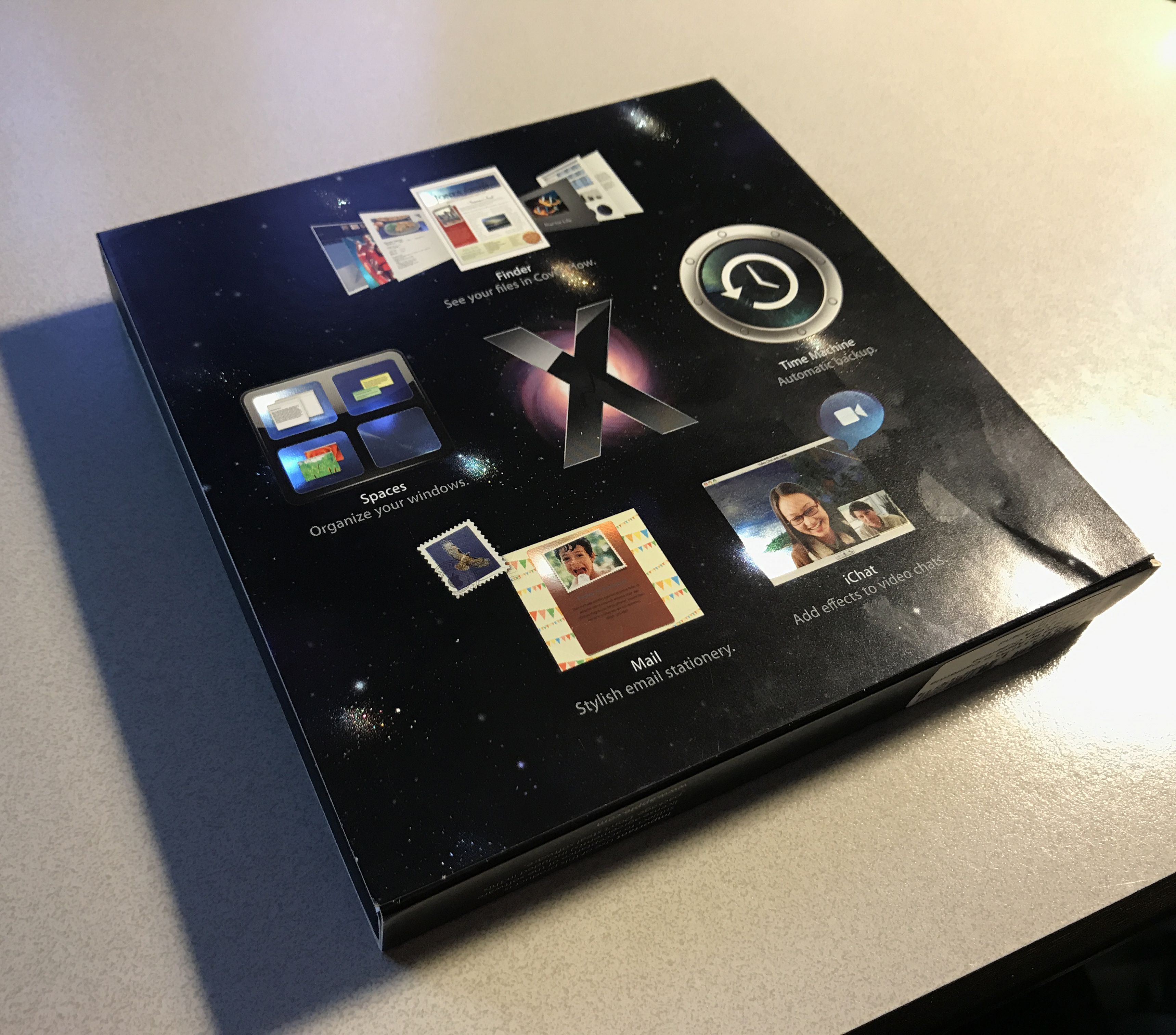
The big OS release in 2006 was macOS 10.5 Leopard. It had a bunch of feature releases, the most notable probably being Time Machine. But 20 years on I still don’t use nor miss Time Machine. I miss what John Sciracusa’s epic review labelled a grab bag item. I miss Spaces.
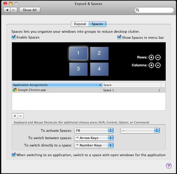
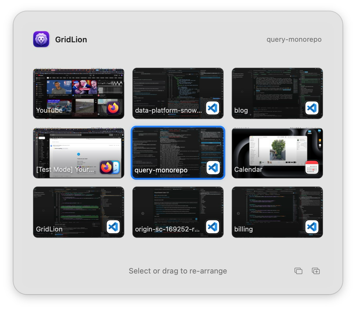
Spaces introduced virtual desktops to macOS and allowed you to arrange them in a customisable grid. Anyone who has used virtual desktops in this way knows the benefit. It allows you to treat them like actual displays in spatial locations. I always favoured a 3x3 grid and treated it like I had 9 screens. Centre screen was my web browser, the screen above my web editor so I could flip back and forth with a single key press. Top left was Xcode, the screen below the iOS simulator. The other screens had other allocated applications/purposes that I don’t exactly remember (mail/itunes/chat etc…) but the benefits were obvious, I could move from one screen to another without thinking, it became muscle memory like I was looking at actual separate physical displays.
I found this grid layout so useful I ended up incorporating it into other applications I built, the grid of 16 sequencing screens you could navigate in my Drum Machine EasyBeats was directly inspired by Apple’s screens.
With the release of macOS Lion, Apple introduced Mission Control, its new take on virtual desktops that inexplicably restricted them to a horizontal line only. I remember thinking at first that I just hadn’t seen the setting somewhere, Apple wouldn’t just completely change how I used my computer right? right?
A single row was/is such a step backwards. If I wanted to get to a particular screen via the keyboard I now had to endure sliding horizontally the whole way. If I remembered the direct keyboard shortcut I could jump directly, but did I leave my browser on screen 7 or 8? This new layout completely destroyed any hope I had of maintaining spatial memory.
I wasn’t alone in my frustration. Alternative solutions popped up but the best of them Total Spaces caused me weird slowdowns and relied on modifying the system dock which was a no go once that eventually required bypassing system integrity protection.
Over time I gave up, and learned to deal with it. An iOS developer had little choice in the matter, and later when I moved onto a new chapter with my current employer I had already bought the extra physical screens and well… just dealt with it :sadface:.
Right now I know some readers are just shouting at their screen “Learn Yabai/Aerospace/whatever”. I’ve tried them all and come away realising they are not for me. I think that its that I don’t particularly like “windows on a desktop” as a concept. It feels like shuffling between papers on a desk, sure the papers can be organised neatly, but I really just want different workstations where everything is as I left it. I like macOS “fullscreen” apps, I sometimes put them in split mode but I really like the concept of dedicated areas for one task only.
Any way like I said, I had learnt to deal with it and merely occasionally complained to my colleagues about maybe moving back to Linux with my next work machine. That was until a couple of months ago, when I saw that someone had managed to remove the animation from macOS when you move from one space to another, without needing system edits. This animation clearly annoyed some people but never really bothered me. However as soon as I saw a space move without an animation I instantly realised I could solve my complaints.
A common discussion with my tech career aligned friends is, in this new age of LLM code generation, does good software have value? If anyone can create software by simply describing it, does it (or will it) make sense to try to make paid software anymore? I think so. I think there is still real value in someone really refining something to the best it can be, making design decisions about how something should behave. I no longer make my living as an indie developer, but I did for a long time and I’m not sure much of what set a good app apart from the pack has changed.
Take a look at any of those knockoff games that flood app stores. Most of the time the problem with them isn’t that they aren’t original or too simple, the problem is the person or team that built them doesn’t care. Caring is what makes the creator “waste” time hunting down things that don’t quite feel right or worry about performance issues most users will never notice.
Anyway I really care about grid based navigation of virtual desktops.
I like the idea of a lightweight wrapper around the native spaces, with support for desktops or fullscreen apps. Just with a grid to navigate. But there is a reason pretty much all solutions that controlled native spaces died out. macOS keeps most of the mission control apis locked down. Its not simply a matter of calling a documented api to add a new desktop, or re-arrange them around. But the ability to move to a space instantly meant I could just create a model that took the single row native spaces and presented them like a grid.
So with the help of an LLM I had an ugly but working prototype within a day. It worked and I was elated, it was instantly something I would have paid money for only days earlier. But after using it for a couple of days, I realised I wanted a much more polished tool.
I decided to spend my very limited free time on it. About a month later I got it to the point where I was pretty happy with it. I decided to name it GridLion, for no reason other than it’s a grid and my issues with macOS Lion I mentioned above. I’ve had feedback this name is terrible, which may be right, but I also think that people value names way too much 😂. Anyway I won’t spend a lot of time talking about features implemented etc… as that’s better found over at the app page. Instead I think it is much more interesting to read about roadblocks and unexpected situations.
It’s funny how you only notice how backwards something is when you are trying to make it easier for others.
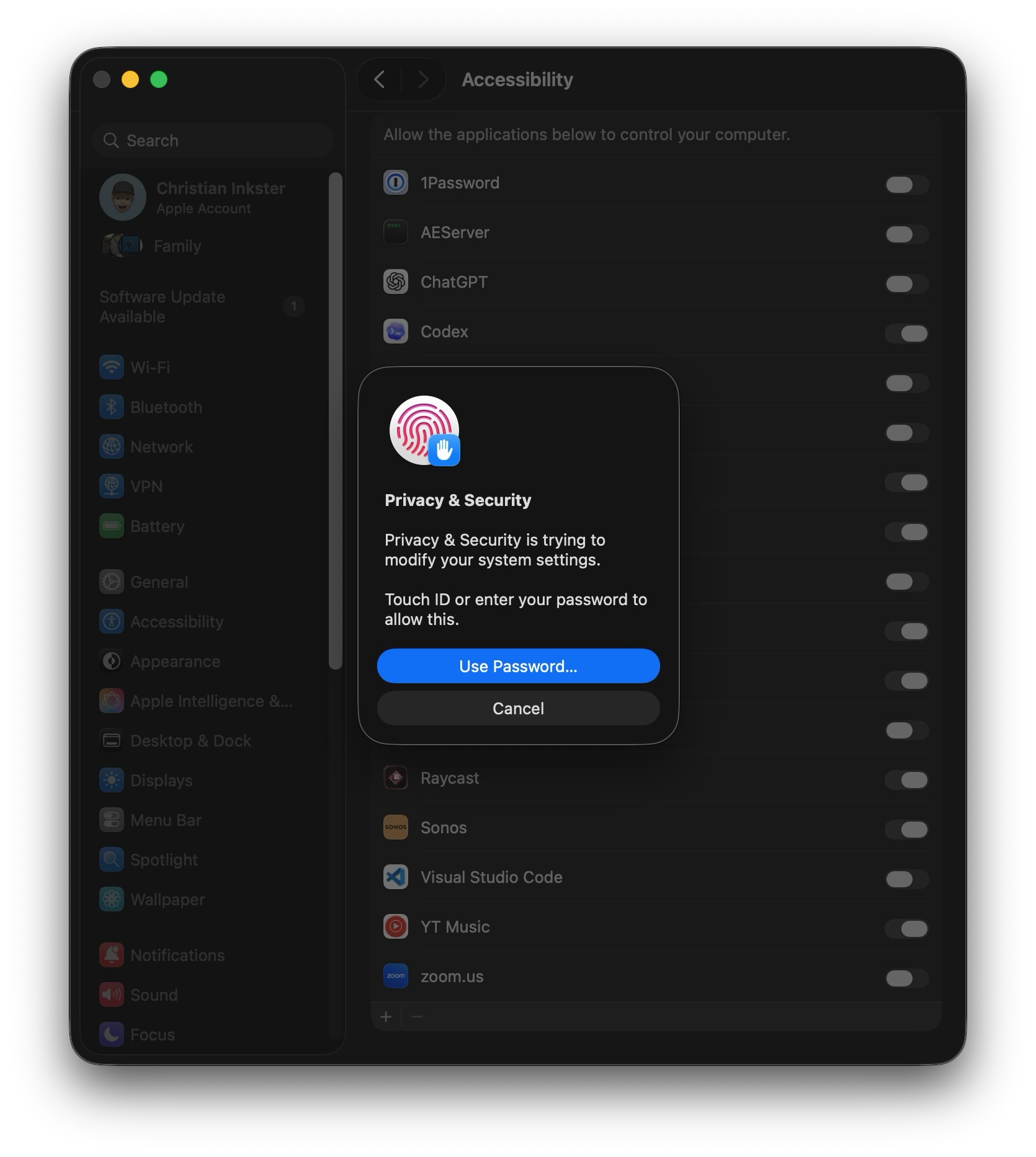
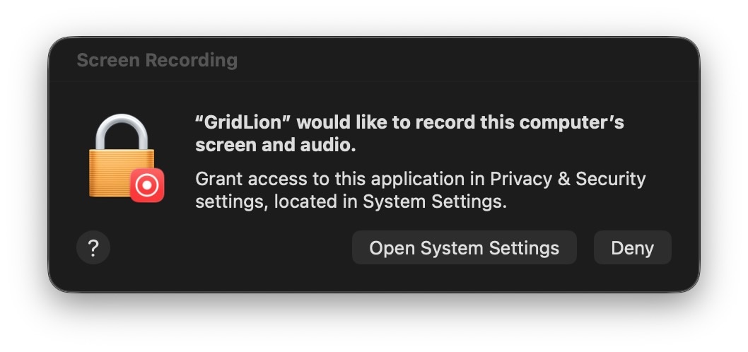
To allow this app to capture global keyboard shortcuts and navigate spaces it needs the macOS “Accessibility” permission. This is totally reasonable, I wouldn’t want software unbeknownst to me the ability to capture key presses. But the flow of how this is approved could be done better like it is on iOS. In iOS if you request a permission, a prompt appears and asks for that permission, if you approve it enables the permission. Done, pretty easy. On macOS however its a whole song and dance. Request permission, user gets a prompt to open accessibility setting or deny. If they approve, the settings open, then the user has to find the specific little toggle and enable it. Another security prompt then done. Why isn’t this at most 2 prompts?
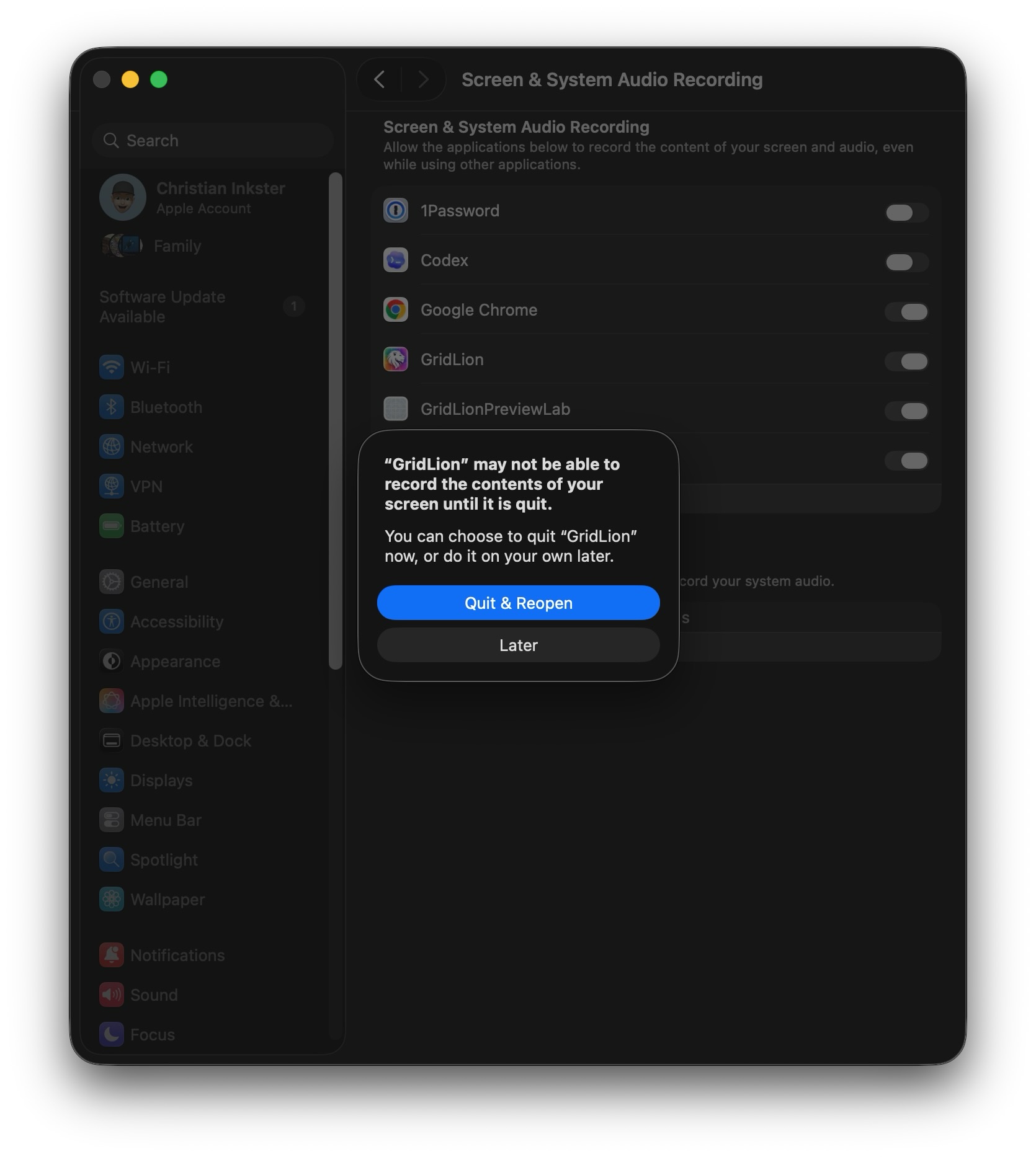
Things get worse however if you want small previews of your spaces ( I do, and most people will I suspect ). This requires enabling the “Screen and System Audio Recording” permission. Like before a dialog pops up asking for permission, which upon approval then leads to another where again you have to find the correct toggle, switch it on where you have to approve yet another dialog, that this time quits and reopens the app. sigh The worst bit of all is that should the user have made it past all these hurdles, because Gridlion needs to create previews of non visible windows/screens you get the scariest dialog yet:

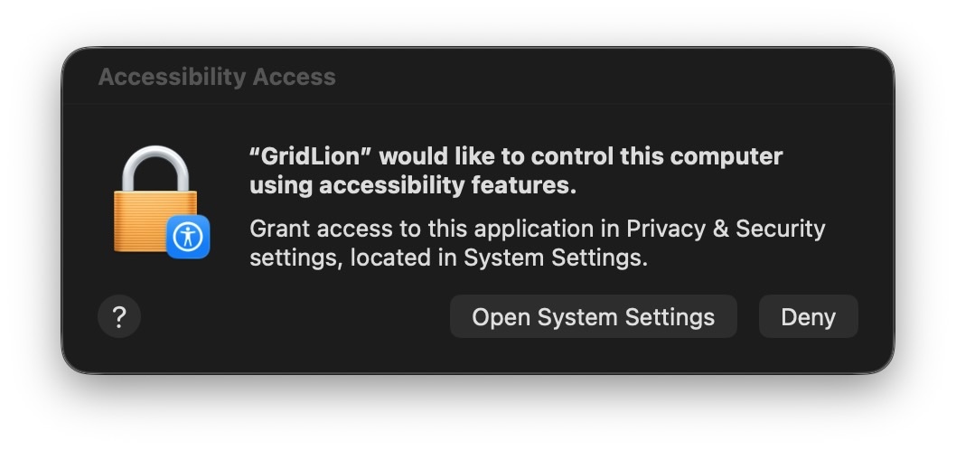
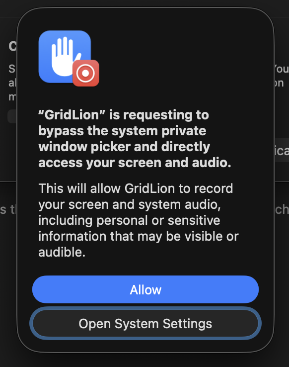
Thats last one is a pretty effective dialog. I even hesitate to click it and I wrote the app 😬. Its a bit excessive for the tiny space preview snapshots but this is what you get when you are trying to do something that should be integrated in the OS. Not much can be done about this except making sure that the app builds trust by never touching the network unless requested (update checking if desired and license key validation).
The app works without that permission, but I think the upgrade is worth it personally.

I’ve only ever sold software through the iOS AppStore. I started it all up so long ago that I don’t remember the hurdles of setting it up. But since GridLion calls private APIs to get space information it’s not permitted on the AppStore. So I had a quick look around at potential solutions.
My first instinct was just to setup website that used Stripe apis and included GST for Australian customers. I am Australian and had done this for a couple of SAAS projects in the past but after being spoilt with the completely hands off nature of various AppStores I was more interested in that sort of service.
Apparently what I wanted was a Merchant of Record. Someone to handle purchases, taxes and refunds. There seems to be three main companies providing this service: Paddle, GumRoad and Lemon Squeezy. I was attracted to LemonSqueezy due to their License code API. Upon purchase they give the customer a license key, and provide methods for activating/deactivating/validating.
I had naively thought I could just create an account, link my Stripe (I believe Stripe acquired/bought/something them) and be selling in minutes. The process however is a bit more drawn out than that. You need to demonstrate to Lemon Squeezy that you are reputable, selling something of actual value/use. There was a few screen casts sent and some social media account proof needed. It was not a problem for me but I could see someone just starting out encountering some roadblocks here.
In retrospect I fully understand these kind of requirements. It’s easy for someone with good intentions to forget about those out there with bad intentions, and since it’s actually LemonSqueezy that deals with the customer ( at least with regards to payments ) they are right to take measures to protect their reputation.
That said even before approval, you have full access to a test account which meant integrating with the app was really easy to setup and test. This all pretty low risk experiment for me but I must admit that I’m looking forward to seeing if this a viable way to sell software outside the app store (Yes yes I know it was this way for decades 😅).
I use LLMs all the time in my day job. I use them as coding assistants and I build products around their services, but this is the first time I’ve used them on a personal native app project and I found the experience… interesting. LLMs are like super fast ships, you set them off in a certain direction but without a good feedback loop they will go off course. You plot the GPS for Venice but arrive at the Venetian, sure it looks the part, but it’s not what you wanted.
Feedback loops depend on the project. With my day job, I’m generally working with concrete targets, correct api results or large dataset queries. If a plan is well specced, the LLM can often see immediately if a result isn’t as desired, then iterate. The bulk of my time is spent reviewing.
This project has been very different. So much of a user interface is about feel, so for anything user facing a human has to be in the loop. It has me questioning the actual gains here. On the one hand, since I haven’t really been doing native mac/iOS work for nearly 10 years the LLM has certainly helped me, but at the same time I think me 10 years ago would have made the same app in the same amount of time and gained a lot more insight along the way.
I’m the number one user so I have attempted to add everything I wanted.
But some things remain. If you want to move a space from one display to another or a window from one space to another there are no reliable apis for that. Fortunately since GridLion works with Mission Control, you can just use mission control to do such tasks but it does niggle at me a little bit I can’t simply do it myself.
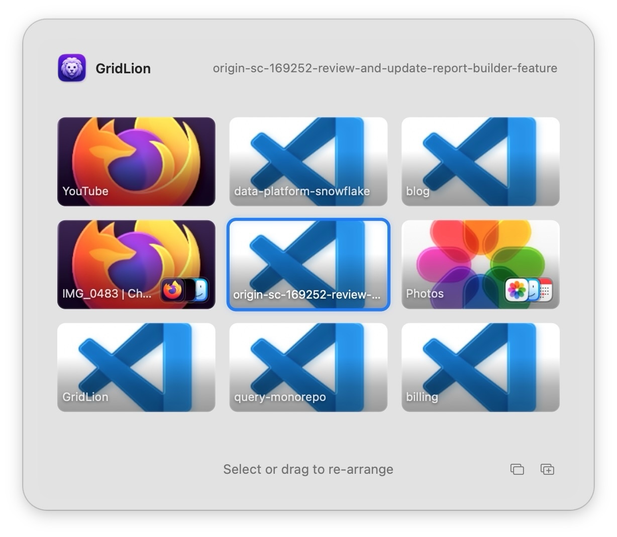
Lastly the ability to have certain applications always appear in a grid location on load. This was a feature of the original macOS spaces but perhaps wouldn’t even be useful for me anymore. Setup/Re-arranging is fast and I rarely restart. Also If you look at the screenshots above you’ll see that I often have many VSCode windows open and I’m not sure how that would have been handled. In any case I’ll probably keep working on a solution in the future.
All this said, I would be very happy if next macOS they announced grid based spaces returning. This should be an OS feature again. Until then though feel free to give GridLion a try.
The setting is "Automatically rearrange Spaces based on most recent use" which explains why the behaviour felt so intermittent.
The non-fullscreen (desktop) case uses an animation for the same purpose, locating the current app window in a sea of others.
So what would the preview be in the swipe-from-desktop case? A preview of the window-sea, or the desktop as is? What should the animation be? I suspect those questions are why they chose to just name the desktop.
I think it would be more consistent if the tab based preview only existed for the desktop window-sea and transitioned to the actual space previews when swiping between spaces.
However, why startups outperform big companies isn't just the skill gap. Even if you have the most amazing leadership in big tech it is monumentally difficult to move the needle on some problems purely because of size not because of incompetence. All I am saying is don't overindex on perceived intelligence. A big org can start looking pretty dumb even though it is still far right of the bell curve compared to even a startup (hypothetically). Org size and the constraints that brings are a significant factor.
Yes and no. Prompting for it modally the way they do now is for sure wild, but for some webapps (e.g. Slack) it makes plenty of sense. I think Firefox used to have a UI they used for some things where they'd inject a non-modal bar with a couple of buttons inside the content area. This sounds like the right type of UI, maybe at the bottom of the viewport.
site.com can send notifications when you're not on this site. (Get Notifications from site.com) (Dismiss)It's a symptom of the whole "we converted our document platform into an application platform" debacle that typifies the modern web.
Notifications make no sense for the majority of websites, but if you use, say, a web-based email client, then you probably do want them.
However, they're also cheaper ($0 or $4.99 vs $13.99).
Radical workflow changes with no recourse is the standard in proprietary software, not so much in FOSS.
Not because she wants to install brew or something.
And even NSA backdoors could be discovered more easily if we had full access to our phones, obviously.
There have been alarm bells ringing in my head for a long time with all these settings, and the fact that they’re buried in the settings app gives me a lot of peace of mind. I’ll click through a lot of boxes and alerts and grant permissions that I shouldn’t. I’m SUPER glad that I won’t accidentally grant, you know, full disk access or accessibility to an app just by clicking on a box that appears at startup.
I remember back in the bad old days when I was constantly making extra user accounts just to run some program. Kinda sucked. Hard truth is, you sometimes want to run code that you don’t fully trust.
GP was saying that systems should be "transparent enough that a compromised system is obvious". I'm not entirely convinced that that's possible (On Trusting Trust should have taught us that compromised systems can create places for the compromise to hide), which means that the salt flats analogy is not a great analogy, IMHO. But at least now you understand the analogy.
For .pkg files, there's UninstallPKG which reads the package manifest and properly uninstalls it.
However, swiping beetween the previews, it sometimes jumps to random places in the order - which is not nice.
Possibly a bug, but I might as well just write this as a letter to Santa because it's got more chance of being read than a feeback.
Jokes aside: yes, I can see how it's technically possible to never experience a workflow change. But also using the same tools at work, your kids school, family you help etc. I just find not very probable.
But like most of the AWS Console, each service is different in a unique way.
Speaking of packages, even more embarrassing, Microsoft Windows literally beat them to shipping a first-party package manager. I feel like Apple lives in a fantasy land that the drag’n’drop app install method from the classic macOS is some kind of platonic ideal — never mind that they can’t stop half the apps out there from going outside that paradigm and installing their crap all over the place.
With that in mind it ends up being weird to me in a way I can't articulate because after all I can speedrun losing a limb if you left me loose in Harbor Freight or speedrun losing all my money and becoming debt-ridden if you give me a laptop with internet connection.
Anyway, I know there's more nuanced discussion to be had still I sometimes wonder how would the ideal approach actually look like without requiring people to have a digital(ing) license before being allowed to connect to the internet.
Except when it becomes a reputational problem for the OEM: Excel sucks at X (i.e., don't use it for that) and Excel sucks can become equivalent in many people's minds.
Sometimes it is actually a problem of people 'holding it wrong' (as the meme/trope goes). And who gets the blame?
Well, if you feel that way, they do make platforms that sound like a better fit: iPad, iOS, even Android kinda fits that mold. I would call them "toy computers" but that is my bias. It's not a real computer to me if I am not even in control of what code runs on it.
And yeah you can root other phones too but then you end up getting blocked in apps, that's the problem. It should be none of their business that my phone is rooted.
Imagine office refusing to work on windows because I logged in with an admin account?
Linux is also doable, but there’s extra work involved with setting up separate user accounts for running specific pieces of software, configuring namespaces for those processes, that sort of thing. But this is backwards. I’d rather start with a secure default state and have to configure exceptions. Back in the day I could get that from SELinux strict policies but it seems like those have fallen by the wayside.
Well, firstly, newer cars are now equipped with tons of safety features like various kinds of auto-braking, various warning systems which monitor blind spots in the car, and driving aids like lane assist, lane monitoring, what have you. And then they also have advanced telemetry features that don’t keep them safe, but their insurance company hopes will identify them as bad drivers if and when they get into accidents so they can be denied coverage. These could be analogous depending how you look at it.
Additionally while there’s not much out there for tools, I think that’s less to do with it not being an issue and more to do with it being kind of impossible? That said a few tools have things like sensors that detect the presence of fingers near saw blades and will not only stop operating, they’ll usually destroy the tool in the process to ensure the operators safety, because fundamentally, more saws exist, more fingers do not.
Like despite loving track driving, I wouldn’t think that everyone tearing around in V8 monsters with stripped interiors and roll cages is a good idea.
To attack your specific example, cars have added all kinds of things that "hand hold" the user and keep them (and others) safe: Seat belts, air bags, anti-lock brakes, traction control, automatic emergency braking, back up cameras, lane keep assist, blind spot monitors, etc, etc, etc. (Oh, and guess what, per-mile traffic deaths are WAY down from a few decades ago).
I guess sadly the press will gloss over all the intricacies for a few clicks.
I also feel that dumbing things down probably just exacerbates this problem as "reasonable folk" have no clue how you actually get from a to b.
Generally I have to admit that society is trending towards making things safe(er) by default but as always with every trend some attempts at following or complying are executed poorly (intentionally or unintentionally). Here's where I agree that while some safeties are universally good and people that disable them suffer from overconfidence I have seen some examples like experienced people removing the shields from brush cutters because they can get in the way and increase the risk of a tangle when cutting overgrowth (though you have to be mindful and careful to not fling small rocks around afterwards).
And yeah, I see your last point and generally agree but for fairness sake I would like to present the other extreme end where a person on a bicycle against a pedestrian is also dangerous albeit less so. That said I'm about to accidentally argue in favor of the "guns don't kill people..." rhetoric and I really don't want that so I will concede that for the time being it's better to (thoughtfully) design safe systems instead of relying solely on operator diligence.
Oh how I dislike that objectively I recognize the need for safety yet subjectively I disdain the fact that my tools try to nanny me and I can't reconcile these two views :/
A discussion on which I think we'd absolutely agree. But yeah, it's a thing, whether we agree with it or not.
> Generally I have to admit that society is trending towards making things safe(er) by default but as always with every trend some attempts at following or complying are executed poorly (intentionally or unintentionally). Here's where I agree that while some safeties are universally good and people that disable them suffer from overconfidence I have seen some examples like experienced people removing the shields from brush cutters because they can get in the way and increase the risk of a tangle when cutting overgrowth (though you have to be mindful and careful to not fling small rocks around afterwards).
Oh 100%. I would argue most safety features, even when implemented well, will encumber those who were already skilled, which is why you rub against the ones in MacOS. It just... I don't think there's a way around that, you know? Think it's just an immovable law of the universe.
> Oh how I dislike that objectively I recognize the need for safety yet subjectively I disdain the fact that my tools try to nanny me and I can't reconcile these two views :/
I struggled with this for a long time too, but for me, it kinda resolves with the following reasoning:
On balance, safer... everything... makes for a better society, because it enables more average people to do more things, to go more places, to use more technology, to make their lives better. And the fact is, for more experienced people, we can get around this.
Like the security constraints in MacOS are a great example: they are fucking ANNOYING when you're configuring a new Mac, completely agreed, because every last thing requires so many steps. However how often do you really find yourself needing those options in daily driver use? I can count on a hand the number of times I needed system access the last couple of weeks (and usually it's just an app update where I have to give the app the go ahead by typing in my password). The last time I had to open security options and do that whole procedure... it would have to be weeks at minimum, perhaps even months.