If you have a UX element that I will be able to interact with before and after an interaction, then keep it visible during the transformation, process, whatever. What UX gain is there in hiding these buttons during the rotation on the iPhone? It doesn't even look better, though appearance has been the altar that recent Apple software has sacrificed actual UX gains.
Will agree with the author though that these taps need to be processed independent of animation.
Simple totally offline ONNX models exist, whcih should make it trivial to categorize the right orientation. Acceleometer/magnetometer can feed this, but should not be the default.
Just do this and avoid the hassle of rotating at all!
Overuse of animations is a terrible thing that has made iOS far worse over the years. I long for the days of yore, when the loading screenshot had a chance of being accurate.
These days, when loading something like the health app I get a series of three different screens, rather than just landing at the destination it knew o wanted to start at. It is idiocy of the highest order. Why show some series of random screen transitions while starting the app? Somebody who has no clue about UX programmed that piece of crap, and then an entire team put up with this behavior. I dearsay that if this shipped under jobs there would be a director level firing to stop it.
Same BS happens with Apple Maps. If you launch the app and it remembers that an hour, day, or two weeks ago you had your phone in a particular orientation forever ago, it slowly rotates the view pane over 1000-2000ms from you ancient view pane as if you've been waiting patiently over two weeks so that Maps doesn't suddenly disrupt your view...
Animation can be helpful but at some point a half-wit VP shoved it into everything Ruth disastrous results and Apple is still recovering. Liquid Glass is a similar disaster of incompetence being promoted far beyond capability.
     *-----*      *-----*
    |       |    |       |
    |   ●   |    |   Ω   |
    |       |    |       |
     *-----*      *-----*

      [================]
The iPhone was eight taps. The Nothing was six. (Yeah, I could have noticed it while watching, but I was situationally incapacitated; namely, I’ve just waken up.)
---
Edit: I’ve rewatched it at 0.5× and the Nothing was eight taps after all, too. Author’s point was, indeed, that all taps should register regardless of what animation state is, and Nothing doesn’t do that. Sorry for the confusion!
---
Regardless! I still find the iPhone one more pleasant to look at, because the animation doesn’t stop. But if you press quickly enough, I guess what they could do is animate until the taps stop, then:
• if the image will arrive to the desired state: finish up the current 90°;
• if it’ll still be 90° away: finish up then show one more 90°;
• if it’ll be 180° away: flip it upside down, then finish up the current 90°;
• if it’ll be 270° away: flip it upside down, finish up, and show one more 90°.
But that’s not a very practical thing to implement I suppose.
We could make something similar for UX. Just a bunch of design pattern constraints that throw flags if you try to ship something with well established UX warts.
No? It makes the opposite argument.
And, you don't have to worry about what to do in the case that someone hits the "rotate ball" button while it's still rotating.
> And it would be so much more predictable and pleasant if you could just tap the button three times at any pace you wanted without thinking, without paying attention, without getting your UI blocked by an animation that no longer helps you.
Am I misreading this?
Eh, it's a pretty trivial problem, comptometers have it figured out more than a hundred years ago.
The Nothing isn't executing all the taps, some are blocked by the animation. It is responding visually and haptically to all of the taps, but some are blocked from doing any work by the animation.
You also said the Nothing was 6 taps but I'm not seeing anywhere the article says that. I believe it was 8 taps on both.
> And it would be so much more predictable and pleasant if you could just tap the button three times at any pace you wanted without thinking, without paying attention, without getting your UI blocked by an animation that no longer helps you.
They cite accessibility.
The thing is, I can imagine the complete opposite side of the argument, where someone with motor impairments or parkinson's, for example, ideally liking if their over-clicks were ignored if they'd already locked-in their intention.
It's tricky to get this stuff right.
I am still reminded of a keynote where Steve Jobs was demoing how much faster PDF documents would display on the newer macOS. So he had engineers put a button in for him to click that would scroll through the PDF on the screen, and he accidentally clicked it more than once. Steve wondered aloud if it would scroll all the way through twice… and sure enough, it buffered the process! He had to wait for it go all the way back up and scroll through a second time!
Steve saved grace by telling the audience that, even with moving through the document a second time, altogether it was still faster than PDFs had been in the last version of the OS.
They are there to mask loading times and ease from one state into the other. That's why we have them.
This knowledge eventually got lost (figuratively speaking) and now we have code that needs to wait on the animation to finish.
Another amazing example of cargo culting.
Engineering attention is finite. Why would you spend time thinking about 8 clicks when most people will only need ~3?
Not all user-action possibilities are equally important, and if they are, then you better have infinite resources to spend on engineering.
The Flat UX fad was objectively terrible on just about every metric I was taught, but people were actively pushing for such designs.
Your write imperative code, which issues two commands, both of which can fail independently.
There are plenty of ways to pretend to 'deal with it'.
Firstly it will just pass all tests, so most devs can stop thinking about it right away.
A dev might think you can just catch and log the exception. Doesn't fix it.
You could run the code in prod for a while, see if it goes wrong. It will, at which point the dev will try it again, and it will probably work the second time, so they can stop thinking about it.
There was a big outbox pattern discussion a couple of days ago (split thing 1 into two halves, and do them atomically, leave thing 2 as an exercise for the reader.)
I think the reason you encounter this problem in the real world is that devs just exist in some quantum superposition of "it won't happen" and "I fixed it" and "it can't be fixed".
I'd expand on this: used well, they show the user than a state change is happening directly because of a particular action of theirs, and hint at how they might reverse or modify it.
In fact I'd disagree with masking. If something appeared instantly with no hint as to why, that is a distinct anti-pattern on a touch screen.
This is really common because of two design features that most UI frameworks share:
- The code that changes the color of the button is an internal part of the "button" component, so that people don't have to individually implement it on every button. But this means that it's kind of disconnected from the code that actually performs the action. If the "on click" handler has some last-ditch check that aborts the action, like the "don't rotate the image if it's in the middle of the rotate animation" check from the article, often there's no way for it to tell the button to cancel the color change. (And conversely sometimes the "on click" handler can fire even if the color change animation doesn't play correctly.)
- Buttons usually change color when you press down the mouse button, but only perform the action when you release the mouse button. Sometimes this is used to intentionally give you a chance to cancel the action at the very last minute by dragging your mouse off the button while it's still held down (or, on mobile, to e.g. reinterpret your interaction as scrolling instead of clicking), other times it just creates more opportunities for something to happen that prevents the action from working after the color change has already happened.
Now if you just naively read out the current state of the button and do something with it elsewhere in the program looping may be off or on randomly.
It is not hard to imagine if there is some other logic (or e.g. a rate limit) on the 30 seconds and on the beep that these would see different slices in time of the button. Congrats you built a button-debounce based RNG.
Physical buttons can be surprisingly complex if you don't rely on someone else's driver. The correct solution is to debounce the button, that can be done either in hardware (too expensive, so rarely done) or in softeare, by e.g. averaging the last 50 reads and wait till the majority is either off or on.
This should be common knowledge for embedded programmers, but every noe and then you will see someone who has never heard of it.
You've just succinctly made the argument against checked exceptions FWIW (which I agree with you on). Anyone who has used Java in anger (is there any other way?) will be familiar with:
    try {
      doSoemthing();
    } catch (CheckedException e) {
      logger.error("Didn't work", e);
    }
This is largely a sotware issue. Control systems are built to handle these kinds of things. A traffic light can't accidentally show green in two directions. It's literally wired for that to be impossible because it's simply too important for it to not be possible. You constantly have to deal with faulty sensors so you have systems that will seek a consensus from 3+ sensors and, if that fails, it'll fail until you fix it.
But in software the standards just seem to be much lower even though it can be critical, even lethal eg [1]. Network interfaces should be fuzzed. Every IO operation should assume it can fail and be tested for when it does. Every IO operation should produce unexpected output. And it's simply cost-cutting and a lack of regulation that allows this sloppiness to persist. There should certainly be strict liability for any companies that allow this to happen.
[1]: https://ethicsunwrapped.utexas.edu/case-study/therac-25
It could probably be done as a global device setting - e.g. ignore taps within 100ms if they're within 50px of each other or whatever.
I was really confused at their mention of accessibility, because my mind jumped to people with hand tremors who would double press when they intended only one press.
And then, of course, there are the people that double-click every button. To handle that, disabling a submit button in the onclick is very common.
> The Nothing Phone button gives you a tap confirmation via both haptics and sound, and then ignores the tap if a previous rotation is still animating.
This is the issue. Number of performed actions has to be equal to number of times the app identified that button press was registered. Debouncing is a good practice, but if it is used then debounced taps must not produce feedback.
Nowadays, you use transitions instead, which are not queued. But I still very occasionally see things that use queued animations.
On physical keyboards we already have three different kinds: normal buttons, modifier keys (shift, etc) and toggle keys (caps lock).
High stakes rare actions can require special button designs. E.g. on a black magic cinema camera the button that formats the memory card needs to be held for three second while it visually counts down. This gives a small delay during which the user can decide: "Fuck this is the wrong memory card!" and cancle.
The downside is that some imaginary power user that uses the camera only to format a stack of SSDs will get burdened. You have to decide which is more common and make a decision.
1. "The Nothing Phone button gives you a tap confirmation via both haptics and sound, and then ignores the tap […]"
2. There is a really good reason to tap this button 3 times in a row.
At the very least, you should consider which is appropriate for which situation, what if, in your UI, for some buttons one is the obvious choice, for others it's the other, but for some it's not so clear, and both behaviours are defensible? Now you've got an inconsistent UI.
I have no good solution for this.
So, for me, on the argument of about accessibility, the Nothing Phone behavior will work a lot better I think. In their mind they don't count and click 6 times to put the image in a specific position. In addition with considering that it would not make much sense to click 8 times in advance to turn back in the exact position where you are.
The mindset in their case is more: click and wait, compare if it is the position you want and do it again. The other sensitive button that will bufer would probably trigger overshooting, going too far, then too back, etc... similarly to when you have issue scrolling in a list to the right spot.
The case of the iphone would be better only for someone like a younger person, tech nerd, that want things to go fast without having to wait. Same thing for computer keyboards where I could type multiple letters in advance before the first one even show up on the screen with the lag.
I couldn't even finish the last Apple presentations as it all feels so stiff, inhuman and run by suits, they all seem like robots scared of diverging from the holy script who will get fired if they display emotions and humanity.
Off-topic perhaps, but got reminded how delightful even the somewhat messy ad-hoc presentations from Jobs were.
This same issue also seems like it would prevent you from quickly double-tapping the button to turn an image upside-down, a much more common use case.
It is probably daily that I encounter products and procedures where I can see that a given scenario is kind of a an edge case, but not an unforeseeable one. Given the scale of many things, edge cases happen pretty frequently and with ever more ridged organisations, lack of customer service, human interaction and a quest for ever more cost savings, hitting an edge case can be everything from frustrating to catastrophic for a person.
Generally I think we, as in humans, need to slow down.
EDIT: sometimes UI elements with mouse-held interaction allow you to use the escape key to cancel an in-progress interaction (ESC: abort, mouse-up: commit) however the reply button on this page doesn't work that way so I have to edit this message to add this. That escape-key behavior should be universal I think.
Although in 3.1 it was easy to tell what was interactable, despite being flat. I attribute this to the use of standardized components almost everywhere.
I want it to rotate an image by 90° when I tap the button that does that.
See, this is exactly my point when I say that animations are no end in themselves. They serve a supporting role to better get the actual job done.
The actual job is not "feel" it is "do". For vibes, there are movies, Art, and AI hallucinations.
Of course, "feel" can greatly enhance the "do", but only if it takes the back seat, which is exactly what I just said.
__
The age-old debate "form follows function" vs "form over function", essentially.
One of them is correct tho, because in the real non-ZIRP world, correctness is defined as "achieves a tangible goal".
Which is not to say that stuff optimizing for other goals would be "incorrect" or "worthless", but it exists in a different category from "software". More like "software-adjacent Art".
The distinction being made based on "what is the primary goal we want to achieve here"
____
Related:
Also caused by ZIRP but differently, we have that problem that software trying to invoke feelings usually does so because it wants to sell you something or has any other style of goal that might not be aligned with yours.
So that adds yet another layer.
Pure utility cannot scam people into stuff they actually didn't want to do.
No, but what should happen in cases like that is that the on-click handler disables the button while it is unresponsive. This will communicate the fact that the button is unresponsive visually to the user and also inhibit the button-was-pressed feedback.
The standard way to debounce is to attach an timer to the button. When you press the button, an ISR runs that temporarily disable the timer from triggering again and starts the timer for a specific period (say 20ms). The processor is free to do whatever it wants for the next 20ms. When that timer expires, another routine checks to see if the button is still being held, sets the button's state accordingly, then re-enables the button Timer so it can be triggered again.
Averaging loops are much better for analog inputs where you may have noise that throws off the reading. You only care about a button being on or off, it doesn't matter if it's been mostly on for that period only that it's still on.
When you get into extremely fast digital inputs that need to be reacted to sooner than the debounce wait period, that's when you need hardware debouncing.
I use some fairly popular (in the MSP space) backup software that thinks the network is infallible. The worst case I’ve seen is when it fails on a network request, doesn’t retry adequately, and incorrectly logs the error as data corruption.
I know you mean "debouncing" but I love the autocorrect. Like the button is some almighty authority that Denounces noisy signals.
Absolutely everything seems scripted including hand movements, shifting of postures, smiles..the whole works.
Now I just wait for the press release and that’s that.
If you flip it and instead ask "how do I write something that can't fail?" you might find some interesting ground.
The best things I know about are static type-checking, pure functions and totality. Different languages provide more or less help with these things. It's perfectly fine to do 'two things which don't fail or cause other things to fail'.
Forgive the digression, but there is an 'infectious' aspect to the above 3 things (see the function-colouring problem), e.g. you can't build pure functions which call non-pure functions. The Dependency Inversion Principle (of SOLID) gives some help in how to tackle this.
Also, the above things only work within one node (of a distributed system).
For multiple nodes, I use something like Kafka, where you write down one event, and have two systems subscribe to it, each doing one thing. Yes, there's still the obvious issue of them failing independently, but when that happens, you have an authoritative source of truth (in the form of Kafka events). This beats the craps out of developer logs.
You skip the laborious questions of "what happened in the system?" and "what should the correct state be?" Because the events are already the answer - just eyeball them.
Events also machine-readable, so if you diagnose a problem and a fix it in one case, there's a good chance you can build a detector for other cases. You don't have to wait for a support ticket to get escalated to the dev team.
You also divide the debugging space dramatically. If the Kafka log says one thing {Bob bought Minecraft for $10}, then the Ownership service is just wrong if it says Bob doesn't own Minecraft, and the Finance service is just wrong if it doesn't report the $10. Fix each independently. At no point do you need to look at Ownership and Finance together to see which one failed halfway through talking to the other, because they don't talk to each other.
Lastly, events are verifiable; they are their own audit trail. If your boss asks how much money is in the system, would you feel more confident reporting whatever the current balance is set to (i.e. the outcome of whatever code executed the last "UPDATE Balance ..." statement, or would you like to be able to sum over every transaction that you ever recorded?
This is a bad way to do it because it adds avoidable latency. A moving average is a low-pass filter. The switch bounce is better handled by hysteresis. Change state as soon as you see an edge, then ignore further edges until a timer expires, e.g. 5 ms, which should be enough for the bouncing to settle. A 5 ms timeout limits your repetition rate to 100 presses per second, which is beyond human capabilities.
You might want a tiny bit of hardware low-pass filtering too, for EMI resistance, but that's with microsecond-scale time constant, not milliseconds.
Let's say you want to retry a network request. It's... A bit more complex than it seems, right?
Firstly, you need to know exactly what type of error you ran into. Some errors aren't really recoverable. Maybe a programming issue occurred and you are constructing an invalid URL and the HTTP client is yelling at you. No sense in retrying that 20 times. Maybe it's a network error, that seems like a good candidate to retry. Maybe, the request succeeded and we have a response, but it is a 500 error, again, seems like a good candidate.
Secondly, you need to know if it is safe to retry. If the request is essentially idempotent, like a read-only GET request, then surely it is safe, right? But, what if it isn't safe? Forget about solutions like idempotency tokens; let's assume you don't control that. Now you need to figure out how you can know if the request had side effects. If a well-known 4xx error is returned you might know, but if you get a network error or a 5xx error it's much harder. Did the request fail during a buffered response after the side effects were already applied? Maybe you can check to see if the request applied with another request. Now you have two network requests, and both need error handling.
Finally, and probably most obviously, you have to make sure you don't hammer the server when it is under load. To avoid the thundering herd problem, you'll probably want to use an exponential backoff with some jitter.
What sucks about all of this is that while there are reusable components here, the concerns effortlessly cut through different layers, making them a pain in the ass to deal with. It isn't that it is impossible for a library to handle all of these problems (I anticipate an excited evangelist may reply explaining how their favorite library does it all in one package if this post gets enough visibility) it's just that this is hard and these problems repeat in different forms, in a way that makes it difficult to fully eliminate the repetition. And this is just the most obvious basics, whereas in reality there are almost always case-specific complexities.
You can, for example, encapsulate a reasonable exponential backoff with deadline implementation and apply that as appropriate for different things, but you can't really cheat your way out of having to think about all of these things, especially if you don't control all of the network APIs you might have to interface with.
This is one part of why I don't like try/catch exceptions. They are an appropriate mechanism to use as a failure isolation boundary due to their stack unwinding capability: it would still be bad in most cases if a logic error or upstream error not being handled properly in a single network request handler were able to crash an entire network server, so being able to blanket catch everything that bubbles up an log it is good. But then using this for normal error handling, it makes doing the wrong thing perhaps just a bit too easy. I don't think you should have to self-flaggelate in order to say "just crash if this errors", but I do think that you should have to say it. Try/catch exceptions are backwards by default, just write normal looking control flow and no errors are handled and it's hard to tell if there even are any. Checked exceptions try to fix this but somehow this feels even worse; now you have a flattened list of exceptions that may occur at various different layers of depth, in some cases the same exception can occur at different layers of depth, you may literally need to read source code and map out the call stack in your head to be sure. (Hope it doesn't change later.)
The Result or Expected type concept seems like the way to go in the frame of modern programming languages. Go's error passing also works OK though it has papercuts (that a linter can help you with, at least.) To me it makes more sense to make stack unwinding error handling a more niche feature used for isolating error domains, rather than use them for all error handling.
But even that! Even that doesn't solve the problem. You still have to sit there and think about the types of errors that can occur and their consequences. At best, explicit error handling with value types just encourages you to confront it and makes it visible, even in cases where you still say "OK, pass to caller".
My favorite example of doing it wrong is a log in form: if the login button is clicked twice, the server would reject the login because the first click has already used up the one-time token so the user gets an error page.
But I think the biggest problem is that people either apply denouncing to all buttons in a UI (like turning it on within the framework they are using) or apply denouncing to nothing. So there really isn’t a culture for carefully considering which situations warrant which.
Now they have at least two problems.
The fact that it makes content move in a way that is illegal breaks my mind. You try to check "is this the end" and it all starts moving. What the hell. Why.
I kinda forgot just how much I hate this animation. Thanks for the reminder. Why, google.
You need to denote a button is different from text. You need feedback that a UI element was interacted with, and for toggles you need for people to be able to tell what represents on vs off. The borders between different UI elements needs to be clearly defined, etc etc.
https://www.custompc.com/wp-content/sites/custompc/2023/06/W...
FOMO for sure is one of the driving factors.
"We cannot risk looking outdated". So weak management, probably.
But also talent availability I suppose. If there's a new trend, the pool of people you can hire include many that are in on that trend.
UI frameworks too, probably. The modern thing™ does the modern thing™ and you do want to be on the modern thing, because you fear that only that receives security fixes or whatever.
I don't know, I understand the principle, but I don't see how you can determine the value of a principle outside of a specific context.
Even for accessibility, we can't target every context in the name of being accessible. We still have to pick which contexts of inaccessibility we'll need to support with more attention.
It's possible to have a flat style but have buttons that look clearly like buttons, and elements that have shadows and colors.
But wait, there's more: when the elevator arrives until it leaves, the button should flash or change to a more prominent color. Why? Because imagine someone presses up and someone else presses down, and the elevator arrives going up. If the up button switches off at this point, now only the down button is lit which clearly signals the elevator is going down, which is wrong.
> The actual job is not "feel" it is "do".
According to.. you? And subject to your expectations? If I click a button to rotate an image 90degrees on my phone's image editor, I personally expect (and want) it to have rotation animation.
So who's right? You, because you speak in absolutes?
But rotating an image is one of the rare use cases where I do want the animation. It makes me see what action happened, with which rotation angle, without having to think twice.
It's not a debate. If you are making app to do something, "form follows function " is always the right choice. If anyone on UI/UX team tells you different you should fire them, they are not interested in making good UIs. If it comes out ugly, well, you need to get good at making useful stuff also look nice
"form over function" only applies to stuff that is looked on more than used by overwhelming degree. Any other case is just someone using it as excuse for them being shit at producing useful stuff that also happens to be beautiful
In most cases that is going to lead to annoying pointless flickering as most actions & animations are basically instantaneous, and with touchscreens even in the non-pointless scenarios it won't have the desired effect as the button itself will be hidden from the user by their own finger.
In principle I think you are right, but in practice buffering presses is often probably the more user-friendly option.
Being fast does not make you a power user. "The button works when I push it twice" is a reasonable expectation of a device by default. If that weren't the default, then most people would have a worse experience with their phone.
we are not fully enumerating and reasoning about failure cases.
I expend all my effort in avoiding 'doing two things'. It's bloody difficult, but since I've come around to thinking that recovering from 1-of-2-things-failing is probably impossible in most situations, doing it the bloody difficult way is easier.
Which to me makes no sense, surely you have some budget for risks if you are a 1T company? I suppose their risks are more moonshots to some degree like the Apple Car but nevertheless, I do miss the old presentations.
If the operation is idempotent, well, clicking twice doesn't do anything. I'd still want to see the button light up to signal that the UI is alive, or the button could grey out or enter a "latched" state like a radio button if there is nothing to be done. Behind the scenes suppressing command propagation is an implementation detail and the trade off is between front-end complexity and redundant command execution overhead.
If the operation is not idempotent I can give you separate examples where different behaviors are appropriate:
1. A button used to increment a counter (e.g. quantity of GPUs to buy) should increment on every click, even if the UI response is delayed. The user can count clicks, and there is going to be a decrement button to reverse any error. You do not want the user waiting around guessing whether the software is still processing the remaining clicks. As a rule, so long as the operation is non-destructive (e.g. inc and dec buttons, all operations reversible/undoable, etc.) every user interaction can and should be actioned.
2. A button used to perform an irreversible action, i.e. a "commit", such as placing the order to purchase a GPU, should only perform that operation once. I would not call this an idempotent operation, certainly not with respect to your bank balance.
I guess you might want to fade it from red to green (red being "this works" and green being "it'll do what I want"), but I don't mind the holding-down behaviour. The only problem is that you can never know how long you need to hold it down for unless you stop holding it.
It would help if GUI elements had a property “automatically disable on click”, removing the need for the “on click handler” to disable the button (in exchange for adding the need to explicitly re-enable it).
I don’t remember seeing GUI libraries that do that, though.
That probably is because it would confuse users if buttons visually get disabled when they click them.
So, the best answer is to visually keep the button enabled, but ignore rapid further clicks. That’s debouncing.
Nobody seemed to have a problem with it. It was largely clear what was a button and what was a checkbox. In hindsight it was certainly uglier than the 95 style (maybe just because I grew up with that) but it wasn't unusable at all. As you say, it was clear what was a button, what was a checkbox. I think it was because GUIs were mostly made out of standardized elements whereas today we have everyone trying to put their unique spin on every element.
I doubt the pleasure of aesthetically pleasing programs can weight up for much. Then there are the ugly and bad programs too. Those have no redemption to speak of.
The motion itself indeed gets picked up intuitively by the brain.
Okay, I'm convinced that picture rotation should be animated to the exact degree that achieves this.
Well, yes, dropping user inputs is "being broken"
An averaging filter makes sense if you have a noisy analog input. For a button input that registers whether it is pressed or not except for a known noise around transitions specifically, ignoring the transitions immediately after the first one registered is not only faster (both in terms of latency and CPU cost) but easier to implement. It's also equally practical for switches with long bounce, where the time it would take for an average to favor a transition might be impractically long.
If you want to achieve low-latency input, "act on first edge, then ignore for the switch bounce period" is a far better approach. It also conveniently solves the "press, then release within bounce period" problem where an averaging algorithm would completely ignore the button press.
There are 2 things here worth paying attention
* first "bounce" is user action * last "bounce" is stop of user action.
You can run action on first bounce then just ignore the button for whatver debounce period you deem satisfactory. But adding delay to start action is always wrong answer for debouncing.
Now the harder problem is the off of the button, especially if hold is also an action but "be off for at least few ms" usually handles it well and off time is not lag user feels
And even with no additional latency, 5ms is perceptible in some cases anyway. Microsoft Research has a video demonstration:
There are other situations but not for a button. There are inputs that might be continuously noisy where a sliding window / ring buffer rolling sample is the only way to tell the difference between states. But we are talking about binary input controls actuated by a person, not a thermometer or O2 sensor.
The visual representation updating (greying out button) is a result of disabling the button, not the same thing. In virtually every GUI toolkit I've ever used there is the concept of the main UI thread, and everything that happens (input and display updates) necessarily has to go through that single thread in order to ensure correctness. (This applies to browsers, too.) That's why input goes into a queue, so you can easily do things like:
(All on the main UI thread):
  - Receive click event 1: disable button, start background process. Possibly redraw button UI *but it doesn't matter because the UI display is not the state, it's just a view*.

  - Receive click event 2: nothing happens, button is disabled

  - Background process finishes, posts update to re-enable the button

- Receive click event 3: disable button, start background process, etc.For users with JS disabled, your solution seems good.
I really don't think that "keeping people entertained" is a sensible goal within the context of building software as tools and not software-adjacent Art.
Which is not to say that I would not want a great and polished experience, but that is not equivalent to "being entertained".
___
It would be nice if not everything one interacts with would try to get some sort of emotion out of me. Bring back being bored.
As opposed to what? Be entertained by all the bells and whistles of modern operating systems that have practically unusable user interfaces?
I don't think I know any non-tech people who like things changing about. Some tech people like that (I don't), but for the non-techy, it's just another thing they have to relearn for no good reason.
We have to go all the way back to Windows 2 in before we find flatness.
Let's say you tell someone to do something, and they say "ok". But when you ask them later whether they did, they say "oh no, I just said ok to indicate that I heard you, not that I was going to do something about it." That doesn't make any sense. The indicator light has the same function. Going on and then off again is a violation of basic communication protocol.
Having computers imitate real world items is useful, because it provides a reference to other things rather than just being its own unique thing. This is useful even if you have never actually used it outside of a computer setting. A stereotypical telephone receiver icon almost always means 'call', even if you've never used a landline phone (much less one that's shaped like that icon usually is). Nobody has ever used a real-world hamburger menu, yet it's described in skeumorphic terms, since it's easier to explain and relate to.
One thing I was (and still am) worried about when it comes to my recent big interactive essay is that by showing all these classic desktop examples, the whole thing might appear old-fashioned, relevant only to a bygone era.
Yet, the challenges it shows are universal. Here’s something I just spotted. This is how you rotate an image on an iPhone and on a Nothing Phone:
It’s a pretty standard control – tap once to rotate counterclockwise, tap a second time to do it again, etc. – with a helpful transition of the photo’s orientation so that you don’t lose yours.
Now, I’m going to exaggerate the problem a bit and tap 90-degree rotation quickly eight times. Eight times should result in what engineers call a “no op” – the image rotating twice in full, and ending up where it started. That indeed happens on the iPhone:
But it’s a different story on the Nothing Phone/Android:
iPhone will remember and buffer the taps, so that the second, pending rotation will happen as soon as the first is done. The Nothing Phone button gives you a tap confirmation via both haptics and sound, and then ignores the tap if a previous rotation is still animating.
Why does it matter?
I often keep thinking about the framework of situational disability, stating that disability is not just something that happens to a few people and no one else. No, pretty much everyone will occasionally encounter a situation that will make them effectively disabled, and this is why accessibility matters much more than many of us assume:
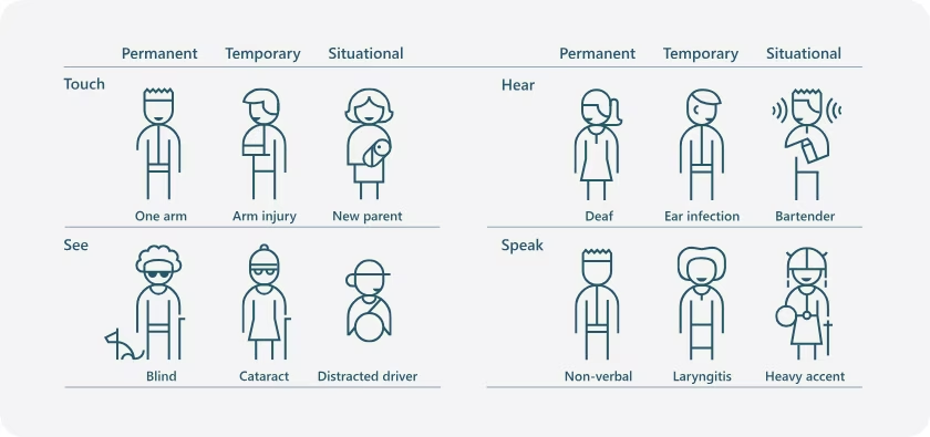
I think similarly about casual and non-casual use. Photo-taking on phones is typically casual. Phone cameras are typically very good at detecting the photo orientation – but get confused when you’re pointing down. Now, as an example, if you had to take photos of a bunch of landscape documents, you might end up having to rotate dozens of photos, one by one. And it would be so much more predictable and pleasant if you could just tap the button three times at any pace you wanted without thinking, without paying attention, without getting your UI blocked by an animation that no longer helps you.
This is, I suppose, “situational power user-ness.” Given a long enough timeframe – or, in this case, a large enough population – even a casual interface like phone photo editing (or, GarageBand) will meet someone who will have no choice but to treat it more seriously and expect more from it.
By the way, buffering the taps is not the only answer. You can also just stop/accelerate the animation after an interrupting tap. But the rule is: never force the user to wait for the animation to finish.
The more complex the intersection, the more controls I can watch, to get a feel for the rhythm, patterns, and triggers that influence the cue to activate my “WALK” signal.
I’m also watching the cars to see when the flows slow down or stop. I should perhaps pay more attention to the signal that pertains to me as a pedestrian or motorist...
[1] https://web.archive.org/web/20220418124401/https://techland....
For example, smartphone app developers routinely run their apps in emulators first to make the development process more convenient, only running it on a physical device for confirmation when the work is basically done.
Many embedded developers would kill for something similar, and we're already seeing the start of it with platforms like Wokwi. Being able to do integration tests without the physical device itself is an absolute game changer.
Skeuomorphic UIs absolutely have a place in things like games and tutorials for the youngest of children (like 5-6 yr olds, max), but past that, I honestly think labelling, a UI with feedback after significant inputs (like sounds, button states being extremely distinct, animations, etc), and not overcrowding the UI with too many controls and jargon will all go much further than skeuomorphism.
The more you can ground what you're teaching in real world terms, the easier it is to teach. And in the moments where it does deviate from real world conditions, that's where it becomes harder to learn, since now you have to remember exceptions in behaviour compared to what you already know.
Screw the dyslexic and colourblind, I guess.
> using descriptive naming in buttons and having self-documenting labels.
Screw the non(-native)-English speaking in this case.
And even in the case that you're a native speaker, this is really hard to do well. You should try. Most fail.
I agree you should do these things, and many of your other suggestions (within reason) if only to give your users a better chance at understanding your software, but they cannot replace a solid grounding in the real world. We should have both.
What's clearer? [Call] or [(telephone receiver emoji) Call]?
You can also use checkmark/cross icons for success/failure. And What does this have to do with dyslexia?
> What's clearer? [Call] or [(telephone receiver emoji) Call]?
We’re arguing about flat vs. skeuomorphic design, so more like:
What's clearer? [(simple phone icon) Call] or [(photorealistic drawing of a telephone receiver) Call]?
Your comment on typography.
> What's clearer? [(simple phone icon) Call] or [(photorealistic drawing of a telephone receiver) Call]?
The latter.
That wasn’t my comment, and GP was presumably referring to things like headings being larger, not some subtle differences that dyslexic people would miss.
> The latter.
Why?
Sorry about that.
> and GP was presumably referring to things like headings being larger, not some subtle differences that dyslexic people would miss.
I was imagining bold or italics, both of which are easily missed by people who are dyslectic, or using different type faces, which can trip them up. Headings can help, if the text and spacing is suitably big, but I'm not sure what situations that can help much with in typical usage. I'm having a hard time thinking of examples where I would do that beyond what's already common.
> Why?
Easier to recognise as what it's supposed to be and easier to distinguish from other icons. More distinct traits in icons help you recognise something for what it is more quickly.