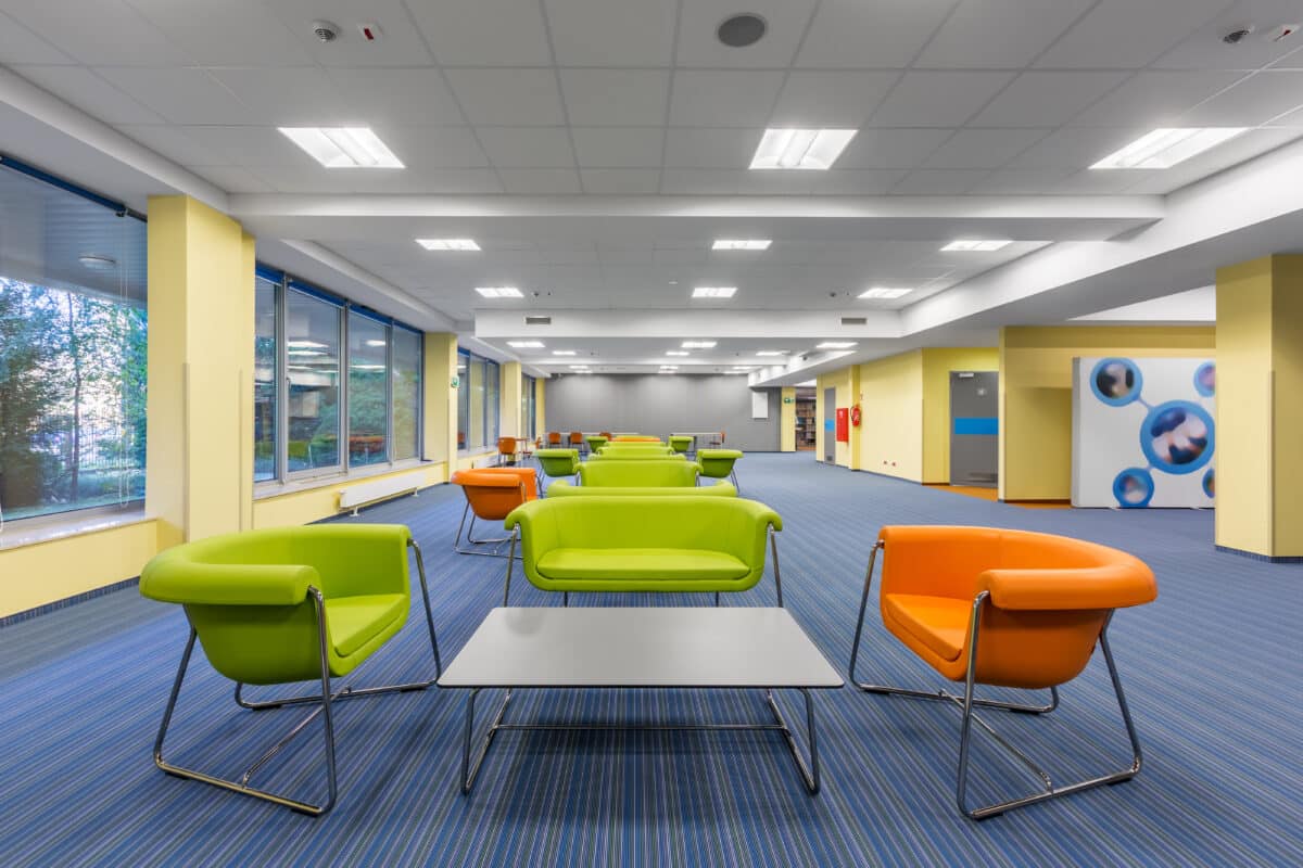
A bright, colorful modern office design. (© Dariusz Jarzabek - stock.adobe.com)
Striped Floors and Flickering LEDs Can Overload the Human Mind, Leaving Some With Headaches or Nausea
In a Nutshell
- Study authors propose that the brain may use more energy than normal to process certain artificial visual patterns, and hypothesize that this overload is what causes physical discomfort in many people, though this mechanism has not yet been fully tested.
- People with autism, ADHD, migraines, dyslexia, and other conditions are disproportionately affected, possibly because their brains may have less ability to suppress overactive visual signals, though the exact mechanism remains unsettled.
- Striped patterns, flickering lights, bright glare, and crowded visual environments such as supermarkets are among the specific stimuli documented as most discomfort-inducing, with a consistent pattern found across at least 11 clinical diagnoses and areas of neurodiversity.
Striped office floors. Flickering lights. Walls covered in repetitive geometric patterns. For many people (including those who are neurodivergent or who live with migraines, epilepsy, or other neurological conditions), these everyday features of modern life are more than an eyesore. They may be causing real physical distress, and a new scientific review sets out a detailed hypothesis to explain why.
A large team of researchers from institutions across the United States, United Kingdom, Europe, Asia, and Canada has published a detailed review arguing that visual discomfort, the headaches, eye strain, nausea, and perceptual distortions that some people experience in response to certain visual stimuli, has a measurable, physical basis in the brain. The paper, published in the journal Vision, pulls together decades of research across neuroscience, architecture, lighting design, and psychology to build a unified theory of why some things are so hard to look at, and what can be done about it.
At its core, the argument is this: the human brain evolved to process the natural world efficiently. When it’s forced to handle the highly repetitive, artificially sharp, and often flickering patterns that dominate modern urban environments — think fluorescent-lit offices, car headlights, striped acoustic panels, or the dense text of a printed page — the researchers argue it may drive greater neural activity than it should, potentially placing excessive demands on the visual cortex. That metabolic overload, they hypothesize, may be what triggers discomfort, and in people with pattern-sensitive epilepsy, it can provoke seizures.

Too much bright visual stimui at the office could be leaving some workers with headaches. (© NAMPIX – stock.adobe.com)
Why the Brain Prefers Nature Over Modern Design
To understand why modern environments can be so hard on the brain, it helps to know how the visual system is built. Eyes and brain alike evolved over millennia to process natural scenes, forests, rivers, coastlines, open skies. These environments share a specific mathematical pattern: their visual complexity decreases predictably as you zoom in on finer and finer details.
Natural scenes follow this rule almost universally. Modern human-made environments frequently do not. Striped wallpaper, gridded building facades, acoustic ceiling tiles, even the lines of printed text create patterns that deviate sharply from what the brain expects. And when the brain encounters something it can’t process efficiently, it doesn’t simply adapt. Brain imaging studies cited in the review show it generates stronger neural responses in visual areas, consumes more oxygen, and in some people produces pain, distortion, or worse.
“We hypothesize that the discomfort is a homeostatic response to the excessive oxygen demands of the visual cortex due to inefficient encoding of the visual stimuli,” the authors write in the paper. Essentially. the brain is sounding an alarm because it’s being overworked.
Brain imaging research cited in the review shows that uncomfortable images, particularly striped, high-contrast patterns, produce much larger responses in visual areas of the brain than natural images do. Tinted glasses chosen specifically for a patient with migraines were shown in one study to normalize that overactive brain response. Patients who viewed comfortable building images in another study showed smaller brain responses and also rated those images as easier to look at.
Who Gets Hit Hardest by Visual Discomfort
Most people experience some degree of visual discomfort at some point. But the burden is not shared equally. People who are neurodivergent, a broad term covering autism, ADHD, dyslexia, and related conditions, are disproportionately affected. So are people with migraines, epilepsy, anxiety, depression, and a range of other neurological conditions.
A possible biological explanation cuts across many of these conditions. In several of them, the brain may have a reduced ability to suppress its own overactivity, a kind of broken dimmer switch. One proposed contributor is GABA, a chemical messenger in the brain that normally acts as a brake on neural activity, though the authors note the evidence linking GABA levels to visual discomfort remains incomplete. Lower levels of that suppression, they suggest, could leave some people’s visual systems more vulnerable to overload when confronted with difficult stimuli.
A study using the Cardiff Hypersensitivity Scale, which categorized visual sensitivity into four subtypes (sensitivity to patterns, brightness, strobing or motion, and intense visual environments like supermarkets), found a consistent profile of discomfort across a wide range of diagnoses. Whether a person has autism, fibromyalgia, migraine, or a mental health condition, they tend to be bothered by the same kinds of visual input. The nature of the discomfort appears consistent across conditions, with differences mainly in how intense it gets.
Younger people are also more susceptible than older adults, as are those who experience frequent headaches.
Flicker Is Particularly Brutal
Among the many sources of visual discomfort the review examines, light flicker emerges as especially problematic. Electric lighting has always flickered, cycling on and off with the alternating electrical current that powers it. In the days of old-fashioned incandescent bulbs, the hot metal filament stayed warm enough between cycles to smooth most of this out. Gas discharge lighting in the mid-20th century was worse, and it took more than forty years before researchers confirmed that the flicker from fluorescent lighting causes headaches.
LED lighting, now standard in homes, offices, and cars, has brought new complications. Many LED systems use a dimming technique that rapidly switches the light on and off (sometimes hundreds of times per second). While this is invisible as flicker to the naked eye under normal conditions, eye movements can expose it. During a rapid eye movement, the flickering light source can paint a streak of ghost images across the retina, a phenomenon called the phantom array. People who experience migraines find this particularly distressing, and research has shown it can interfere with reading.
Car headlights also present a documented source of discomfort. Some modern car lights use temporal light modulation, rapidly switching on and off, at frequencies the review notes “can make the phantom array annoyingly visible.” A recent study cited in the review found that high-frequency temporal light modulation activates the visual cortex in measurable ways.

Bright car headlights can also cause strain for other motorists. (Photo by Mohammad Alizade on Unsplash+)
Designing Spaces to Reduce Visual Discomfort
One of the most actionable sections of the review is its discussion of design. Many of the changes needed to reduce visual discomfort are cost-neutral if built in from the start, the researchers argue, and it’s retrofitting that gets expensive.
An analysis of apartment building images drawn from Google found that apartment building design has moved progressively further from the natural visual patterns that the brain processes most efficiently. Repetitive grids, stark contrasts, and uniform surfaces have replaced the organic variation of earlier styles. This trend, the authors argue, may make such built environments more visually demanding, particularly for the substantial portion of the population with heightened sensitivities.
Practical recommendations include reducing contrast in unavoidable repetitive patterns, avoiding striped acoustic paneling in places like lecture halls, and using software tools now available to assess how stressful a building facade or interior might be before it’s built. On the individual level, the review discusses the evidence for colored lenses, precision-tinted glasses selected to match an individual’s specific sensitivity, as a way of reducing the brain’s overactive response to difficult visual stimuli. Colored overlays placed over text have also shown promise in some studies for people who experience visual distress from repetitive text patterns, though researchers note the mechanisms remain uncertain and not everyone is affected equally.
A Field United Around a Single Theory
This review was written by more than 30 researchers from across a wide range of disciplines (optometry, neuroscience, architecture, lighting engineering, education) following a workshop held at Birkbeck, University of London, in January 2025. For a problem that has historically been scattered across different fields, with different names and different assumed causes, the unusually broad collaboration lends weight to the hypothesis.
Visual discomfort has long been dismissed as subjective and therefore hard to take seriously. This review pushes back on that dismissal. The researchers argue that the discomfort is real and that brain imaging studies point toward a measurable physical basis for it. They conclude that addressing this will require collaboration across neuroscience, design, engineering, and education, and that, while key questions remain unresolved, enough evidence has accumulated to make a compelling case for building spaces that are less visually demanding.
When modern environments hurt to look at
What a major new scientific review says about visual discomfort and the brain — Vision, 2026
The core hypothesis
Natural world
Visual complexity decreases predictably at finer scales — forests, rivers, coastlines. The brain evolved to process this efficiently, with low metabolic cost.
Low neural load Efficient encoding
Modern environments
Striped floors, flickering LEDs, tiled ceilings, dense text — patterns that deviate sharply from what the brain expects, triggering stronger responses.
Higher neural load More oxygen demand
Proposed mechanism — how discomfort may occur
Difficult visual input
Repetitive, high-contrast, or flickering patterns
Inefficient encoding
Visual cortex works harder than it should
Metabolic overload
Excessive oxygen demand — hypothesized trigger
Discomfort
Headaches, nausea, eye strain, distortions
This is a proposed hypothesis, not a proven causal mechanism. The authors acknowledge key questions remain unresolved.
Common triggers
Striped patterns
Floors, acoustic panels, wallpaper, dense printed text
LED flicker
Pulse-width dimming creates invisible-but-detectable flicker
Car headlights
High-frequency modulation can make the “phantom array” visible
Busy spaces
Supermarkets, crowded urban facades, gridded building designs
Who may be most affected
Neurodivergent people — autism, ADHD, dyslexia, dyspraxia — disproportionately affected, possibly due to reduced cortical suppression
People with migraines or epilepsy — the same patterns that cause discomfort can trigger attacks
Those with anxiety, depression, fibromyalgia, or PTSD — consistent sensitivity profile found across 11+ diagnoses
Younger people and those with frequent headaches are also more susceptible than average
Potential solutions
1
Precision-tinted lenses
Individually selected color tints shown in studies to normalize overactive brain responses in migraine patients
2
Smarter building design
Reduce contrast on repetitive patterns; avoid striped acoustic panels; use assessment software before construction begins
3
Colored reading overlays
Shown to improve reading speed for some people who experience visual distress from text patterns
About the study
A review paper by 32 researchers across optometry, neuroscience, architecture, lighting engineering, and education. No external funding. Published June 2026.
32
researchers
& institutions
11+
diagnoses
studied
5%
of epilepsy
patients
Source: Hibbard et al., “A Cerebral Basis for Visual Discomfort and Visual Stress,” Vision, Vol. 10, Issue 2, Art. 34 (2026). DOI: 10.3390/vision10020034
Disclaimer: This article describes a review paper, meaning the authors compiled and synthesized existing research rather than conducting a new clinical trial or laboratory study. The proposed mechanism connecting certain visual stimuli to brain overload is presented as a hypothesis, not a proven causal finding. Individual responses to visual stimuli vary widely. People experiencing discomfort, headaches, or other symptoms related to visual environments should consult a qualified healthcare provider.
Paper Notes
Limitations
This paper is a review, meaning it synthesizes and interprets existing research rather than presenting new experimental data. The authors themselves note that current visual tests for susceptibility to discomfort are subjective and poorly standardized. They also acknowledge that the proposed mechanism (that discomfort is the brain’s response to overwork) has not been fully tested, particularly the hypothesis that colored tints reduce discomfort by steering visual stimulation away from overactive brain areas. The relationship between the brain’s excitatory and inhibitory chemical signals and visual discomfort also remains, in their words, “unsettled.” Several key research questions are flagged as unresolved, including how to best quantify the real-world impact of visual stress on people’s lives and how to objectively measure susceptibility.
Funding and Disclosures
The research received no external funding. The paper originated from a workshop held at Birkbeck, University of London, in January 2025, arranged by Daphne Jackson Research Fellow Beverley Burke and funded by a conference and research activities allowance. Several authors disclosed potential conflicts of interest: Arnold Wilkins receives royalties from Cerium Visual Technologies but has donated these for a student bursary; Katherine Batey and Andrew Keyes operate the visual stress clinic Vision Through Colour; Karen Monet runs the visual stress clinic Opticalm; and Miroslav Slouka is affiliated with indie Technologies Switzerland AG (Exalos). The remaining authors declared no commercial or financial relationships that could be construed as conflicts of interest.
Publication Details
Authors: Paul B. Hibbard, Peter Allen, Jordi M. Asher, Katherine Batey, Beverley Burke, Jason J. Braithwaite, Geoff G. Cole, Caelan Dow, Bruce J.W. Evans, Anna Franklin, Sarah M. Haigh, Hillevi Hemphälä, Ian Hosking, Andrew Keyes, Chan-su Lee, Ute Leonards, Cathy Manning, John Maule, Naomi Miller, Karen Monet, Louise O’Hare, Olivier Penacchio, Gordon T. Plant, Georgie Powell, Alice Price, Andrew J. Schofield, Miroslav Slouka, Petroc Sumner, Cleo Valentine, Thomas Wilcockson, Sanae Yoshimoto, and Arnold J. Wilkins.
Journal: Vision, Volume 10, Issue 2, Article 34 (2026) | Paper Title: “A Cerebral Basis for Visual Discomfort and Visual Stress” | DOI: 10.3390/vision10020034
Published: June 11, 2026. Open access under Creative Commons Attribution (CC BY) license.
About StudyFinds Analysis
Called "brilliant," "fantastic," and "spot on" by scientists and researchers, our acclaimed StudyFinds Analysis articles are created using an exclusive AI-based model with complete human oversight by the StudyFinds Editorial Team. For these articles, we use an unparalleled LLM process across multiple systems to analyze entire journal papers, extract data, and create accurate, accessible content. Our writing and editing team proofreads and polishes each and every article before publishing. With recent studies showing that artificial intelligence can interpret scientific research as well as (or even better) than field experts and specialists, StudyFinds was among the earliest to adopt and test this technology before approving its widespread use on our site. We stand by our practice and continuously update our processes to ensure the very highest level of accuracy. Read our AI Policy (link below) for more information.
Our Editorial Team
Steve Fink
Editor-in-Chief
John Anderer
Associate Editor